
1.用sass工具定义flex布局样式
```
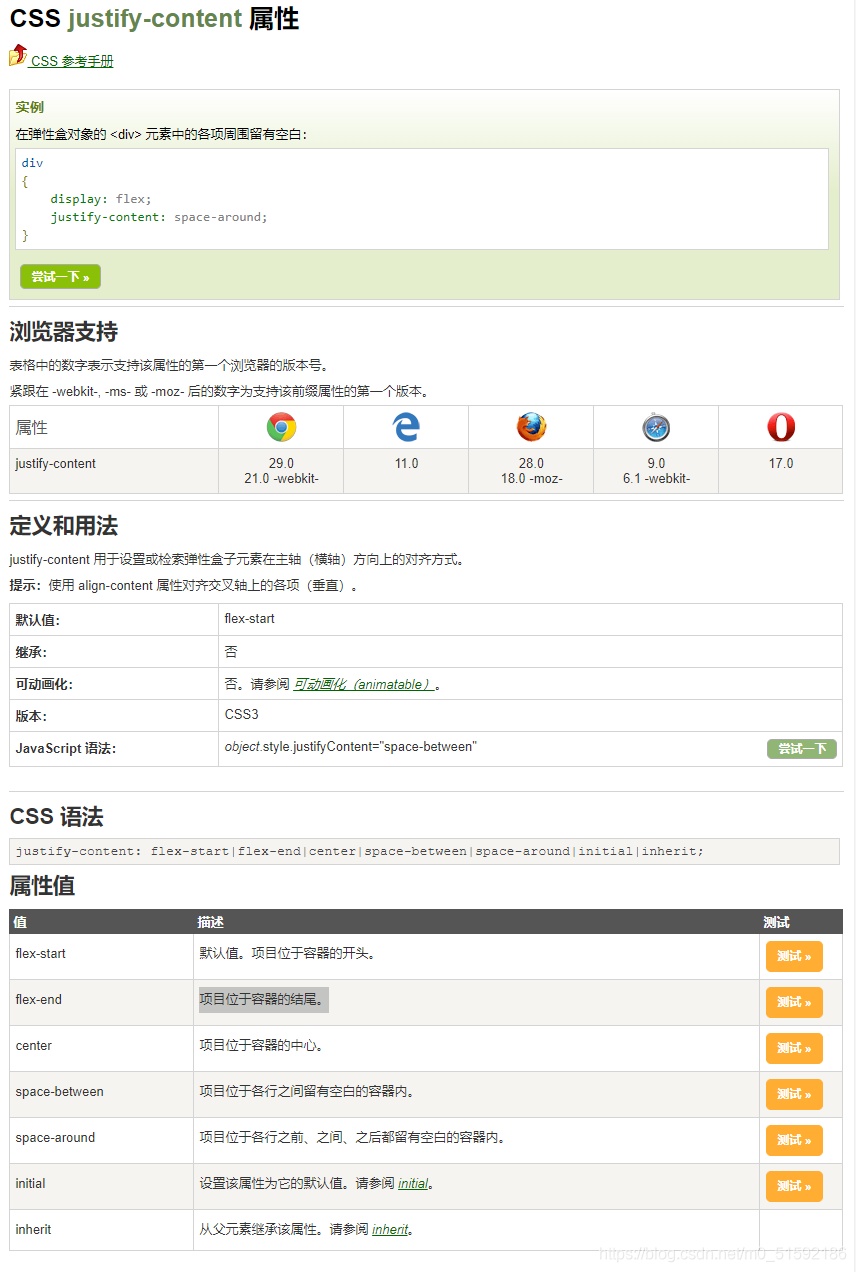
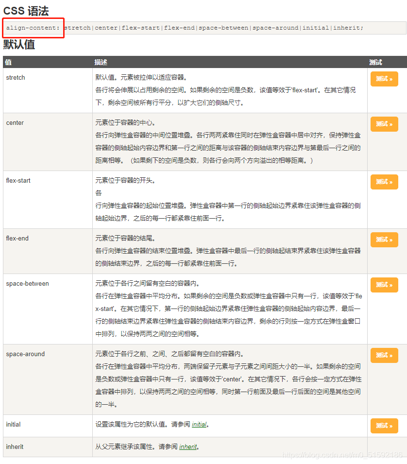
**flex 属性用于设置或检索弹性盒模型对象的子元素如何分配空间。
其中justify-content(水平方向对齐)属性和align-content(垂直方向对齐)属性更方便地解决元素的对其、分布方式**
```
```
具体在什么场景如何得到效果大家去链接中测试。
```
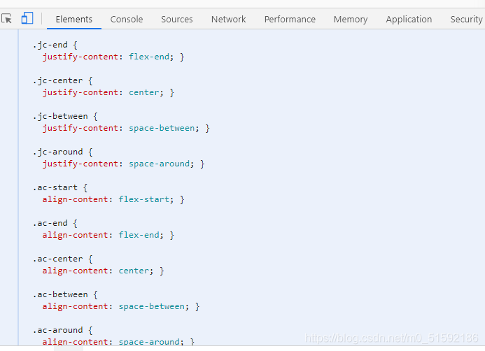
sass工具定义:
```
// flex布局
.d-flex{
display: flex;
}
$flex-jc: (
start: flex-start,
end: flex-end,
center: center,
between: space-between,
around: space-around,
);
@each $key,$value in $flex-jc {
.jc-#{$key} {
justify-content: $value;
}
}
$flex-ac: (
start: flex-start,
end: flex-end,
center: center,
between: space-between,
around: space-around,
stretch: stretch,
);
@each $key,$value in $flex-ac {
.ac-#{$key} {
align-content: $value;
}
}
```
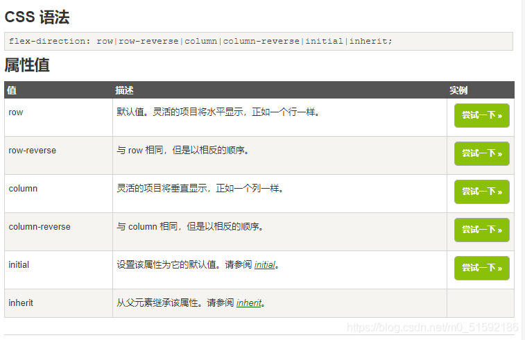
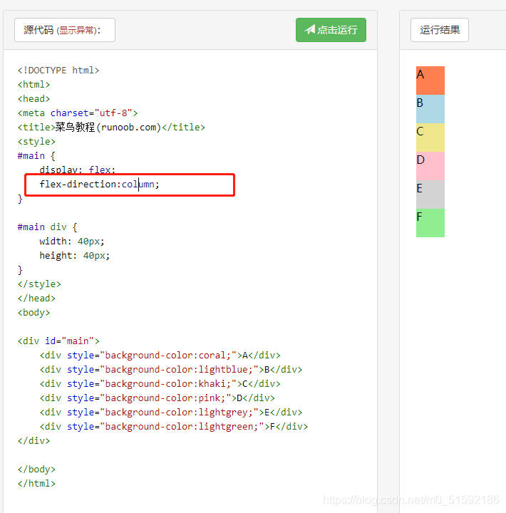
另外,如果遇到需要让几个灵活项目横、纵向排列,可以用到flex-derection:
```
.flex-column{
// 灵活的项目将垂直显示,正如一个列一样。
flex-direction: column;
}
```
2.利用sass生成的css搭建web端
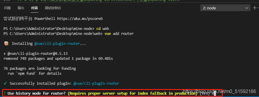
(1)添加web端路由
具体路由操作见admin路由设置
与admin端相同,直接给web端添加路由:
```
cd web
vue add router
```
选择no,使用普通路由
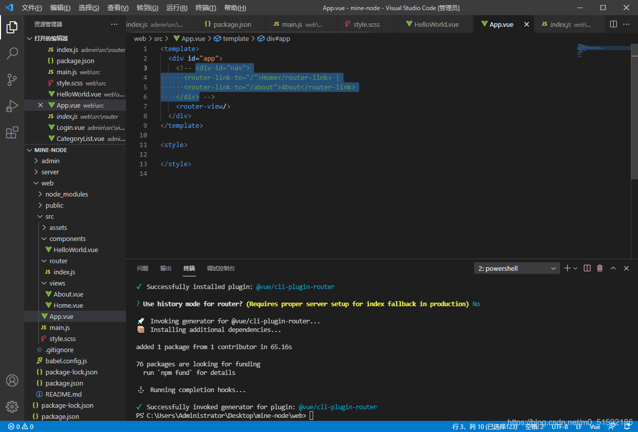
安装完成后,web端文件自动配置,同时页面出现了路由:
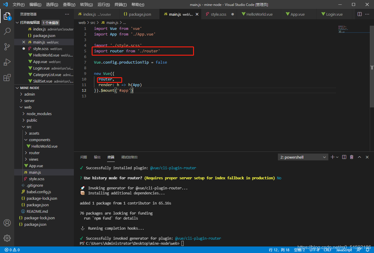
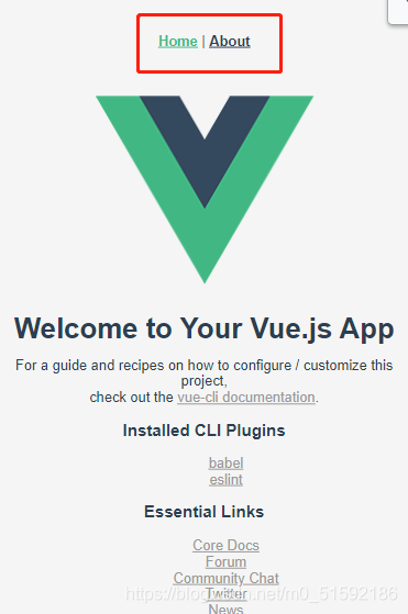
我们不在所有页面使用固定路由,所以删掉vue默认设置的路由。
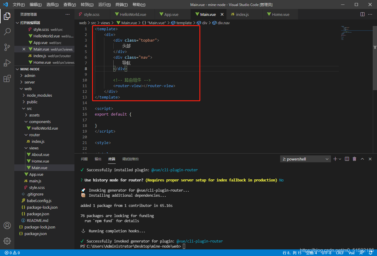
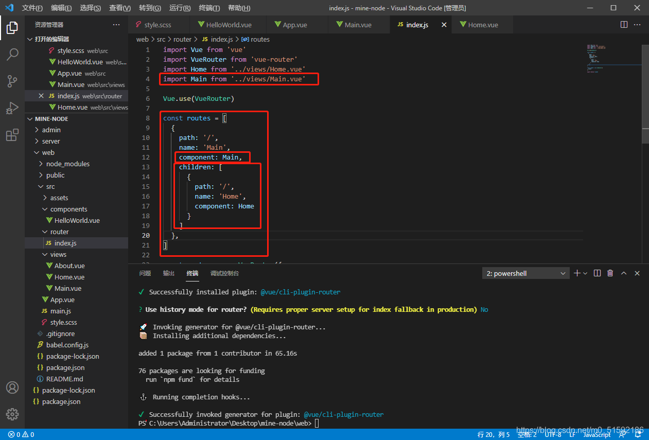
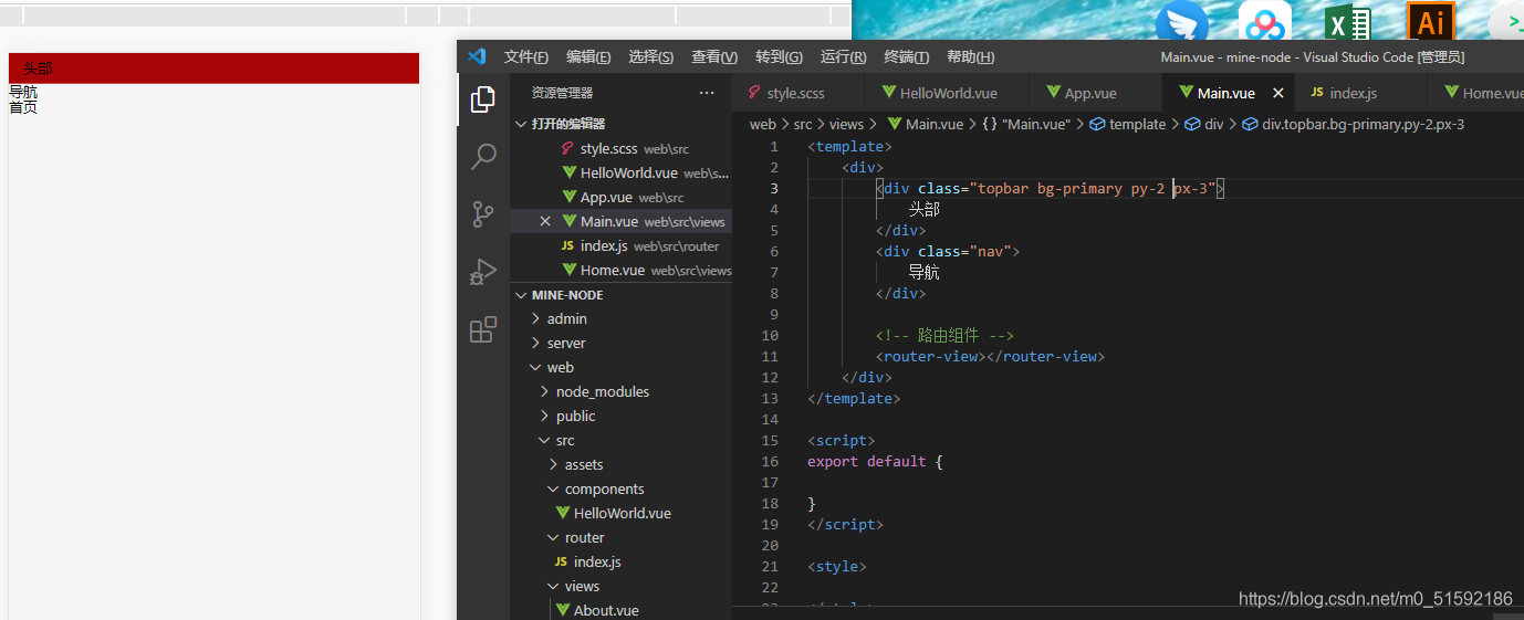
新建主入口页面Main.vue,将Main组件当作主页面,把Home.vue视为首页组件,通过路由将Home.vue作为子组件引入到Main.vue:
待页面样式完善后,添加其他页面路由。
(2)使用sass生成的css优化界面
给我们需要添加效果的模块直接添加类名即可。
我的页面,其中首页为Home.vue,技能学习为Skill.vue,文章中心为Article.vue:
在这里插入图片描述
```
<template>
<div>
<div class="topbar py-2 px-3 d-flex ac-center">
<img src="../assets/logo.png" height="50">
<div class="px-2 flex-1">
<div class="text-black fs-lg pt-2">八方设计</div>
<div class="text-gray fs-xxs pt-2">用设计挖掘梦想</div>
</div>
<div class="py-3">
<button class="btn bg-primary text-white">用户登录</button>
</div>
</div>
<div class="bg-primary pt-3 pb-2">
<div class="nav d-flex text-white jc-around">
<div class="nav-item">
<!-- 导航使用路由的active-class,根据所在路由位置为标签添加类名,同时在style.scss中设置active类名的样式 -->
<!-- extra属性与active-class配合使用,更精确找到路由位置,若不加则会认为/skill在/内(即技能学习在首页内部),二者都会被赋予active类名 -->
<router-link class="nav-link" tag="div" to="/" active-class="active" exact>首页</router-link>
</div>
<div class="nav-item">
<router-link class="nav-link" tag="div" to="/skill" active-class="active" exact>技能学习</router-link>
</div>
<div class="nav-item">
<router-link class="nav-link" tag="div" to="/article" active-class="active" exact>文章中心</router-link>
</div>
</div>
</div>
<!-- 路由组件 -->
<router-view></router-view>
</div>
</template>
<script>
export default {
}
</script>
<style>
.fs-xxs{
letter-spacing: 3px;
}
.fs-lg{
letter-spacing: 3px;
}
.topbar{
/* 吸顶效果 */
position: sticky;
top: 0;
z-index: 999;
}
</style>
```
style.scss
```
// 规范样式
* {
// 避免margin/padding等将页面向外扩充,加入border-box后页面像内部挤压
box-sizing: border-box;
// 取消鼠标移入等高亮样式
outline: none;
}
html {
// 设置默认字体大小
font-size: 13px;
}
body {
// 设置body默认
// 去除body边框
margin: 0;
// 设置字体:所有计算机自带字体,苹果电脑自带字体,非衬线字体
font-family: Arial, Helvetica, sans-serif;
// 行距
line-height: 1.2rem;
// 背景颜色
background: #f5f5f5;
}
a {
color: #999;
}
ul, li{
list-style: none;
}
// colors常用颜色
$colors: (
// 主色
"primary": #a80506,
// 辅色
"auxiliary": #054ea8,
// 点缀色
"Embellishment":#db9e3f,
// 白色
"white": #fff,
// 黑色
"black": #000,
// 灰色
"gray": #777,
);
@each $colorKey, $color in $colors {
// 文字颜色
.text-#{$colorKey} {
color: $color;
}
// 背景颜色
.bg-#{$colorKey} {
background: $color;
}
}
// text常用文本
@each $var in (left, center, right) {
.text-#{$var}{
text-align: $var;
}
}
// 使用px to rem插件设置默认字体大小为13px
// 设置基础字体大小
$base-font-size: 1rem;
// 根据基础字体大小设置字体大小
$font-size: (
// 使用px to rem插件,alt + z 转化px到rem
// xs为6px
xxs: 0.4615,
// xs为10px
xs: 0.7692,
// sm为12px
sm: 0.9231,
// md为13px
md: 1,
// lg为14px
lg: 1.0769,
// xl为16px
xl: 1.2308,
);
@each $sizeKey, $size in $font-size {
// 文字颜色
.fs-#{$sizeKey} {
font-size: $size * $base-font-size;
}
}
// flex布局
.d-flex{
display: flex;
}
.flex-1{
flex: 1;
}
.flex-column{
// 灵活的项目将垂直显示,正如一个列一样。
flex-direction: column;
}
$flex-jc: (
start: flex-start,
end: flex-end,
center: center,
between: space-between,
around: space-around,
);
@each $key,$value in $flex-jc {
.jc-#{$key} {
justify-content: $value;
}
}
$flex-ac: (
start: flex-start,
end: flex-end,
center: center,
between: space-between,
around: space-around,
stretch: stretch,
);
@each $key,$value in $flex-ac {
.ac-#{$key} {
align-content: $value;
}
}
// 间距spacing
// bootstrap中,mt-1 -> margin-top: 1rem, pb-2 -> padding-bottom: 2rem
// 类型
$spacing-types: (m: margin, p: padding);
// 方向
$spacing-directions: (t: top, r: right, b: bottom, l:left);
// 尺寸
$base-spacing-size: 1rem; // 基础尺寸
$spacing-sizes: (0: 0, 1: 0.25, 2: 0.5, 3: 1, 4: 1.5, 5: 3); // 基础尺寸为准的倍数
@each $typeKey, $type in $spacing-types {
@each $directionKey, $direction in $spacing-directions {
@each $sizeKey, $size in $spacing-sizes {
// 样版: .mt-1 { margin-top: 0.25rem }
.#{$typeKey}#{$directionKey}-#{$sizeKey} {
#{$type}-#{$direction}: $size * $base-spacing-size;
}
}
}
}
// m-1, p-1等只需要嵌套类型变量$spacing-directions和尺寸变量$spacing-sizes
@each $typeKey, $type in $spacing-types {
@each $sizeKey, $size in $spacing-sizes {
// 样版: .mt-1 { margin-top: 0.25rem }
.#{$typeKey}-#{$sizeKey} {
#{$type}: $size * $base-spacing-size;
}
}
}
// 水平、垂直方向边距
@each $typeKey, $type in $spacing-types {
@each $sizeKey, $size in $spacing-sizes {
// mx-1,px-1
.#{$typeKey}x-#{$sizeKey} {
#{$type}-left: $size * $base-spacing-size;
#{$type}-right: $size * $base-spacing-size;
}
// my-1,py-1
.#{$typeKey}y-#{$sizeKey} {
#{$type}-top: $size * $base-spacing-size;
#{$type}-bottom: $size * $base-spacing-size;
}
}
}
// button
.btn{
border: none;
border-radius: 0.1538rem;
font-size: map-get($font-size, 'sm') * $base-font-size;
padding: 0.4rem 0.6rem;
}
// nav-border
.nav{
.nav-item{
border-bottom: 3px solid transparent;
padding-bottom: 0.2rem;
// 符号&代表上一层本身
.active{
border-bottom: 2px solid #fff;
}
}
}
```
- tp6+vue
- 1.工具和本地环境
- 2.启动项目
- 3.路由、模型与数据库操作
- 4.优化后端接口,前端使用axios实现接口功能
- 5.用户登录,bcrypt(hash)加密与验证
- 6.用户登录(二),token验证
- 7.分类的模型关联和通用CRUD接口
- 8.使用vue的markdown编辑器并批量上传图片
- Node.js + Vue.js
- 工具,本地环境
- 2.1启动项目
- 3.element-ui和vue-router路由的安装和使用
- 4.使用axios,并创建接口上传数据到mongodb数据库
- 5.mongoodb数据库的“删、改、查”操作
- 6.mongodb数据库无限层级的数据关联(子分类)
- 7.使用mongodb数据库关联多个分类(关联多个数据)
- 8.server端使用通用CRUD接口
- 9.图片上传
- 10.vue的富文本编辑器(vue2-editor)
- 11.动态添加分栏上传多组数据
- 12-1.管理员模块
- 13-1.搭建前台web端页面
- 1.使用sass工具搭建前台web端页面
- 2.sass工具的变量
- 3.使用flex布局并开始搭建web端
- 4.vue广告轮播图,并使用接口引入数据
- 5.使用字体图标(iconfont)
- 6.卡片组件的封装
- 14-1.生产环境编译
- 1.环境编译
- 2.购买域名服务器并解析域名到服务器
- 3.nginx配置web服务器并安装网站环境
- 4.git拉取代码到服务器
- 5.配置Nginx反向代理
- 6.迁移本地数据到服务器(mongodump)
- uni
- 1.工具&本地环境
- 2.页面制作
- 3.页面制作、组件与轮播
- 4.页面跳转与横向滑动
- 5.用户授权登录和用户信息获取
- 6.用户注册和数据存储
- 7.用户填写表单信息