
> Flex 是 Flexible Box 的缩写,意为"弹性布局",用来为盒状模型提供最大的灵活性。
~~~
.box{
display:flex;
}
~~~
* [参数详解](https://www.kancloud.cn/wangking/uniapp/1618274#_7)
* [flex-direction(默认row)](https://www.kancloud.cn/wangking/uniapp/1618274#flexdirectionrow_8)
* [flex-wrap (默认nowrap)](https://www.kancloud.cn/wangking/uniapp/1618274#flexwrap_nowrap_20)
* [nowrap](https://www.kancloud.cn/wangking/uniapp/1618274#nowrap_26)
* [wrap](https://www.kancloud.cn/wangking/uniapp/1618274#wrap_29)
* [justify-content (默认flex-start)](https://www.kancloud.cn/wangking/uniapp/1618274#justifycontent_flexstart_33)
* [align-items (默认stretch)](https://www.kancloud.cn/wangking/uniapp/1618274#alignitems_stretch_53)
* [flex-grow (默认0)](https://www.kancloud.cn/wangking/uniapp/1618274#flexgrow_0_63)
* [flex-shrink (默认1)](https://www.kancloud.cn/wangking/uniapp/1618274#flexshrink_1_72)
* [flex-basis(默认auto)](https://www.kancloud.cn/wangking/uniapp/1618274#flexbasisauto_83)
* [flex:1](https://www.kancloud.cn/wangking/uniapp/1618274#flex1_92)
* [align-self](https://www.kancloud.cn/wangking/uniapp/1618274#alignself_102)
* [代码案例](https://www.kancloud.cn/wangking/uniapp/1618274#_111)
* [学习flex布局的ui参考](https://www.kancloud.cn/wangking/uniapp/1618274#flexui_144)
# 参数详解
## flex-direction(默认row)
> **水平方向**的对齐方式
> `row`(默认值):主轴为水平方向,起点在左端。
> `row-reverse`:主轴为水平方向,起点在右端。
> `column`:主轴为垂直方向,起点在上沿。
> `column-reverse`:主轴为垂直方向,起点在下沿。
~~~
.box {
flex-direction: row | row-reverse | column | column-reverse;
}
~~~

## flex-wrap (默认nowrap)
~~~
.box{
flex-wrap: nowrap | wrap;
}
~~~
### nowrap
> 不换行
> 
### wrap
> 换行
> 
## justify-content (默认flex-start)
> **水平方向**的对齐方式
> `flex-start`(默认值):左对齐
> `flex-end`:右对齐
> `center`: 居中
> `space-between`:两端对齐,项目之间的间隔都相等。
> `space-around`:每个项目两侧的间隔相等。所以,项目之间的间隔比项目与边框的间隔大一倍。
~~~
.box {
justify-content: flex-start | flex-end | center | space-between | space-around;
}
~~~

~~~
.box {
align-items: flex-start | flex-end | center | baseline | stretch;
}
~~~
## align-items (默认stretch)
> **垂直方向**的对齐方式
> `flex-start`:交叉轴的起点对齐。
> `flex-end`:交叉轴的终点对齐。
> `center`:交叉轴的中点对齐。
> `baseline`: 项目的第一行文字的基线对齐。
> `stretch`(默认值):如果项目未设置高度或设为auto,将占满整个容器的高度。

## flex-grow (默认0)
> 如果父元素的剩余空间,默认为0(不放大)。
> 如果所有项目的`flex-grow`属性都为1,则它们将等分剩余空间(如果有的话)。如果一个项目的`flex-grow`属性为2,其他项目都为1,则前者占据的剩余空间将比其他项多一倍。
~~~
.item {
flex-grow: <number>; /* default 0 */
}
~~~
## flex-shrink (默认1)
> 定义项目的缩小比例,默认为1,即如果空间不足,该项目将缩小
~~~
.box {
flex-shrink: <number>; /* default 1 */
}
~~~

> 如果所有项目的`flex-shrink`属性都为1,当空间不足时,都将等比例缩小。如果一个项目的`flex-shrink`属性为0,其他项目都为1,则空间不足时,前者不缩小。
## flex-basis(默认auto)
> 定义在分配多余空间之前,项目占据的主轴空间(main size)。浏览器根据这个属性,计算主轴是否有多余空间。它的默认值为`auto`,即项目的本来大小
~~~
.box {
flex-basis: <length> | auto; /* default auto */
}
~~~
> 它可以设为跟`width`或`height`属性一样的值(比如350px),则项目将占据固定空间。
## flex:1
> `flex`属性是`flex-grow`,`flex-shrink`和`flex-basis`的简写,默认值为`0 1 auto`。后两个属性可选。
> `flex:1`等同于`flex: 1 1 auto;`
> 建议优先使用这个属性,而不是单独写三个分离的属性,因为浏览器会推算相关值。
~~~
.item {
flex: none | [ <'flex-grow'> <'flex-shrink'>? || <'flex-basis'> ]
}
~~~
## align-self
> `align-self`属性允许单个项目有与其他项目不一样的对齐方式,可覆盖`align-items`属性。默认值为`auto`,表示继承父元素的`align-items`属性,如果没有父元素,则等同于`stretch`。
~~~
.item {
align-self: auto | flex-start | flex-end | center | baseline | stretch;
}
~~~

# 代码案例
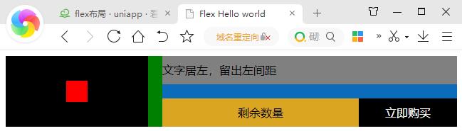
~~~
<!DOCTYPE html>
<html lang="en">
<head>
<meta charset="UTF-8">
<title>Flex Hello world</title>
<style type="text/css">
.box{display: flex;background: green;height: 100px;}
.box .left{display: flex;width: 200px;align-items: center;justify-content: center;background: black;margin-right: 20px;}
.box .right{display: flex;flex: 1;flex-direction: column;background: #0b6cbc;}
.box .right .line1{background: grey;margin-bottom: 20px;height: 40px;line-height: 40px;}
.box .right .line2{display: flex;height: 40px;line-height: 40px;text-align: center;}
</style>
</head>
<body>
<div class="box">
<div class="left">
<div style="height: 30px;width: 30px;background: red;"></div>
</div>
<div class="right">
<div class="line1">文字居左,留出左间距</div>
<div class="line2">
<div style="background: goldenrod;flex: 2;overflow: hidden;">剩余数量</div>
<div style="background: black;flex: 1;overflow: hidden;color:#FFF;">立即购买</div>
</div>
</div>
</div>
</body>
</html>
~~~
# 学习flex布局的ui参考
> 1. ColorUI-UniApp :[https://ext.dcloud.net.cn/plugin?id=239](https://ext.dcloud.net.cn/plugin?id=239)
> 2. uView :[https://www.uviewui.com/](https://www.uviewui.com/)
- 基础知识
- UNI核心介绍
- flex布局
- 生命周期
- 全局方法
- 组件定义
- 自定义组件
- 全局组件
- 组件之间的数据传输
- 条件编译
- 自定义头部
- 节点信息 (SelectorQuery)
- vuejs基础语法
- 页面跳转以及参数传递
- 事件的监听注册以及触发
- css3动画
- block的妙用
- mixin (混入)
- uniapp快捷键
- vuex状态管理
- 实用功能
- 获取服务提供商
- 启动页 / 启动界面
- 引导页
- tabbar配置
- 头部导航栏基础设置
- 上拉下拉(刷新/加载)
- 第三方登录
- 第三方分享
- 推送通知 之 unipush
- scroll-view双联动
- 配置iOS通用链接(Universal Links)
- 本地缓存操作
- 升级/更新方案
- 热更新
- 图片上传
- 搜索页实现
- canvas绘图助手
- 地图定位
- 第三方支付————todo
- 分类轮播
- 清除应用缓存
- uniapp与webview的实时通讯
- 视频-----todo
- 聊天----todo
- 长列表swiper左右切换
- 第三方插件
- uview
- mescroll
- uCharts (图表)
- 无名 (更新插件)
- 第三方模版
- 自定义基座
- 打包发行
- 要封装的方法
- 缓存 cache.js
- 请求接口 request.js
- 工具类 util.js
- 小程序登录 xcxLogin.js
- 版本更新 update.js
- 优质插件
- 更新插件----todo
- 语音
- 语音识别 (含上传)
- 百度语音合成播报接口
- 官方常用组建
- input 输入框
- image 图片
- audio 音频
- picker 选择器
- video 视频
- scroll-view 滚动视图
- uni-app 地图全解析+事件监听