# 一、背景展示
·背景属性
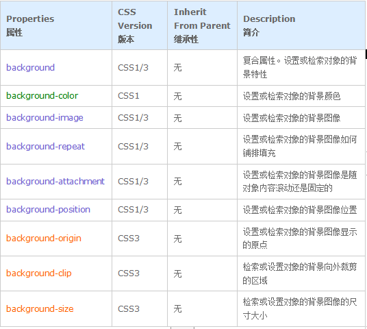
**复合属性(background)**:
1. 是上面8个属性的总和…可以把所有属性写在一起。
2. 顺序不限,以空格隔开即可
**背景颜色 (background-color)**
background-color是最早,最古老,最…常用的属性之一,取值是唯一的,颜色值。
**背景图片(background-image)**
background-image顾名思义是设置背景“图片”的
**背景重复(background-repeat)**
background-repead用于设置背景的重复方式,可选值有下面几种:
*·no-repeat 不重复,等价于no-repeat no-repeat
·repeat-X X轴方向(横向)重复,等价于repeat no-repeat
·repeat-Y Y轴方向(纵向)重复,等价于no-repeat repeat
· repeat 重复平铺,等价于repeat repeat*
**·除了这4个常用的,还有两个…大概没什么人用,兼容性也不是很好的取值:**
·round 图像在指定方向平铺,会根据显示空间的大小缩放图像(什么时候缩放,什么时候增减平铺的数量是由浏览器决定的)
·space 图像会尽可能重复,但不裁剪,第一张和最后一张固定在元素两端,剩下的均匀分布。此时background-position属性被忽视。另外只有在图像大过元素的时候会发生裁剪。
**当图片的宽度大于容器时:**
div {
width: 200px;
height: 200px;
border: solid 1px red;
background-color: #fff3d4;
background-size: 300px;
background-image: url(https://ununsplash.imgix.net/photo-1415302199888-384f752645d0?q=75&fm=jpg&s=823bdcc1b7ad955f5180efd352561016);
}
.test1 {
background-repeat: space;
}
.test2 {
background-repeat: round;
}
space 背景图不会产生缩放,会被裁切 round 缩放背景图至容器大小(非等比例缩放)
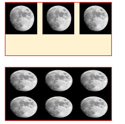
**容器空间大于图片时:**
div {
width: 200px;
height: 100px;
border: solid 1px red;
background-color: #fff3d4;
background-size: 60px;
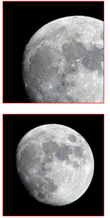
background-image: url(./moon.jpg);
}
.test1 {
background-repeat: space;
}
.test2 {
background-repeat: round;
}
space 在不缩放的前提下尽可能多的重复图片 round 充分利用容器空间,重复n次之后(x/y轴方向)如果剩余空间大于等于imgWidth\*50%则重复第n+1次,否则拉伸已经重复的背景图
**背景固定(background-attachment)**
background-attachment用于设置背景相对的固定方式,可选值有:
·scroll 默认值,背景相对于元素固定。
·fixed 背景相对于整个窗口固定。随着最近全屏大图网站的流行,这种背景固定模式也日渐多见起来。
·local 背景相对于元素内容固定,如果元素内有滚动条,背景会随着内容滚动。
local这种模式我们几乎不怎么用到,这里找到一篇文章,作者写了一个Demo,在元素出现滚动条的时候,会在它的可滚动方向出现阴影。虽然是属于交互设计范畴,但随着各个网站更加强调重视用户体验,这种需求是早晚的事,而作者的Demo是非常有趣(且有效率)的实现方式。
**1.scroll**
设置background-attachment:scroll,背景图是相对于元素自身固定,内容动时背景图也动。
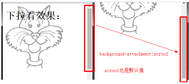
对于scroll,一般情况背景随内容滚动,但是有一种情况例外。
对于可以滚动的元素(设置为overflow:scroll的元素)。当background-attachment设置为scroll时,背景图不会随元素内容的滚动而滚动。
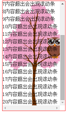
**2. local**
对于可以滚动的元素(设置为overflow:scroll的元素),设置background-attachment:local,则背景会随内容的滚动而滚动。
因为背景图是相对于元素自身内容定位,开始固定,元素出现滚动条后背景图随内容而滚动。
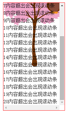
**3. fixed**
背景图片相对于视口固定,就算元素有了滚动条,背景图也不随内容移动
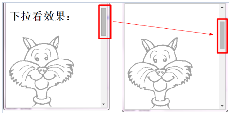
```
<style>
body{
background-image: url(img/cartooncat.png);
background-position: bottom left;
background-attachment: fixed;
background-repeat: no-repeat;
height: 1000px;
}
</style>
</head>
<body>
<h1>下拉看效果:</h1>
</body>
```
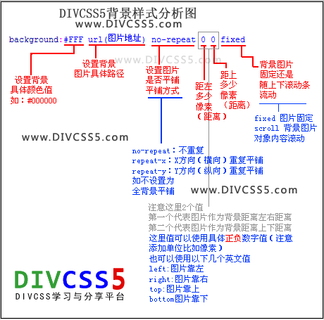
**背景定位(background-position)**
background-positon,顾名思义就是用来定位的…但是这个定位吧…语法很复杂(或者说很随意)。可用的各种指示方向的关键字,也可以用数字单位或者百分比,**写法有下面几种:**
·并列写两个关键字(或值),第一个值代表它的水平位置,第二个值代表它的垂直位置(这个和padding、margin、border这些先上下再左右的属性刚好是反的…)。另外如果两个都是关键字,那么位置可以交换,也就是说,center left是合法的,然而50% left不行。
·只写一个关键字(或值),那么它的第二个值就默认为center(居中)。
·三、四值,可以从元素的四周定位,比如离右边10px,底边5px,就可以写成right 10px bottom 5px,两组关键字\-值对可以交换位置,也可以用center替代关键字\-值。这种写法目前(2016-06)只有FF支持。
```
.box{
width: 300px;
height: 300px;
margin: 28px auto;
background: red url(https://ununsplash.imgix.net/photo-1415302199888-384f752645d0?q=75&fm=jpg&s=823bdcc1b7ad955f5180efd352561016);
background-size: 300px;
background-position: left 10px bottom 5px;
}
.a{
background-repeat: no-repeat;
}
```
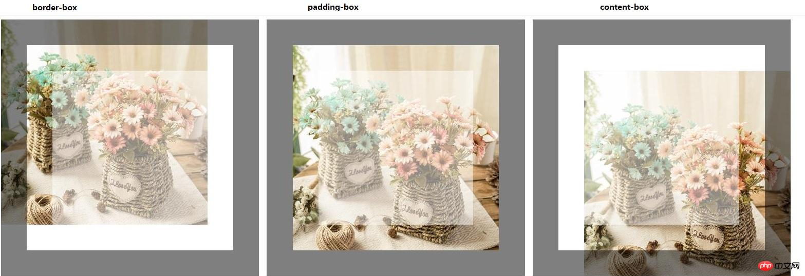
**背景原点(background-origin)**
**background-origin根据box-model有3个值:**
1、border-box-定位背景位置0,0指向边框的左上角。
2、padding-box(默认)-将背景位置定位在填充的左上角0,0点。
3、content-box-定位背景位置0,0指向内容的左上角。
**注释:如果背景图像的 background-attachment 属性为 "fixed",则该属性没有效果**
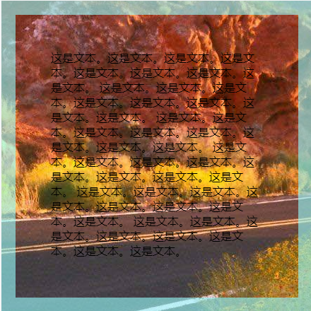
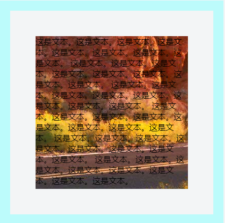
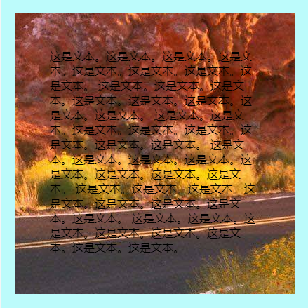
**背景裁切(background-clip)**
background-clip是设定背景所覆盖的范围的属性。可选值有:
·border-box 默认值,背景延伸到边框下,但是只有当边框的颜色是半透明的时候才能看到延伸过来的背景。
·padding-box 边框下没有背景。
·content-box 只有内容下有背景(padding的空间里都没有)
**扩展用法:**
```
<div>Clip</div>
```
```
div {
margin: auto;
width: 400px;
height: 300px;
line-height: 300px;
text-align: center;
font-size: 180px;
font-weight: bold;
color: transparent;
background: url(https://timgsa.baidu.com/timg?image&quality=80&size=b9999_10000&sec=1590934642528&di=824dd9ab66306a64814cb95b00f3bbbf&imgtype=0&src=http%3A%2F%2Fpic1.win4000.com%2Fwallpaper%2F9%2F57e344c4b0bca.jpg) no-repeat center center;
background-size: cover;
-webkit-background-clip: text;
}
```
```
<div class="text">保健沐足按摩</div>
```
```
.text {
margin: 0 auto;
width: 500px;
line-height: 100px;
font-family: 'Arial', sans-serif;
text-align: center;
z-index: 1;
font-size: 80px;
font-weight: bold;
background: linear-gradient(90deg, red 0, orange 15%, yellow 30%, green 45%, teal 60%, blue 75%, purple 90% ,purple 100%);
-webkit-background-clip: text;
color: transparent;
animation: changeColor .5s linear infinite alternate;
}
@keyframes changeColor {
0% {
background: linear-gradient(90deg, red 0, orange 15%, yellow 30%, green 45%, teal 60%, blue 75%, purple 90% ,purple 100%);
-webkit-background-clip: text;
}
50% {
background: linear-gradient(90deg, deeppink 0, yellowgreen 15%, fuchsia 30%, lime 45%, olive 60%, aqua 75%, coral 90% ,brown 100%);
-webkit-background-clip: text;
}
100% {
background: linear-gradient(-90deg, red 0, orange 15%, yellow 30%, green 45%, teal 60%, blue 75%, purple 90% ,purple 100%);
-webkit-background-clip: text;
}
}
```
**背景尺寸(background-size)**
background-size用来设置背景尺寸,可选值有:
*length:*设置背景图像的高度和宽度, 第一个值设置宽度,第二个值设置高度, 如果只设置一个值,则第二个值会被设置为 "auto"。
*percentage:*以父元素的百分比来设置背景图像的宽度和高度。值得设置与length相同。
cover:把背景图像扩展至足够大,以使背景图像完全覆盖背景区域。背景图像的某些部分也许无法显示在背景定位区域中。
contain: 把图像图像扩展至最大尺寸,以使其宽度和高度完全适应内容区域。
```
div{
width: 800px;
height: 600px;
border: 1px solid red;
background: url(https://ununsplash.imgix.net/photo-1415302199888-384f752645d0?q=75&fm=jpg&s=823bdcc1b7ad955f5180efd352561016) 0 0 no-repeat;
}
.length{background-size: 800px 600px;}
.length2{background-size: 800px ;}
.percentage{background-size: 100% 100%;}
.percentage2{background-size: 100% ;}
.cover{background-size: cover;}
.cover2{width: 1000px;height:200px;border: 1px solid red;background: url(https://ununsplash.imgix.net/photo-1415302199888-384f752645d0?q=75&fm=jpg&s=823bdcc1b7ad955f5180efd352561016) 0 0 no-repeat;background-size: cover;}
.contain{background-size: contain;}
.contain2{height: 80px;background-size: contain;}
```
```
<h3>像素级的缩放设置</h3>
<div class="length"></div>
<h3>像素级的缩放只设置一个参数时候第二个参数为auto</h3>
<div class="length2"></div>
<h3>百分比的缩放设置</h3>
<div class="percentage"></div>
<h3>百分比的缩放当只设置一个参数时第二个参数为auto</h3>
<div class="percentage2"></div>
<h3>cover</h3>
<div class="cover"></div>
<p>突然发现背景图怎么没显示完全。<br>
cover是按比例去设置背景图片的,它会把图片设置到最大程度进行<br>
适配如本图它的高度已经到了极限所以它就不会再去做宽度的适应,<br>就像上面关于cover介绍的后半部分:背景图像的某些部分也许无法显示在背景定位区域中。
</p>
<h3>为了更好的理解我们做一个宽度达到极限的例子</h3>
<div class="cover2"></div>
<p>按比例适应时发现宽度可以放大到最大程度,高度因为比例的变化会有一部分被隐藏掉了</p>
<h3>contain</h3>
<div class="contain"></div>
<p>最大程度去适应背景,同样做一个相反的例子进行比较如下图</p>
<div class="contain2"></div>
```
