
# 7. 对齐单元格/区域中所有项目
[toc]
## 7.1 属性
| 序号 | 属性 | 描述 |
| ---- | --------------- | ------------------------------------------------- |
| 1 | `justify-items` | 设置所有项目在单元格/网格区域中水平方向的对齐方式 |
| 2 | `align-items` | 设置所有项目在单元格/网格区域中垂直方向的对齐方式 |
| 3 | `place-items` | 简写, `place-items: 垂直对齐方式 水平对齐方式` |
---
## 7.2 示例 1: 对齐单元格中所有项目
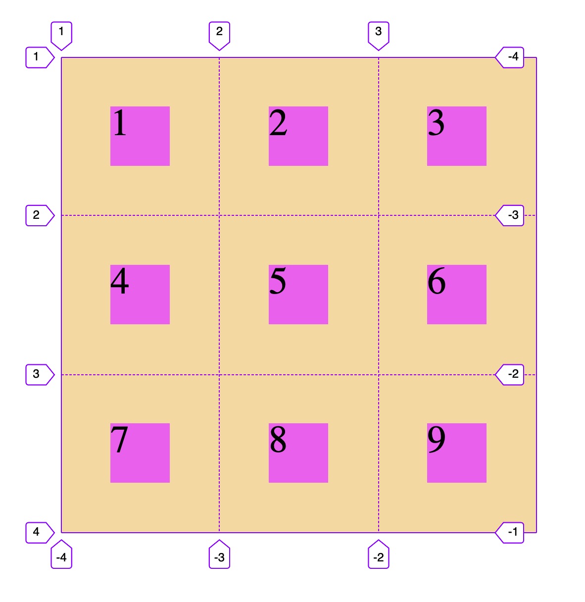
```html
<!DOCTYPE html>
<html lang="en">
<head>
<meta charset="UTF-8" />
<meta name="viewport" content="width=device-width, initial-scale=1.0" />
<title>对齐单元格中所有项目</title>
<style>
.container {
width: 400px;
height: 400px;
background-color: wheat;
display: grid;
grid-template-columns: repeat(3, 1fr);
grid-template-rows: repeat(3, 1fr);
/* 项目在单元格的对齐方式,默认是拉伸,除非设置了项目大小,否则会占据单元格全部空间 */
justify-items: stretch;
align-items: stretch;
/* 水平居左,垂直居中 */
justify-items: start;
align-items: center;
/* 水平居右, 垂直居下 */
justify-items: end;
align-items: end;
/* 水平垂直居中 */
justify-items: center;
align-items: center;
/* 这二个属性与flex弹性布局中的属性相同,为了区别, 建议使用简写语法 */
/* 简写语法: place-items: 垂直对齐 水平对齐 */
/* 垂直靠上,水平居右 */
place-items: start end;
/* 垂直靠下, 水平居左 */
place-items: end start;
/* 垂直居中, 水平居中 */
place-items: center center;
/* 二个值一样,同样可以简写成一个值 */
place-items: center;
}
.item {
width: 50px;
height: 50px;
background-color: violet;
font-size: 2rem;
}
</style>
</head>
<body>
<div class="container">
<span class="item item1">1</span>
<span class="item item2">2</span>
<span class="item item3">3</span>
<span class="item item4">4</span>
<span class="item item5">5</span>
<span class="item item6">6</span>
<span class="item item7">7</span>
<span class="item item8">8</span>
<span class="item item9">9</span>
</div>
</body>
</html>
```
---
## 7.3 示例 2: 对齐网格区域中所有项目
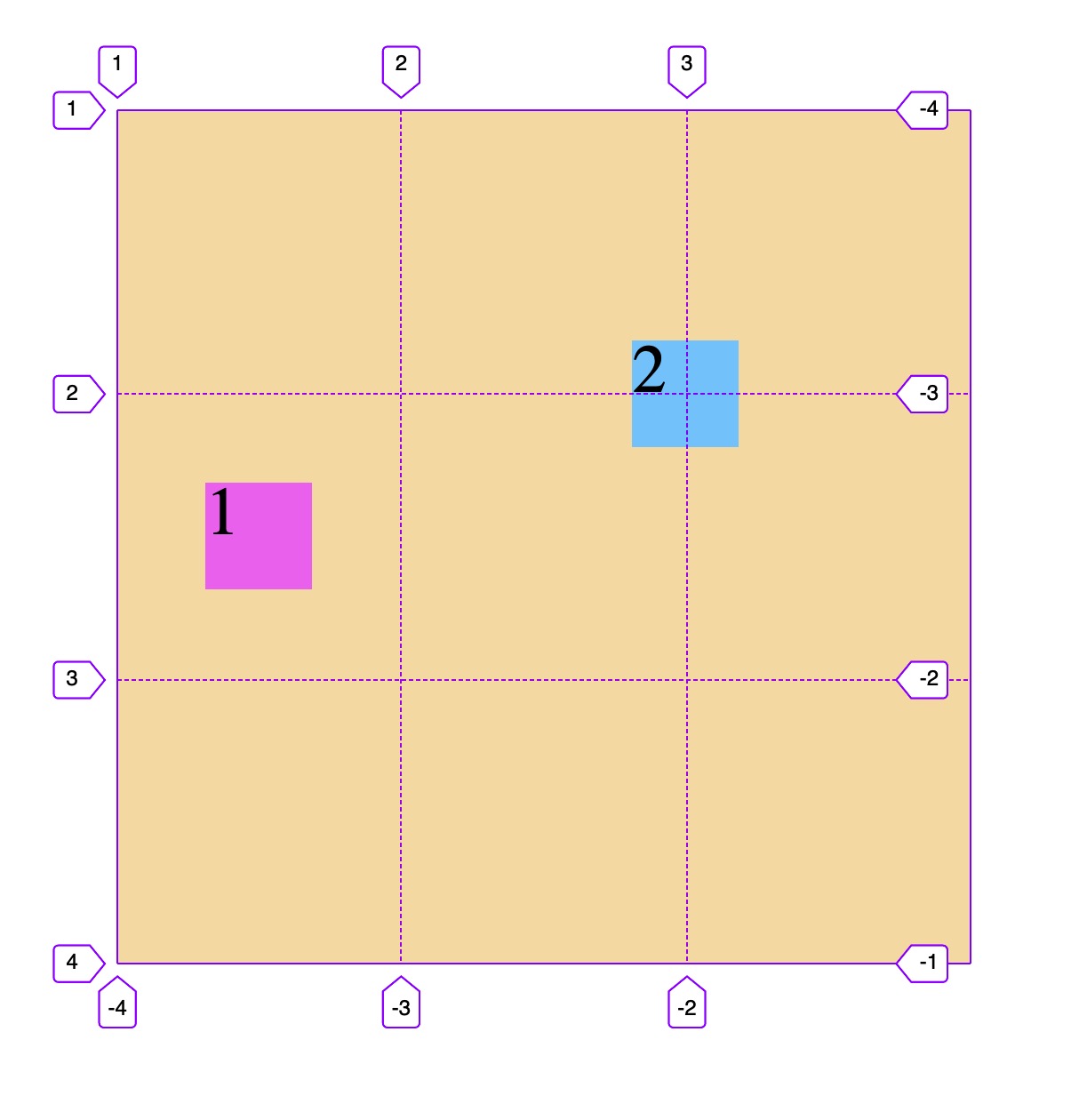
```html
<!DOCTYPE html>
<html lang="en">
<head>
<meta charset="UTF-8" />
<meta name="viewport" content="width=device-width, initial-scale=1.0" />
<title>对齐网格区域中所有项目</title>
<style>
.container {
width: 400px;
height: 400px;
background-color: wheat;
display: grid;
grid-template-columns: repeat(3, 1fr);
grid-template-rows: repeat(3, 1fr);
/* 所有项目在网格区域中垂直水平对齐 */
place-items: center;
}
.item {
width: 50px;
height: 50px;
background-color: violet;
font-size: 2rem;
}
.item1 {
/* 跨3行,占据最左一列 */
grid-row-end: span 3;
}
.item2 {
background-color: lightskyblue;
/* 水平跨2行,垂直跨2列,占据一块四个单元格组成的矩形网格区域 */
grid-row-end: span 2;
grid-column-end: span 2;
}
</style>
</head>
<body>
<div class="container">
<span class="item item1">1</span>
<span class="item item2">2</span>
</div>
</body>
</html>
```
- 教学大纲
- HTML5基础
- 1-html基础知识
- 2-语义化结构元素
- 3-语义化文本元素
- 4-链接/列表/图像元素
- 5-表格元素
- 6-表单与控件元素[重点]
- CSS3基础
- 1-css与html文档
- 2-css选择器
- 3-细说盒模型
- Flex布局[精简版]
- 1-Flex概论
- 2-Flex布局是什么
- 3-Flex基本概念
- 4-Flex容器属性
- 5-Flex项目属性
- Flex布局[细说版]
- 1-flex 布局概述
- 2-flex 容器与项目
- 3-flex 容器主轴方向
- 4-flex 容器主轴项目换行
- 5-flex 容器主轴与项目换行简写
- 6-flex 容器主轴项目对齐
- 7-flex 容器交叉轴项目对齐
- 8-flex 多行容器交叉轴项目对齐
- 9-flex 项目主轴排列顺序
- 10-flex 项目交叉轴单独对齐
- 11-flex 项目放大因子
- 12-flex 项目收缩因子
- 13-flex 项目计算尺寸
- 14-flex 项目缩放的简写
- Flex布局[案例版]
- 1-调整项目顺序
- Grid布局[精简版]
- 1. 常用术语
- 2. 容器属性
- 3. 项目属性
- 4. 布局实例
- 1. 经典三列布局
- 2. 媒体查询
- Grid布局[细说版]
- 1-必知术语
- 2-容器创建与行列划分
- 3-单元格常用单位
- 4-项目填充到单元格
- 5-项目填充到网格区域
- 6-对齐容器中的所有项目
- 7-对齐单元格中所有项目
- 8-对齐单元格中某个项目
- 9-容器中行与列之间的间距