[TOC]
>[success] # css 定位
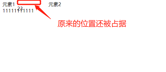
>[danger] ##### relative 相对定位
1. 使用相对定位,位置从自身出发。
2. 还占据原来的位置。
3. 行内元素使用相对定位不能转行内块
4. left、right、top、bottom用来设置元素的具体位置
5. 定位参照对象是元素自己原来的位置
~~~ html
<!DOCTYPE html>
<html lang="en">
<head>
<meta charset="UTF-8">
<meta http-equiv="X-UA-Compatible" content="IE=edge">
<meta name="viewport" content="width=device-width, initial-scale=1.0">
<title>Document</title>
<style>
.outer>div{
display: inline-block;
}
.outer > :nth-child(2){
position: relative;
top: 14px;
left: 2px;
width: 100px;
}
</style>
</head>
<body>
<div class="outer">
<span>元素1</span>
<div>23</div>
<div>元素2</div>
</div>
<div>11111111111</div>
</body>
</html>
~~~
>[danger] ##### 固定定位 -- fixed
1. 固定定位之后,不占据原来的位置(脱标)
2. 元素使用固定定位之后 ,定位参照对象是视口(即可视区域), 当画布滚动时,固定不动
3. 元素使用固定定位之后,会转化为行内块
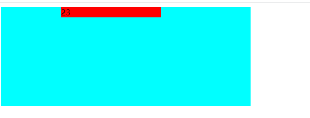
>[danger] ##### absolute -- 绝对定位
1. 元素使用绝对定位之后不占据原来的位置(脱标)
2. 元素使用绝对定位,位置是从浏览器出发。
3. 嵌套的盒子,父盒子没有使用定位,子盒子绝对定位,子盒子位置是从浏览器出发。
4. 嵌套的盒子,父盒子使用定位,子盒子绝对定位,子盒子位置是从父元素位置出发。
5. 给行内元素使用绝对定位之后,转换为行内块。(不推荐使用,推荐使用display:inline-block;)
注:因此才会出现`子绝父相`,但是实际上来说父元素也可以是其他定位元素例如`绝对定位`,只是相对来说`子绝父相`更常见
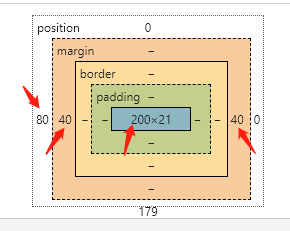
* 关于绝对定位宽度 和 高度
1. 定位参照对象的宽度 = left + right + margin-left + margin-right + 绝对定位元素的实际占用宽度
2. 定位参照对象的高度 = top + bottom + margin-top + margin-bottom + 绝对定位元素的实际占用高度
~~~ html
<!DOCTYPE html>
<html lang="en">
<head>
<meta charset="UTF-8">
<meta http-equiv="X-UA-Compatible" content="IE=edge">
<meta name="viewport" content="width=device-width, initial-scale=1.0">
<title>Document</title>
<style>
.outer{
position: relative;
width: 500px;
height: 200px;
background-color: aqua;
}
.outer > div{
position: absolute;
width: 200px;
background-color: red;
left: 80px;
right: 0;
margin-right:40px;
margin-left:40px;
}
</style>
</head>
<body>
<div class="outer">
<div>23</div>
</div>
</body>
</html>
~~~
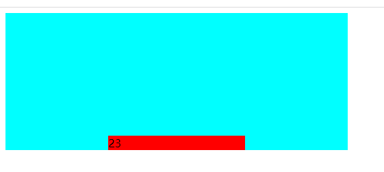
`margin:0 auto` 只能让标准流的盒子居中对齐,现在绝对定位已经脱离标准盒子,此时想定位就可以利用上面的公式,只要去设置left: 0、right: 0、top: 0、bottom: 0、margin: auto 和盒子具体宽度,对应调整这些属性即可控制居中位置
~~~
<!DOCTYPE html>
<html lang="en">
<head>
<meta charset="UTF-8">
<meta http-equiv="X-UA-Compatible" content="IE=edge">
<meta name="viewport" content="width=device-width, initial-scale=1.0">
<title>Document</title>
<style>
.outer{
position: relative;
width: 500px;
height: 200px;
background-color: aqua;
}
.outer > div{
position: absolute;
width: 200px;
background-color: red;
left: 0;
right: 0;
bottom: 0;
margin: 0 auto;
}
</style>
</head>
<body>
<div class="outer">
<div>23</div>
</div>
</body>
</html>
~~~
>[success] # 粘性定位 - sticky
1. 可以看做是相对定位和固定定位的结合体
2. 它允许被定位的元素表现得像相对定位一样,直到它滚动到某个阈值点(top,bottom.left.right)
3. 当达到这个阈值点时, 就会变成固定定位
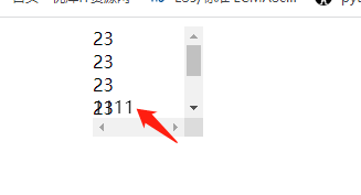
4. sticky是相对于最近的滚动祖先包含视口的(the nearest ancestor scroll container’s scrollport ) 如图
~~~
<!DOCTYPE html>
<html lang="en">
<head>
<meta charset="UTF-8">
<meta http-equiv="X-UA-Compatible" content="IE=edge">
<meta name="viewport" content="width=device-width, initial-scale=1.0">
<title>Document</title>
<style>
.outer{
width: 100px;
margin: 0 auto;
height: 100px;
overflow: scroll;
}
.outer > .footer{
position: sticky;
bottom: 0; // 阈值点
}
</style>
</head>
<body>
<div class="outer">
<div>23</div>
<div>23</div>
<div>23</div>
<div>23</div>
<div>23</div>
<div>23</div>
<div class="footer">1111</div>
</div>
</body>
</html>
~~~
- HTTP -- 初始
- HTTP -- 什么是HTTP
- HTTP -- 相关技术
- HTTP -- 相关的协议
- Emmet -- 语法
- HTML -- 补充
- iframe -- 补充
- checkbox 和 radio 细节
- form -- 补充
- html -- html5
- html -- 视频音频
- html -- html5 data-* 全局属性
- css -- 重学
- css -- 单位
- css 知识补充 -- 导入
- css -- 颜色补充
- css --继承性
- css - 元素隐藏
- 标签元素--块/行内/行内块
- css -- 盒子阴影 – 在线查看
- css -边框图形
- css -- Web字体
- css -- 精灵图
- css -- 属性补充
- text-align -- 内容
- line-height -- 行高
- 文字换行
- overflow-溢出
- css -- 选择器
- css -- 伪元素
- css -- 伪类选择器
- 设置高度宽度 和 盒子模型
- css -- 文字溢出
- css -- white-space / text-overflow
- css -- 定位
- css -- 浮动
- 浮动 -- 案例
- flex -- 布局
- flex -- 解决等距布局
- flex -- 内容居中
- flex -- 导航栏
- Grid -- 布局
- css -- transform 形变
- css -- 垂直水平居中
- css -- transition 动画
- css -- Animation 动画
- css -- vertical-align
- css -- 函数
- css -- 媒体查询
- 重学案例
- 重新 -- 鼠标常见样式
- 重学 -- 透明边框background-clip
- 重学 -- 多重边框box-shadow
- css -- 预处理器
- 移动端适配
- 前端结构目录说明
- 浏览器 加载过程
- 回流和重绘
- 杂七杂八 -- 小工具方法
- npm包比较网站
- IP定位
- 通过useragent获取手机品牌型号
- 自启本地服务
- BOM -- 常用知识点记录
- window -- 认识
- windows -- 大小滚动
- BOM -- Location
- BOM -- URLSearchParams
- BOM -- history
- BOM -- navigator 和 screen
- 前端存储 -- Cookie、LocalStorage、IndexedDB
- DOM -- 知识总结
- DOM -- 获取元素
- DOM -- 节点属性
- DOM -- 元素属性
- 获取元素style的读取 - getComputedStyle
- DOM -- 元素的操作
- DOM -- 元素大小和滚动
- DOM -- 小练习
- Event -- 事件
- event -- 事件对象
- event -- 案例
- event -- 做一个树
- js -- ajax
- 封装一个ajax
- ajax -- 文件上传
- 倒计时抢购案例
- axios -- 封装
- 跨域
- 前端 -- Fetch API
- js -- 基础篇
- 数据类型
- 数据类型检测
- 类型小知识
- 原始类型的包装类
- 类型转换
- delete -- 运算符
- Date -- 对象
- 函数参数传递
- 对象某个属性不存时候判断
- 操作符
- 函数变量传值
- 访问对象通过点和[]
- 和if等同的一些写法
- for -- 执行顺序
- JS -- 执行过程
- JS中的堆(Heap)栈(Stack)内存
- JS -- 执行上下文
- Js -- ES3 和 ES5+ 后
- let const var
- ES3 -- 案例思考
- 闭包概念
- 浅拷贝和深拷贝
- JS -- 严格模式
- js -- 数组篇
- Array -- 数组基础
- Array -- 小常识检测数组
- Array -- 小技巧将数组转成字符串
- Array -- 自带方法
- Array -- 数组插入总结
- Array -- every是否都符合巧用
- js--Function篇
- Function -- length 属性
- Function -- arguments
- Function -- 也是对象
- Function -- new Function 创建方法
- Function -- 函数作为返回值
- Function -- callee
- 匿名函数
- Function -- 闭包
- 闭包内存查看
- 闭包 -- 使用的案例
- 闭包 -- 使用的案例
- 箭头函数不适用场景
- js -- this、call、apply
- this -- 指向
- call、apply -- 讲解
- 总结 -- this
- 思考题
- Object -- 数据属性/访问器属性
- 新增关于对象方法
- js -- 面向对象
- 对象到底是什么
- 到底什么是js的对象
- js --prototype、__proto__与constructor 1
- JS es5继承
- JS 中的原型继承说明
- JS -- Object是所有类的父类
- 总结
- Object -- 函数构造函数
- Object -- 手动实现一个new
- js -- 函数式编程(目前只是了解后面需要更多时间深入)
- 了解 -- 高阶函数
- 了解 -- 纯函数
- 了解 -- 函数柯里化
- 柯里化 -- 知识点
- 了解 -- 函数组合
- 了解 -- 函子
- js--小知识点
- url -- 将get请求连接参数变成对象
- event -- 一个函数处理多个事件
- try -- 处理异常
- Error -- 前段报错信息传给后台
- JSON -- 序列化
- return -- 返回true和false
- for -- 循环里初始化变量
- 命名 -- get和set怎么命名
- 链式调用
- 利用递归代替循环思路
- JS -- 技巧篇
- 技巧 -- 代码规范
- 技巧 -- 惰性载入函数
- 技巧 -- 防抖函数
- 技巧 -- 节流函数
- 插入补充(防抖/节流)
- 技巧 -- 定时器的使用
- 技巧 -- 回调函数
- 技巧 -- 分时函数
- 技巧 -- 除了return 我怎么跳出多层循环
- 技巧 -- switch 还是 if-else?
- 技巧 -- 将字符串转成对象
- 技巧 -- 函数转换
- 技巧 -- 工作记录数组对象中相同项
- JS -- 数组小文章总结
- 数组类型判断
- includes 和 indexOf
- for ... in,for ... of和forEach之间有什么区别
- map、filter、reduce、find 四种方法
- 多种形式处理数组思考方式
- for...in 和 Object.keys
- 各种知识点集合文章
- 创建数组 -- 总结
- 数组去重 -- 总结
- 获取数组中不重复的元素 -- 总结
- 比较两个数组元素相同 -- 总结
- 出现频率最高的元素 -- 总结
- 两数组交集 -- 总结
- 两数组差集 -- 总结
- 工具方法 - 总结
- 扁平化数组
- JS -- 数组技巧篇 30s
- 30s Array -- 创建数组篇(一)
- 30s Array --过滤(查询)篇章(一)
- 30s Array --过滤篇章(二)
- 30s Array -- 新增篇(一)
- 30s Array--比较篇(一)
- 30s Array -- 分组篇(一)
- 30 Array -- 删除篇(一)
- 30s Array-- 其他篇(一)
- 30s Array -- 个人感觉不常用篇章
- JS -- 对象技巧篇30s
- 30s Object -- 查(一)
- 30s Object -- 增(一)
- 30s Object -- 工具类型小方法
- 30s Object -- 跳过没看系列
- ES -- 新特性
- 变量篇章
- 变量 -- let/const/var声明
- 变量 -- 词法声明和变量声明
- 变量 -- var x = y = 100
- 变量 -- a.x = a = {n:2}
- 带标签的模板字符串
- 函数篇章
- 函数 -- 参数篇章
- 函数 -- 只能通过new创建实例
- 函数 -- 箭头函数
- 函数 -- 尾调优化
- 对象篇章
- 对象 -- 字面量写法的优化/新增方法
- 赋值篇章
- 解构赋值 -- 简单概念
- 解构赋值 -- 对象解构
- 解构赋值 -- 数组解构
- 解构赋值 -- 函数参数
- Symbol 属性
- Set 和 Map
- Set -- 去重/交、并、差集
- Map -- 集合
- 类class篇章
- ES6 和 ES5 的写法比较
- es6 -- mixin函数继承
- es6 -- 创建一个接口
- ES5 VS ES6 -- class 编译
- 数组新功能
- 创建/转换 -- 数组
- 迭代器和生成器
- es6 -- 迭代器
- es6 -- 生成器
- for-of 循环的是什么
- 做一个异步执行器
- 代理和反射
- Proxy -- 使用
- Reflect -- 使用
- Proxy 和 Reflect 结合使用
- 运算符 -- 展开运算符
- ES7 -- 新特性
- ES8 -- 新特性
- ES9 -- 新特性
- ES10 -- 新特性
- ES11 -- 新特性
- ES12 -- 新特性
- ES13 -- 新特性
- ES6 和 ES8 的异步
- js -- 异步、同步、阻塞、非阻塞
- js -- 如何做到异步的
- js -- 引擎线程,GUI渲染线程,浏览器事件触发线程
- js -- 如何通过事件循环运行异步
- js -- 误区任务回调就是异步
- js -- 宏任务和微任务
- 参考文章推荐阅读
- js -- callback 还是 promise
- js -- Promise 初识
- js -- 自己实现一个Promise
- js -- Promise 更多用法
- 再来看setTimeout 和for
- js -- ES8 异步 async await
- js -- 红绿灯问题
- js -- 倒计时
- 异步图片预加载
- 手动触发异步
- 异步题
- JS -- 模块化
- CommonJS -- 在node服务器端
- AMD 模块化规范
- ES Modules
- ES Modules -- 使用特点
- import 和 export 使用
- export 和 import -- 执行
- 其他用法
- systemjs
- 对比区别
- 使用babel 或webpack进行模块打包
- Jq -- 细节
- JS -- 性能优化
- 图片预加载
- js -- 正则
- 设计原则和编程技巧
- 设计原则 -- 单一职责
- js -- 设计模式
- 设计模式 -- 简单理解
- 一、鸭子类型
- 1.1 多态概念
- 1.2 小章节记录 -- 封装
- 1.3.多态和鸭子
- 设计模式 -- 单例模式(透明、惰性)
- 单例模式 -- js单例和惰性单例
- ES6 -- 写单例模式
- 设计模式 -- 策略模式
- 策略模式 -- 表单验证
- 策略模式 -- 表单验证多规则
- 策略模式和多态区别
- 设计模式 -- 代理模式(代理被代理相同方法)
- 代理模式 -- 分类
- 代理模式 -- 总结
- 设计模式 -- 迭代器模式
- 设计模式 -- 观察者(发布订阅)模式
- 观察者 和 发布订阅区别
- 发布订阅模式 -- 现在通用模型
- 发布订阅模式 -- 书中实际案例
- 发布订阅模式--全局发布订阅对象
- 发布订阅模式 -- vue
- 设计模式 -- 命令模式(对象方法拆分指令)
- 命令模式 -- js 自带
- 命令模式 -- 撤销和重做
- 命令模式 -- 命令和策略的区别
- 设计模式 -- 组合模式(树)
- 组合模式 -- 拆分了解
- 组合模式 -- java角度
- 组合模式 -- 书中案例扫描文件夹
- 组合模式 -- 注意点
- 组合模式 -- 引用父对象(书中案例)
- 组合模式 -- 小的案例
- 组合模式 -- 总结
- 设计模式 -- 模板方法(抽象类继承)
- 模板方法 -- 前端角度思考
- 模板方法 -- java 思考方式
- 模板方法 -- js没有抽象类
- 模板方法 -- 钩子方法
- 模板方法 -- 用js方式来实现
- 设计模式 -- 享元模式
- 享元、单例、对象池
- 享元模式 -- 前端角度思考
- 享元模式 -- 代码案例
- 享元模式 -- 适用和内外部状态
- 额外扩展 -- 对象池
- 设计模式 -- 职责链模式
- 职责链 -- 前端角度
- 职责链和策略
- 职责链 -- 异步的职责链
- 职责链 -- AOP
- 职责链 -- 改造迭代器模式的代码
- 设计模式 -- 中介者模式
- 中介者模式 -- 前端角度(一)
- 中介者模式 -- 前端角度(二)
- 中介者模式 -- 前端角度(三)
- 中介者模式 -- 总结
- 设计模式 -- 装饰者模式
- 装饰者模式 -- es5 解决方案
- 装饰器模式 -- 和代理模式区别
- 设计模式 -- 状态模式
- 状态模式 -- 前端思想
- 状态模式 -- 文件上传案例
- 状态模式 -- 和策略模式的区别
- 设计模式 -- 适配器模式
- js -- 代码重构
- 重构 -- 方法封装
- 重构 -- 抽象函数
- 高阶函数 -- 范式
- 状态管理方案
- Node -- 学习篇
- Node -- 服务端运行的js
- node -- Global(全局成员)
- node -- Buffer缓冲器
- node -- 路径操作
- node -- 文件的读写
- node -- 目录操作
- node -- HTTP
- HTTP -- 响应头常见类型
- HTTP -- 处理Get
- HTTP -- 处理Post
- HTTP -- 简单的案例
- Express
- Express -- 中间件
- Express -- 处理post/get
- Express -- 模板引擎
- Express -- 简单案例和目录搭建
- Express -- 数据库service.js
- Express -- json/url
- Express -- 配合数据库
- 配合数据库 -- 简单的登录
- npm -- js包管理
- npm -- 淘宝镜像
- nrm -- 更多镜像的选择
- yarn -- 包管理
- yarn -- 清理缓存
- WebPack -- 模块化开发
- webPack -- 安装、使用、打包
- webPack -- 使用配置文件
- 延伸 -- base64图片优劣
- webPack -- 完整配置