
## 按钮组
通过按钮组容器(.btn-group)把一组按钮放在同一行里。通过与按钮插件联合使用,可以设置为单选框或多选框的样式和行为。
注意:
1. 按钮组中的工具提示和弹出框需要特别的设置。当为`.btn-group`中的元素应用工具提示或弹出框时,必须指定`container: 'body'`选项,这样可以避免不必要的副作用(例如工具提示或弹出框触发时,会让页面元素变宽和/或失去圆角)。
2. 确保设置正确的`role`属性并提供一个 label 标签。为了向使用辅助技术 - 如屏幕阅读器 - 的用户正确传达一正确的按钮分组,需要提供一个合适的`role`属性。对于按钮组合,应该是`role="group"`,对于toolbar(工具栏)应该是`role="toolbar"`。
3. 此外,按钮组和工具栏应给定一个明确的label标签,尽管设置了正确的`role`属性,但是大多数辅助技术将不会正确的识读他们。在这里提供的实例中,我们使用`aria-label`,但是,`aria-labelledby`也可以使用。
**基本实例**
在.btn组中用.btn包装一系列按钮。
```html
<div class="btn-group" role="group">
<button type="button" class="btn btn-default">Left</button>
<button type="button" class="btn btn-default">Middle</button>
<button type="button" class="btn btn-default">Right</button>
</div>
```

*****
**按钮工具栏**
我们常常会看到将多个按钮组合在一起使用,那么把一组`<div class="btn-group">`组合进一个`<div class="btn-toolbar">`中就可以做成按钮组。
```html
<div class="btn-toolbar" role="toolbar" aria-label="...">
<div class="btn-group" role="group" aria-label="...">
<button type="button" class="btn btn-default">Left</button>
<button type="button" class="btn btn-default">Middle</button>
<button type="button" class="btn btn-default">Right</button>
</div>
<div class="btn-group" role="group" aria-label="...">
<button type="button" class="btn btn-default">1</button>
<button type="button" class="btn btn-default">2</button>
<button type="button" class="btn btn-default">3</button>
</div>
<div class="btn-group" role="group" aria-label="...">
<button type="button" class="btn btn-default">one</button>
</div>
</div>
```

*****
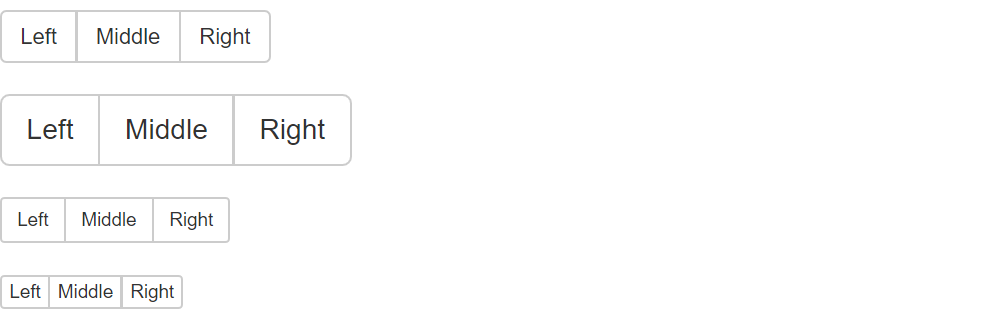
**尺寸**(按钮组大小)
只要给`.btn-group`加上`.btn-group-*`类,就省去为按钮组中的每个按钮都添加尺寸类了,如果包含了多个按钮组时也适用。按钮组的大小,我们也可以通过以下方法:
.btn-group-lg:大按钮组
.btn-group-sm:小按钮组
.btn-group-xs:超小按钮组
只需要在`.btn-group`类名上追加对应的类名,就可以得到不同大小的按钮组。
```html
<div class="btn-group" role="group" aria-label="...">
<button type="button" class="btn btn-default">Left</button>
<button type="button" class="btn btn-default">Middle</button>
<button type="button" class="btn btn-default">Right</button>
</div>
<div class="btn-group btn-group-lg" role="group" aria-label="...">
<button type="button" class="btn btn-default">Left</button>
<button type="button" class="btn btn-default">Middle</button>
<button type="button" class="btn btn-default">Right</button>
</div>
<div class="btn-group btn-group-sm" role="group" aria-label="...">
<button type="button" class="btn btn-default">Left</button>
<button type="button" class="btn btn-default">Middle</button>
<button type="button" class="btn btn-default">Right</button>
</div>
<div class="btn-group btn-group-xs" role="group" aria-label="...">
<button type="button" class="btn btn-default">Left</button>
<button type="button" class="btn btn-default">Middle</button>
<button type="button" class="btn btn-default">Right</button>
</div>
```
*****
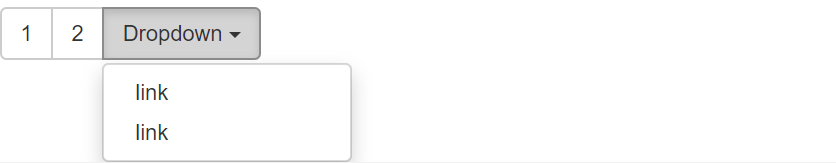
**下拉菜单组嵌套**
想要把下拉菜单混合到一系列按钮中,只须把`.btn-group`放入另一个`.btn-group`中。
```html
<div class="btn-group" role="group">
<button type="button" class="btn btn-default">1</button>
<button type="button" class="btn btn-default">2</button>
<div class="btn-group" role="group">
<button type="button" class="btn btn-default dropdown-toggle" id="dropdownMenu4" data-toggle="dropdown" aria-haspopup="true" aria-expanded="true">
Dropdown
<span class="caret"></span>
</button>
<ul class="dropdown-menu" aria-labelledby="dropdownMenu4">
<li><a href="##">link</a></li>
<li><a href="##">link</a></li>
</ul>
</div>
</div>
```
*****
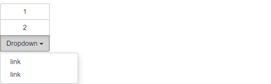
**下拉菜单垂直排列**
让一组按钮垂直堆叠排列显示而不是水平排列。在按钮组添加类 .btn-group-vertical
```html
<div class="btn-group" role="group">
<button type="button" class="btn btn-default">1</button>
<button type="button" class="btn btn-default">2</button>
<div class="btn-group" role="group">
<button type="button" class="btn btn-default dropdown-toggle" id="dropdownMenu4" data-toggle="dropdown" aria-haspopup="true" aria-expanded="true">
Dropdown
<span class="caret"></span>
</button>
<ul class="dropdown-menu" aria-labelledby="dropdownMenu4">
<li><a href="##">link</a></li>
<li><a href="##">link</a></li>
</ul>
</div>
</div>
```
*****
**两端对齐排列的按钮组**
让一组按钮拉长为相同的尺寸,填满父元素的宽度。对于按钮组中的按钮式下拉菜单也同样适用。
**注意** :1. 关于边框的处理。由于对两端对齐的按钮组使用了特定的 HTML 和 CSS (即`display: table-cell`),两个按钮之间的边框叠加在了一起。
2. IE8 和边框。 IE8不支持在两端对齐的按钮组中绘制边框,无论是`<a>`或`<button>`元素。为了兼容IE8,把每个按钮放入另一个`.btn-group`中即可。
**(1)** 关于`<a>`元素
只须将一系列`.btn`元素包裹到`.btn-group.btn-group-justified`中即可。
```html
<div class="btn-group btn-group-justified" role="group" aria-label="...">
<a type="button" class="btn btn-default">Left</a>
<a type="button" class="btn btn-default">Middle</a>
<a type="button" class="btn btn-default">Right</a>
</div>
```

如果 a 元素用作按钮在页面功能中触发,而不是链接到其他页面中去,还要给它们添加属性role=“button”。
**(2)** 关于`<button>`元素
为了将`<button>`元素用于两端对齐的按钮组中,必须将每个按钮包裹进一个按钮组中。
```html
<div class="btn-group btn-group-justified" role="group">
<div class="btn-group" role="group">
<button type="button" class="btn btn-default">Left</button>
</div>
<div class="btn-group" role="group">
<button type="button" class="btn btn-default">Milddle</button>
</div>
<div class="btn-group" role="group">
<button type="button" class="btn btn-default">Right</button>
</div>
</div>
```
它的页面效果和 a 元素展示的效果一样。
- 第一章 . bootstrap介绍
- 第二章 . 全局CSS样式
- 1、总体注意事项
- 2、栅格系统
- 3、排版
- 4、代码
- 5、表格
- 6、表单
- 7、 按钮
- 8、 图片
- 9、辅助类
- 10、响应式工具
- 第三章 . bootstrap相关CSS应用
- 1、CSS媒体查询 @media
- 2、px,em,rem之间的关系和换算方式
- 第四章 . 组件
- 1、Glyphicons 字体图标
- 2、下拉菜单
- 3、按钮组
- 4、按钮式下拉菜单
- 5、输入框组
- 6、导航
- 7、导航条
- 8、路径导航
- 9、分页
- 10、标签
- 11、徽章
- 12、巨幕
- 13、页头
- 14、缩略图
- 15、警告框
- 16、进度条
- 17、媒体对象
- 18、列表组
- 19、面版
- 20、Well
- 第五章 . JavaScript 插件
- 1、JavaScript 插件引入前提
- 2、过渡效果 (transition.js)
- 3、模态框 (modal.js)
- 4、下拉菜单 (dropdown.js)
- 5、滚动监听 (scrollspy.js)
- 6、可切换标签 (tab.js)
- 7、工具提示 (tooltip.js)
- 8、弹出框 (popover.js)
- 9、警告信息 (alert.js)
- 10、按钮 (button.js)
- 11、折叠插件(collapse.js)
- 12、轮播插件(carousel.js)
- 13、Affix插件(affix.js)