
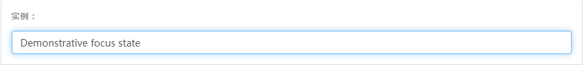
## 焦点状态
我们将某些表单控件的默认`outline`样式移除,然后对`:focus`状态赋予`box-shadow`属性。
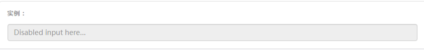
## 禁用状态
为输入框设置`disabled`属性可以禁止其与用户有任何交互(焦点、输入等)。被禁用的输入框颜色更浅,并且还添加了`not-allowed`鼠标状态。
~~~html
<input class="form-control" id="disabledInput" type="text" placeholder="Disabled input here..." disabled>
~~~
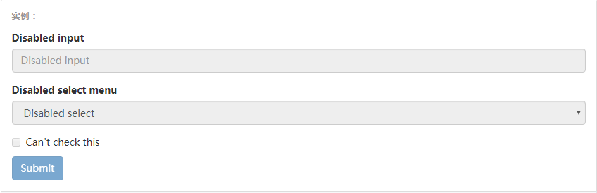
### 被禁用的`fieldset`
为`<fieldset>`设置`disabled`属性,可以禁用`<fieldset>`中包含的所有控件。
#### `<a>`标签的链接功能不受影响
默认情况下,浏览器会将`<fieldset disabled>`内所有的原生的表单控件(`<input>`、`<select>`和`<button>`元素)设置为禁用状态,防止键盘和鼠标与他们交互。然而,如果表单中还包含`<a ... class="btn btn-*">`元素,这些元素将只被赋予`pointer-events: none`属性。正如在关于[禁用状态的按钮](https://v3.bootcss.com/css/#buttons-disabled)章节中(尤其是关于锚点元素的子章节中)所描述的那样,该 CSS 属性尚不规范,并且在 Opera 18 及更低版本的浏览器或 Internet Explorer 11 总没有得到全面支持,并且不会阻止键盘用户能够获取焦点或激活这些链接。所以为了安全起见,建议使用自定义 JavaScript 来禁用这些链接。
#### 跨浏览器兼容性
虽然 Bootstrap 会将这些样式应用到所有浏览器上,Internet Explorer 11 及以下浏览器中的`<fieldset>`元素并不完全支持`disabled`属性。因此建议在这些浏览器上通过 JavaScript 代码来禁用`<fieldset>`。
~~~html
<form>
<fieldset disabled>
<div class="form-group">
<label for="disabledTextInput">Disabled input</label>
<input type="text" id="disabledTextInput" class="form-control" placeholder="Disabled input">
</div>
<div class="form-group">
<label for="disabledSelect">Disabled select menu</label>
<select id="disabledSelect" class="form-control">
<option>Disabled select</option>
</select>
</div>
<div class="checkbox">
<label>
<input type="checkbox"> Can't check this
</label>
</div>
<button type="submit" class="btn btn-primary">Submit</button>
</fieldset>
</form>
~~~
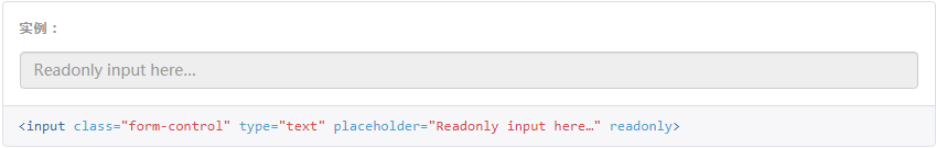
## 只读状态
为输入框设置`readonly`属性可以禁止用户修改输入框中的内容。处于只读状态的输入框颜色更浅(就像被禁用的输入框一样),但是仍然保留标准的鼠标状态。
## 校验状态
Bootstrap 对表单控件的校验状态,如 error、warning 和 success 状态,都定义了样式。使用时,添加`.has-warning`、`.has-error`或`.has-success`类到这些控件的父元素即可。任何包含在此元素之内的`.control-label`、`.form-control`和`.help-block`元素都将接受这些校验状态的样式。
#### 将验证状态传达给辅助设备和盲人用户
使用这些校验样式只是为表单控件提供一个可视的、基于色彩的提示,但是并不能将这种提示信息传达给使用辅助设备的用户 - 例如屏幕阅读器 - 或者色盲用户。
为了确保所有用户都能获取正确信息,Bootstrap 还提供了另一种提示方式。例如,你可以在表单控件的`<label>`标签上以文本的形式显示提示信息(就像下面代码中所展示的);包含一个[Glyphicon 字体图标](https://v3.bootcss.com/components/#glyphicons)(还有赋予`.sr-only`类的文本信息 - 参考[Glyphicon 字体图标实例](https://v3.bootcss.com/components/#glyphicons-examples));或者提供一个额外的[辅助信息](https://v3.bootcss.com/css/#forms-help-text)块。另外,对于使用辅助设备的用户,无效的表单控件还可以赋予一个`aria-invalid="true"`属性。
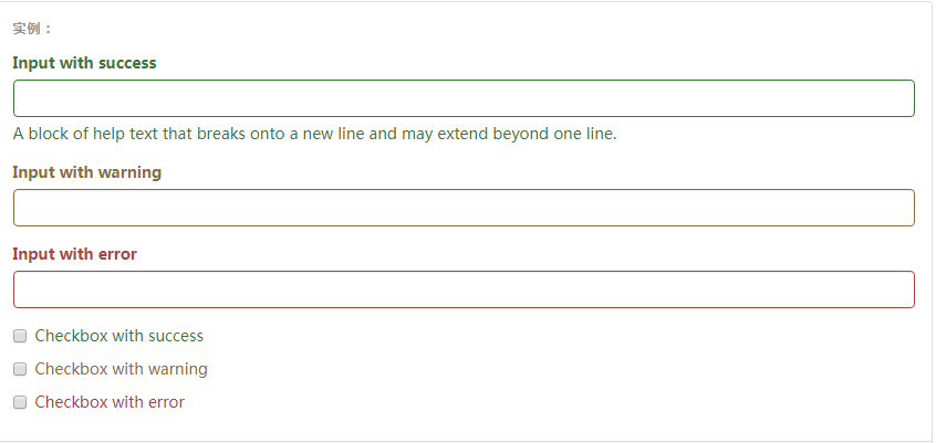
~~~html
<div class="form-group has-success">
<label class="control-label" for="inputSuccess1">Input with success</label>
<input type="text" class="form-control" id="inputSuccess1" aria-describedby="helpBlock2">
<span id="helpBlock2" class="help-block">A block of help text that breaks onto a new line and may extend beyond one line.</span>
</div>
<div class="form-group has-warning">
<label class="control-label" for="inputWarning1">Input with warning</label>
<input type="text" class="form-control" id="inputWarning1">
</div>
<div class="form-group has-error">
<label class="control-label" for="inputError1">Input with error</label>
<input type="text" class="form-control" id="inputError1">
</div>
<div class="has-success">
<div class="checkbox">
<label>
<input type="checkbox" id="checkboxSuccess" value="option1">
Checkbox with success
</label>
</div>
</div>
<div class="has-warning">
<div class="checkbox">
<label>
<input type="checkbox" id="checkboxWarning" value="option1">
Checkbox with warning
</label>
</div>
</div>
<div class="has-error">
<div class="checkbox">
<label>
<input type="checkbox" id="checkboxError" value="option1">
Checkbox with error
</label>
</div>
</div>
~~~
- 概览
- 移动设备优先
- 排版与链接
- 布局容器
- 栅格系统
- 简介
- 媒体查询
- 栅格参数
- 实例:从堆叠到水平排列
- 实例:流式布局容器
- 实例:移动设备和桌面屏幕
- 实例:手机、平板、桌面
- 实例:多余的列(column)将另起一行排列
- 响应式列重置
- 列偏移
- 嵌套列
- 列排序
- Less mixin 和变量
- 排版
- 标题
- 页面主体
- 内联文本元素
- 对齐
- 改变大小写
- 缩略语
- 地址
- 引用
- 列表
- 代码
- 表格
- 基本表格
- 状态类
- 响应式表格
- 表单
- 基本表单
- 内联表单
- 水平排列的表单
- 被支持的控件
- 多选和单选框
- 下拉列表
- 静态控件
- 焦点、禁用、只读、校验状态
- 添加额外的图标
- 控件尺寸
- 按钮
- 图片
- 响应式图片
- 图片形状
- 辅助类
- 关闭按钮和三角符号
- 快速浮动
- 让内容块居中
- 清除浮动
- 显示或隐藏内容
- 屏幕阅读器和键盘导航
- 图片替换