
[TOC]
*****
# 1\. Matplotlib
[Matplotlib官网](https://matplotlib.org/)
matplotlib是PYTHON绘图的基础库,是模仿matlab绘图工具开发的一个开源库。 PYTHON其它第三方绘图库都依赖与matplotlib。 本节课我们重点学习三种绘图方式:
1. matplotlib绘制基础图形
2. pandas plot API
3. seaborn绘制统计图形
我们可视化课程的重点是利用图形去理解数据,而不是注重图形的美观。因此本课程讲解的图形都是基于数据统计分析的简单图形,类似于雷达图这样的复杂图形不会在课程中讲解。
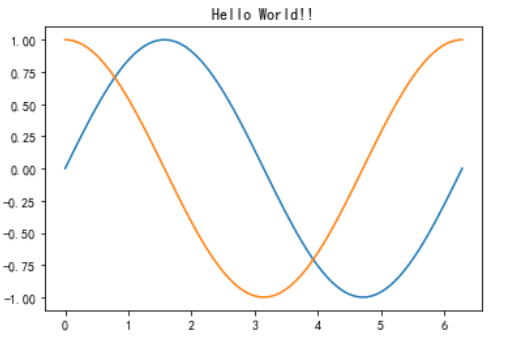
# 2\. Hello World
```
import numpy as np
import matplotlib.pyplot as plt
plt.rcParams['font.sans-serif']=['SimHei'] #用来正常显示中文标签
plt.rcParams['axes.unicode_minus']=False #用来正常显示负号
#生成0到2pi的100个值,均等划分,最后放到X的数组里
X = np.linspace(0, 2*np.pi,100)# 均匀的划分数据
#根据正弦函数生成100个值放在Y数组里
Y = np.sin(X)
Y1 = np.cos(X)
#在plt的空白画布上添加标题
plt.title("Hello World!!")
#在画布上描绘100个点
plt.plot(X,Y)
#在画布上描绘100个点
plt.plot(X,Y1)
#显示plt画布
plt.show()
```
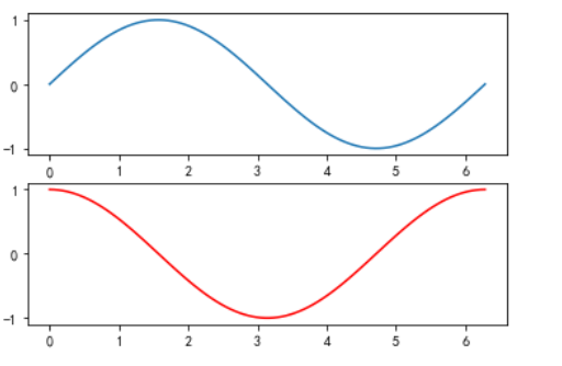
```
X = np.linspace(0, 2*np.pi,100)
Y = np.sin(X)
#将画布分成两部分,分别绘制两个图,第一部分
plt.subplot(211) # 等价于 subplot(2,1,1)
plt.plot(X,Y)
#将画布分成两部分,分别绘制两个图,第二部分
plt.subplot(212)
#图形颜色是红色,Y值根据X数组值计算
plt.plot(X,np.cos(X),color = 'r')
```
*****
# 3\. BAR CHART 条形图
### 3.0.1. Verticle 垂直的
```
#列表
data = [5,25,50,20]
# 第一个参数列表是几个条形的x坐标,data是几个条形的y坐标
plt.bar(range(len(data)),data)
```
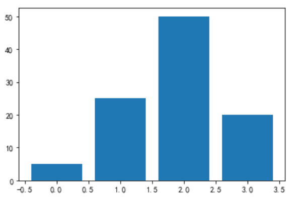
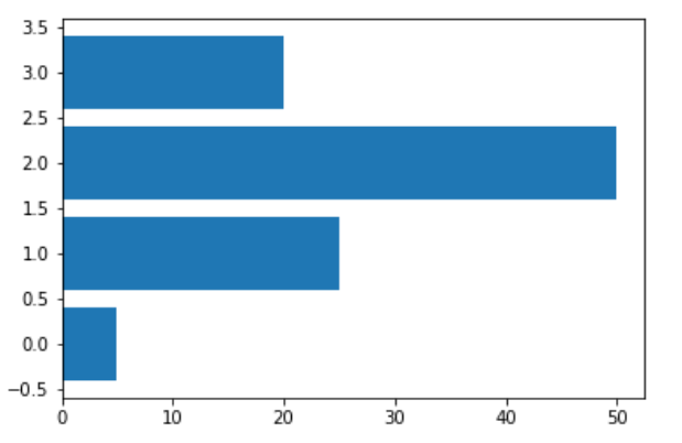
### 3.0.2. Horizontal 水平的
```
data = [5,25,50,20]
#barh()表示绘制水平的条形图。第一个参数列表是几个条形的y坐标,data是几个条形的x坐标
plt.barh(range(len(data)),data)
```
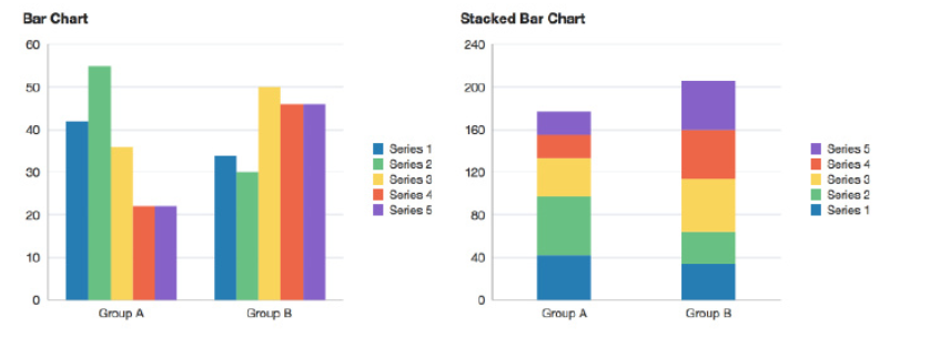
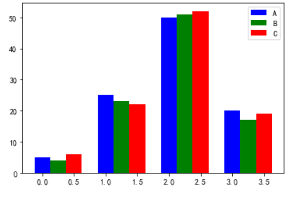
### 3.0.3. 多个bar
```
# 有三组分类变量的条形图 data是它们的频数列表
data = [[5,25,50,20],
[4,23,51,17],
[6,22,52,19]]
X = np.arange(4)
# label 标签 标注
#宽度:width = 0.25 。 label = "A" 这个分类变量的名字是A
plt.bar(X + 0.00, data[0], color = 'b', width = 0.25,label = "A")
# 第二组条形图紧挨着第一组,x坐标右移一个第一变量的宽度
plt.bar(X + 0.25, data[1], color = 'g', width = 0.25,label = "B")
# 第三组条形图紧挨着第二组
plt.bar(X + 0.50, data[2], color = 'r', width = 0.25,label = "C")
# legend 图例 图示 调用legend()才会显示分类变量标注
plt.legend()
```
*****
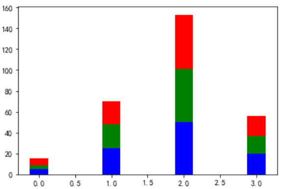
### 3.0.4. Stacked 堆
```
data = [[5,25,50,20],
[4,23,51,17],
[6,22,52,19]]
X = np.arange(4)
#三组分类变量的x坐标都相同,因为要堆叠起来
plt.bar(X, data[0], color = 'b', width = 0.25)
# bottom = data[0] 第二组条形的底部是在第一组条形的高度
plt.bar(X, data[1], color = 'g', width = 0.25,bottom = data[0])
# 第三组条形的底部是(第一组条形的高度+第二组条形的高度)
# 两个列表的元素不能一一对应相加,先用np.array()把列表变为数组,数组可以元素上对应相加
plt.bar(X, data[2], color = 'r', width = 0.25,bottom = np.array(data[0]) + np.array(data[1]))
plt.show()
```
*****
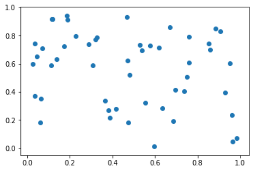
# SCATTER POINTS 散点图
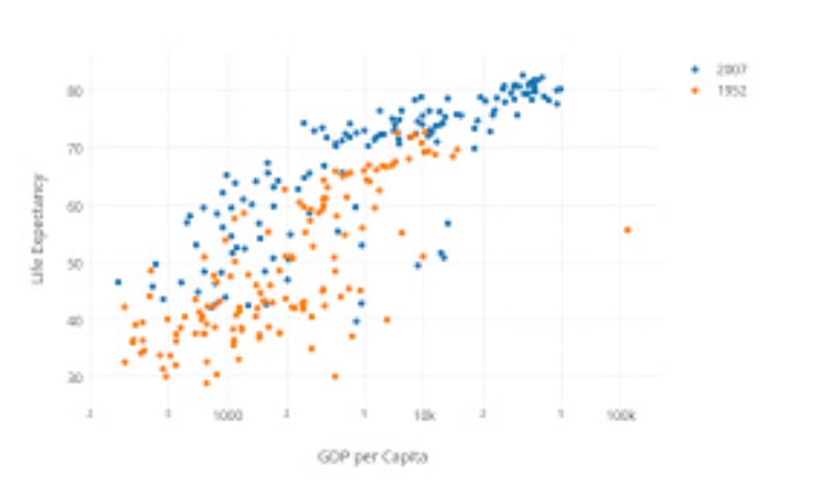
散点图用来衡量两个连续变量之间的相关性
```
import numpy as np
import matplotlib.pyplot as plt
N = 50
#生成50个[0,1)之间的值
x = np.random.rand(N)
y = np.random.rand(N)
plt.scatter(x, y)
```
*****
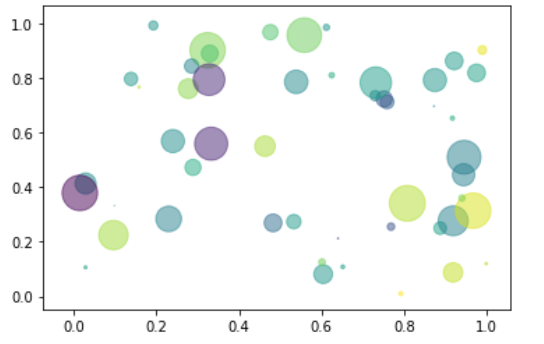
```
N = 50
x = np.random.rand(N)
y = np.random.rand(N)
#生成的数值序列表示颜色
colors = np.random.randn(N)
#生成表示点面积大小的数值序列
area = np.pi * (15 * np.random.rand(N))**2 # 调整大小
# alpha是透明度
plt.scatter(x, y, c=colors, alpha=0.5, s = area)
```
*****
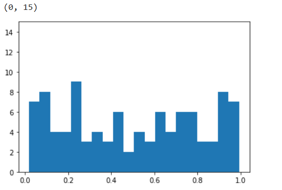
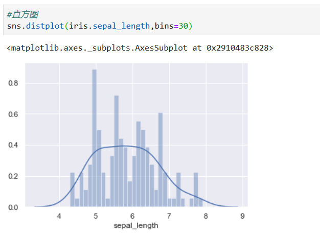
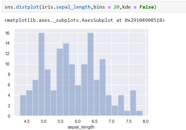
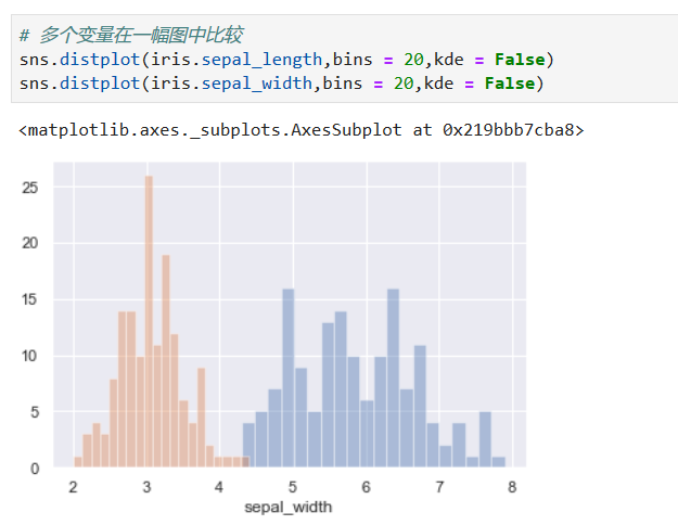
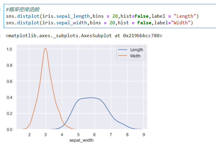
# Histogram
**解释:直方图是用来衡量连续变量的概率分布的。在构建直方图之前,我们需要先定义好bin(值的范围),也就是说我们需要先把连续值划分成不同等份,然后计算每一份里面数据的数量。**
*****
```
a = np.random.rand(100)
#bins将数据值划为20份
plt.hist(a,bins= 20)
#设置直方的高度在0到15之间
plt.ylim(0,15)
```
*****
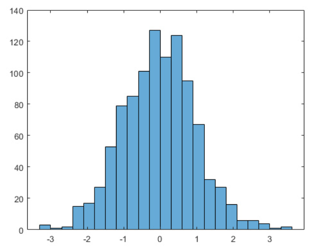
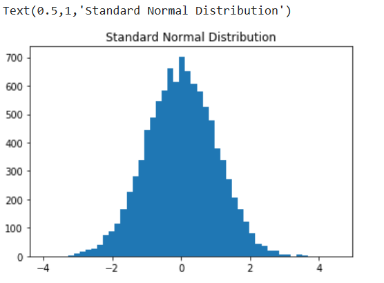
```
a = np.random.randn(10000)
plt.hist(a,bins=50)
plt.title("Standard Normal Distribution")
```
*****
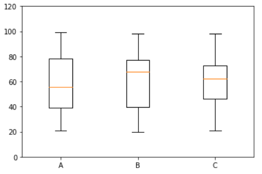
# BOXPLOTS 箱型图
boxlot用于表达连续特征的百分位数分布。统计学上经常被用于检测单变量的异常值,或者用于检查离散特征和连续特征的关系
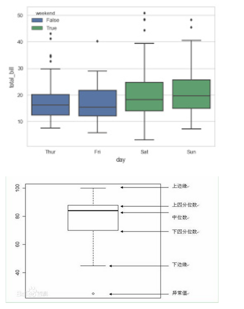
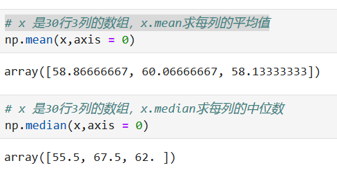
```
#生成20到100的整数,并且是30行3列的数组
x = np.random.randint(20,100,size = (30,3))
#根据三列数据会绘制出三个箱型图
plt.boxplot(x)
#y轴取值是0到120
plt.ylim(0,120)
# x轴上标记是1,2,3。标记的标签是A,B,c,如图
plt.xticks([1,2,3],['A','B','C'])
#plt.hlines是画一条横线,y值是第一个参数,从xmin画到xmanx
plt.hlines(y = np.mean(x,axis = 0)[1] ,xmin =0,xmax=3)
```
*****
*****
# COLORS/TEXTS/annotate
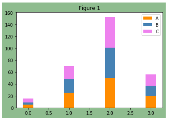
```
#设置画布背景颜色为darkseagreen
fig, ax = plt.subplots(facecolor='darkseagreen')
data = [[5,25,50,20],
[4,23,51,17],
[6,22,52,19]]
#返回给定值内的均匀间隔值
X = np.arange(4)
plt.bar(X, data[0], color = 'darkorange', width = 0.25,label = 'A',bottom= 0)
plt.bar(X, data[1], color = 'steelblue', width = 0.25,bottom = data[0],label = 'B')
plt.bar(X, data[2], color = 'violet', width = 0.25,bottom = np.array(data[0]) + np.array(data[1]),label = 'C')
#设置图像title
ax.set_title("Figure 1")
#显示条形图标注
plt.legend()
```
*****
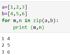
**zip方法**
*****
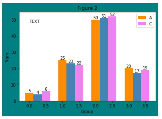
增加文字
~~~python
plt.text(x, y, s, fontdict=None, withdash=False, **kwargs)
~~~
```
fig, ax = plt.subplots(facecolor='teal')
data = [[5,25,50,20],
[4,23,51,17],
[6,22,52,19]]
X = np.arange(4)
plt.bar(X+0.00, data[0], color = 'darkorange', width = 0.25,label = 'A')
plt.bar(X+0.25, data[1], color = 'steelblue', width = 0.25)
plt.bar(X+0.50, data[2], color = 'violet', width = 0.25,label = 'C')
ax.set_title("Figure 2")
plt.legend()
# 添加文字描述
W = [0.00,0.25,0.50]
for i in range(3):
for a,b in zip(X+W[i],data[i]):
plt.text(a,b,"%.0f"% b,ha="center",va= "bottom")
plt.xlabel("Group")
plt.ylabel("Num")
plt.text(0.0,48,"TEXT")
```
*****
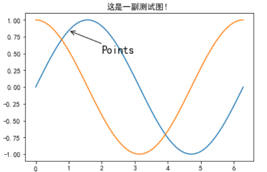
在数据可视化的过程中,图片中的文字经常被用来注释图中的一些特征。使用annotate()方法可以很方便地添加此类注释。在使用annotate时,要考虑两个点的坐标:被注释的地方xy(x, y)和插入文本的地方xytext(x, y)
```
import matplotlib.pyplot as plt
plt.rcParams['font.sans-serif']=['SimHei'] #用来正常显示中文标签
plt.rcParams['axes.unicode_minus']=False #用来正常显示负号
X = np.linspace(0, 2*np.pi,100)# 均匀的划分数据
Y = np.sin(X)
Y1 = np.cos(X)
plt.plot(X,Y)
plt.plot(X,Y1)
plt.annotate('Points',
#要注释的地方
xy=(1, np.sin(1)),
# 文本的地方
xytext=(2, 0.5), fontsize=16,
#注释的地方和文本产生联系的符号
arrowprops=dict(arrowstyle="->"))
plt.title("这是一副测试图!")
```
*****
# Subplots
~~~python
matplotlib.pyplot.subplots(nrows=1, ncols=1, sharex=False, sharey=False, squeeze=True, subplot_kw=None, gridspec_kw=None, **fig_kw)
~~~
使用 **subplot** 绘制多个图形
~~~python
subplot(nrows, ncols, index, **kwargs)
~~~
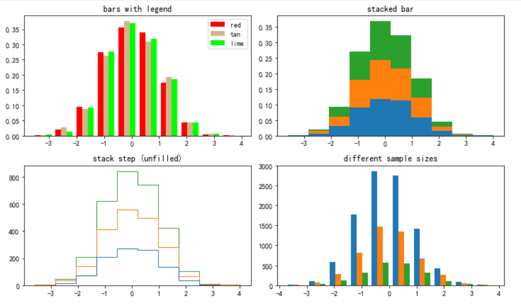
```
#在jupyter lab里调整图片大小
%pylab inline
pylab.rcParams['figure.figsize'] = (10, 6) # 调整图片大小
np.random.seed(19680801)
#直方图图形份数
n_bins = 10
# 数据为1000行*3列
x = np.random.randn(1000, 3)
#将画布横的分成两部分,纵轴分为两部分,共分为4部分。放在数组中
fig, axes = plt.subplots(nrows=2, ncols=2,facecolor='white')
#将数组一维化,并将四个部分按索引顺序储存在变量中
ax0, ax1, ax2, ax3 = axes.flatten()
colors = ['red', 'tan', 'lime']
ax0.hist(x, n_bins, normed=1, histtype='bar', color=colors, label=colors)
ax0.legend(prop={'size': 10})
ax0.set_title('bars with legend')
ax1.hist(x, n_bins, normed=1, histtype='bar', stacked=True)
ax1.set_title('stacked bar')
ax2.hist(x, n_bins, histtype='step', stacked=True, fill=False)
ax2.set_title('stack step (unfilled)')
# Make a multiple-histogram of data-sets with different length.
x_multi = [np.random.randn(n) for n in [10000, 5000, 2000]]
ax3.hist(x_multi, n_bins, histtype='bar')
ax3.set_title('different sample sizes')
fig.tight_layout() # Adjust subplot parameters to give specified padding.
plt.show()
```
*****
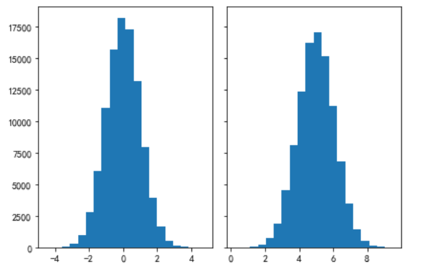
**两部分图共享X轴或Y轴**
```
# ShareX or ShareY
N_points = 100000
n_bins = 20
#产生一个标准正态分布
# Generate a normal distribution, center at x=0 and y=5
x = np.random.randn(N_points)
y = .4 * x + np.random.randn(100000) + 5
#将画布竖着分为两部分,共享y轴
fig, axs = plt.subplots(1, 2, sharey=True, tight_layout=True)
# We can set the number of bins with the `bins` kwarg
axs[0].hist(x, bins=n_bins)
axs[1].hist(y, bins=n_bins)
```
*****
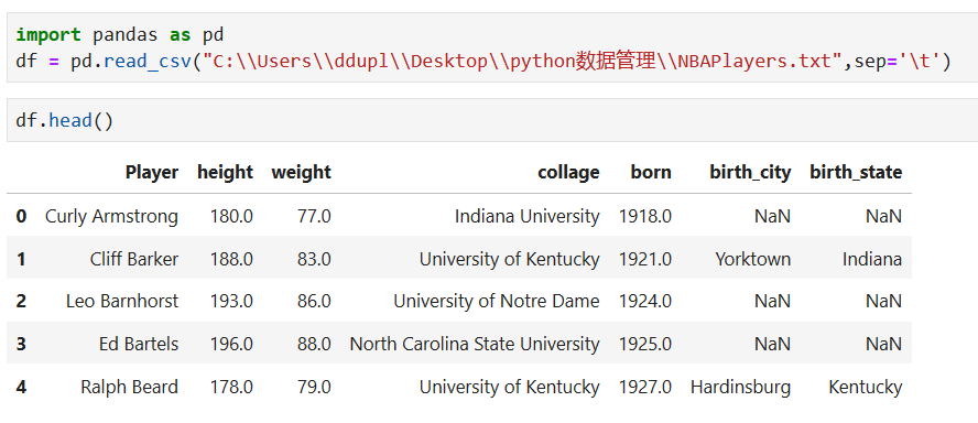
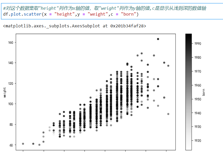
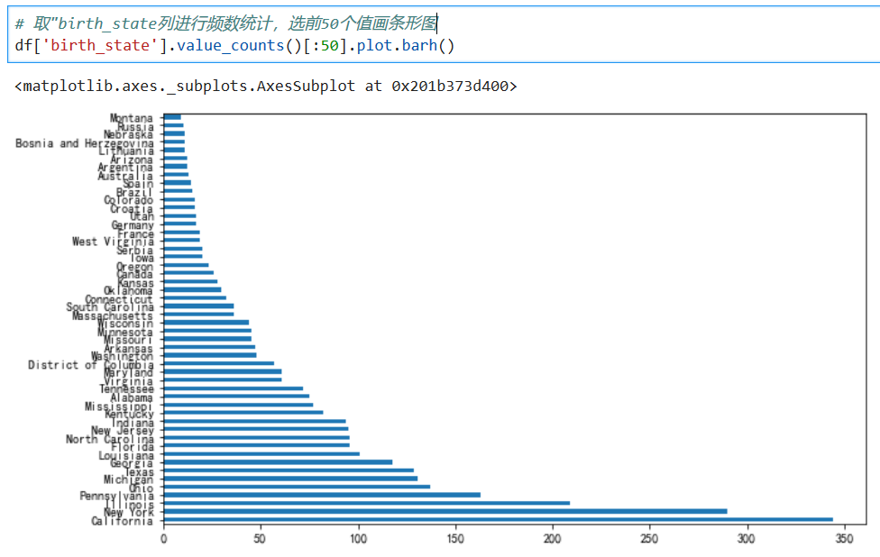
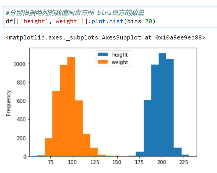
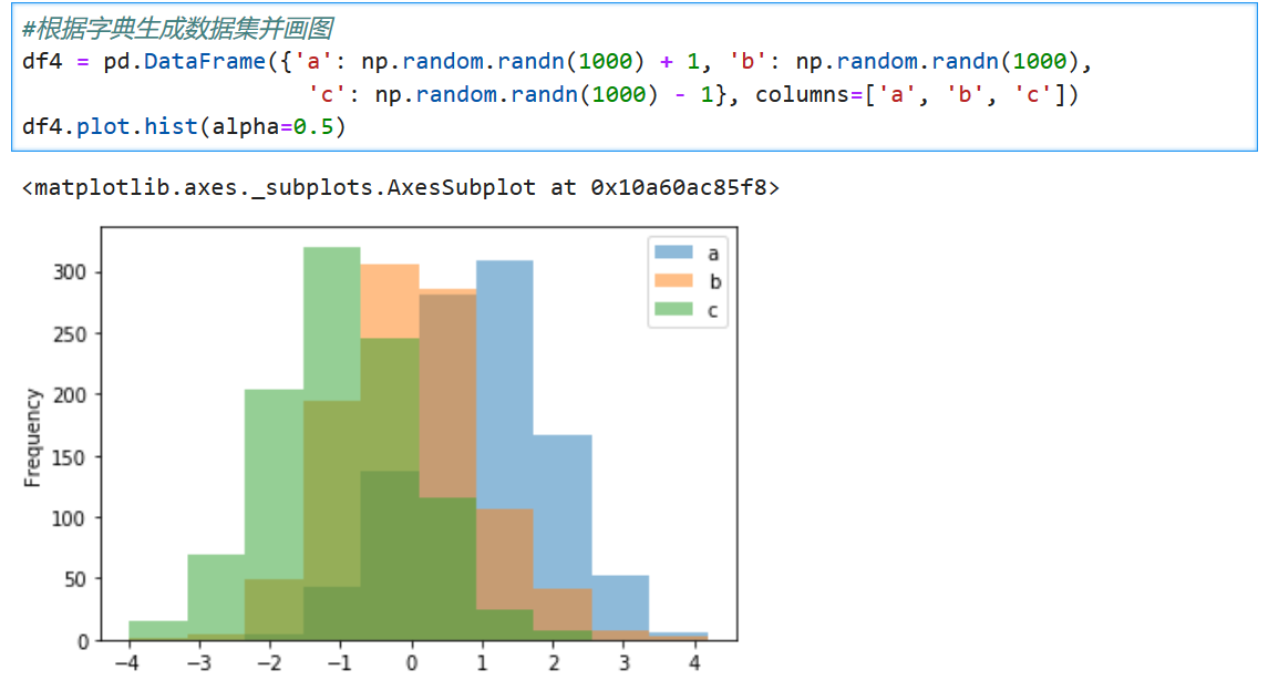
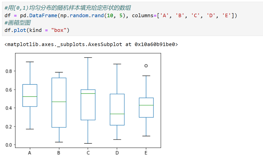
# PANDAS API
利用pandas API画图
*****
*****
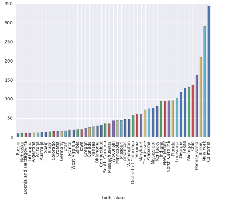
```
#按值分组
grouped = df.groupby("birth_state")
#每个分组行的数量
gs = grouped.size()
#大于10的组排序 并画条形图
gs[gs >=10].sort_values().plot.bar()
```
*****
*****
*****
*****
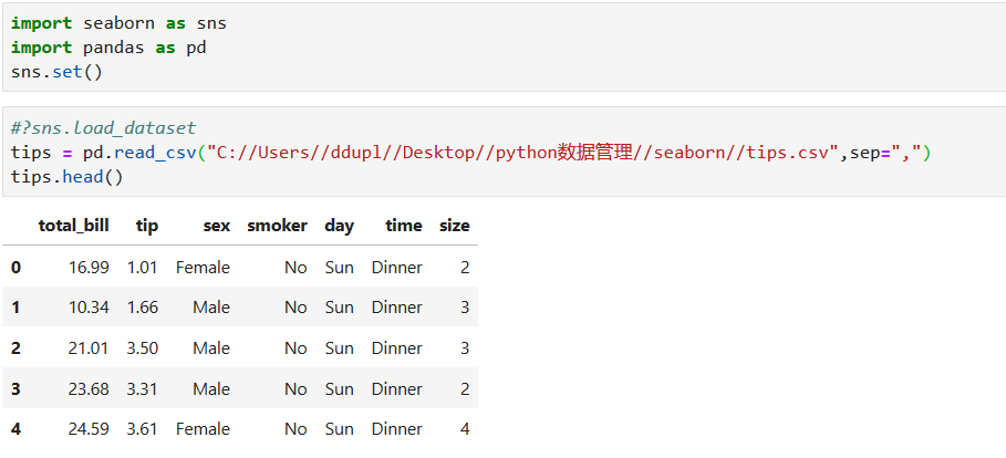
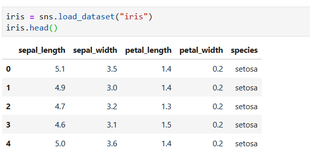
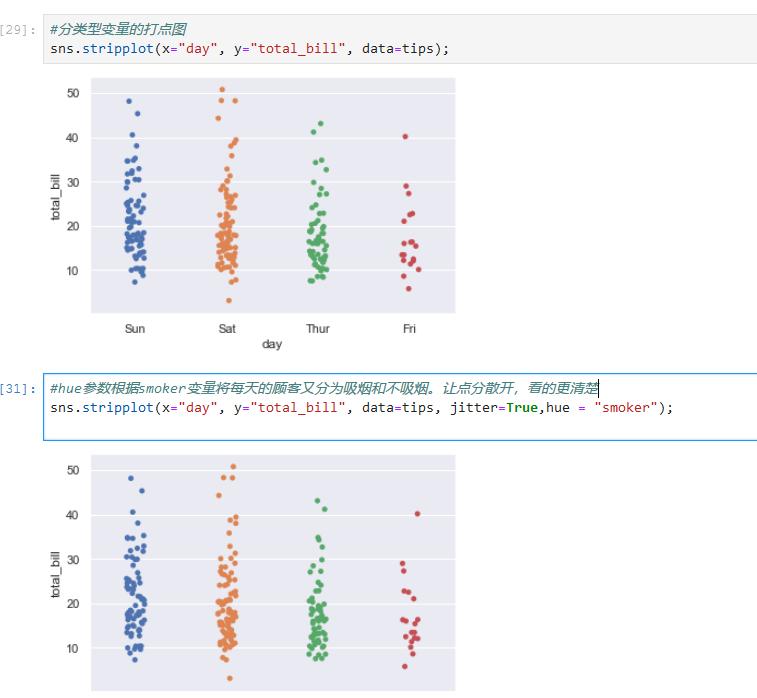
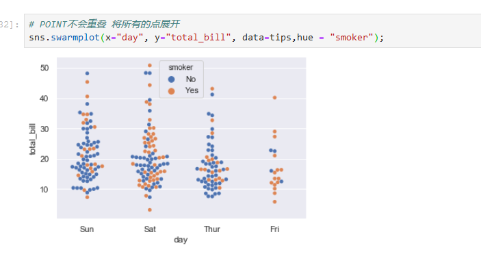
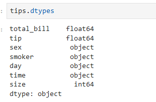
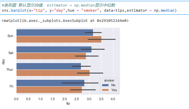
# Sseaborn: statistical data visualization
## Visualizing the distribution of a dataset
*****
*****
*****
*****
*****
*****
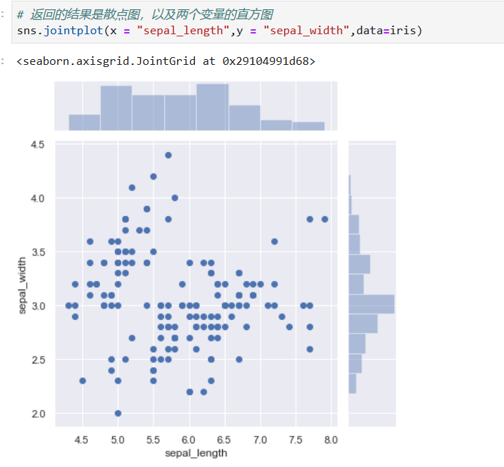
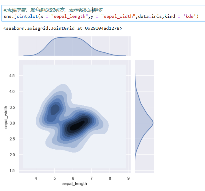
### Plotting bivariate distributions 绘制双变量分布
*****
*****
*****
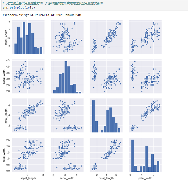
### Visualizing pairwise relationships in a dataset
可视化数据集中的成对关系
*****
*****
*****
*****
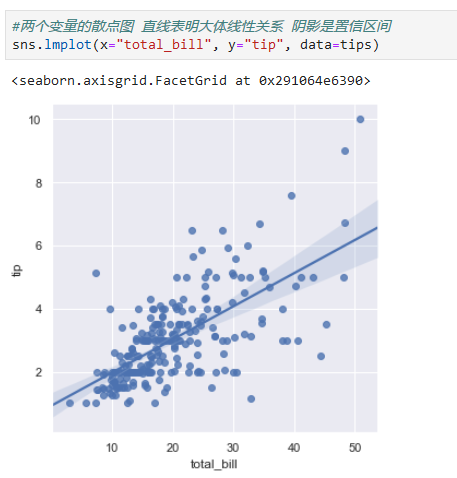
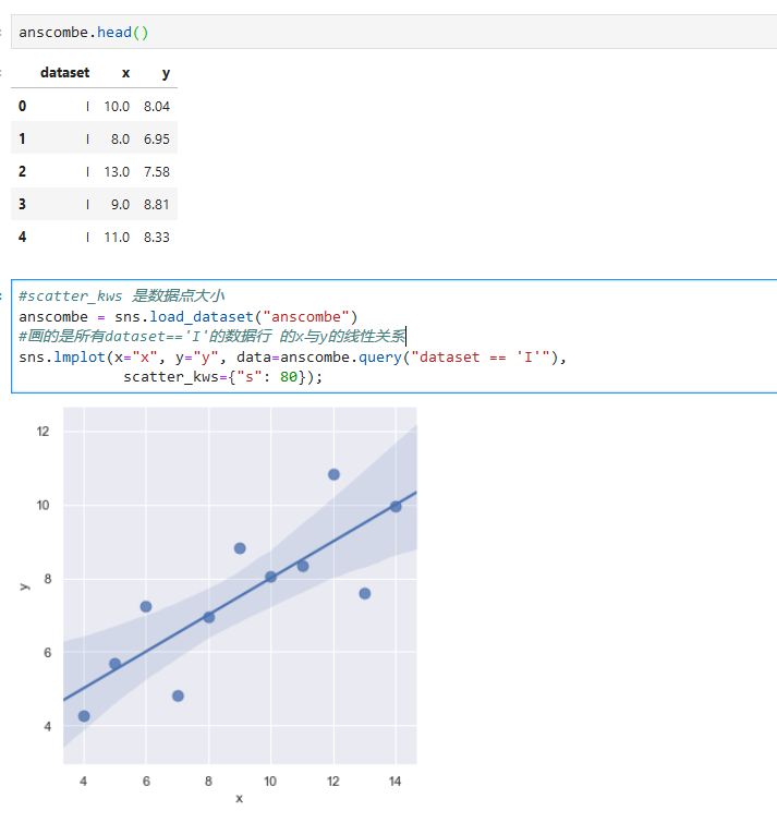
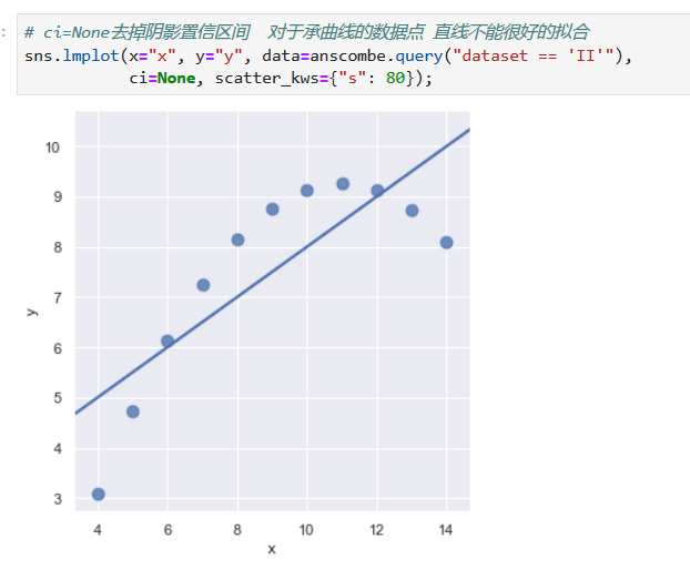
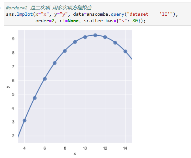
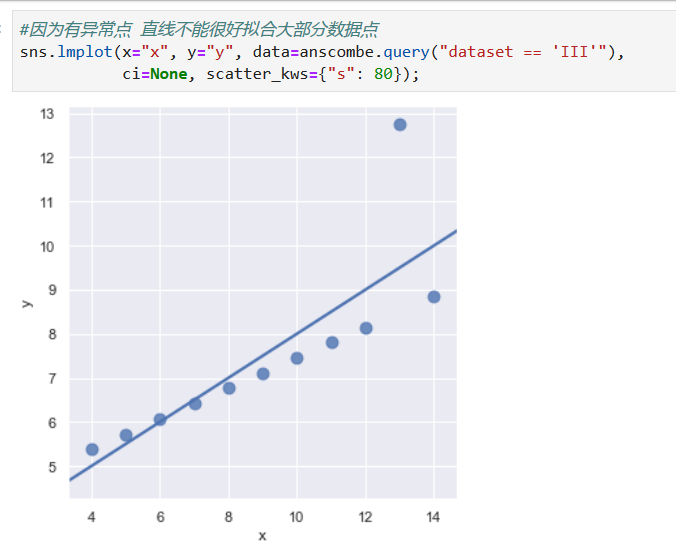
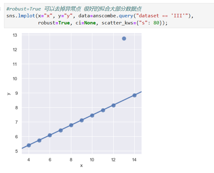
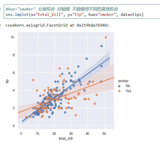
## Visualizing linear relationships
*****
*****
*****
*****
*****
*****
- 第五节 Pandas数据管理
- 1.1 文件读取
- 1.2 DataFrame 与 Series
- 1.3 常用操作
- 1.4 Missing value
- 1.5 文本数据
- 1.6 分类数据
- 第六节 pandas数据分析
- 2.1 索引选取
- 2.2. 分组计算
- 2.3. 表联结
- 2.4. 数据透视与重塑(pivot table and reshape)
- 2.5 官方小结图片
- 第七节 NUMPY科学计算
- 第八节 python可视化
- 第九节 统计学
- 01 单变量
- 02 双变量
- 03 数值方法
- 第十节 概率
- 01 概率
- 02 离散概率分布
- 03 连续概率分布
- 第一节 抽样与抽样分布
- 01抽样
- 02 点估计
- 03 抽样分布
- 04 抽样分布的性质
- 第十三节 区间估计
- 01总体均值的区间估计:𝝈已知
- 02总体均值的区间估计:𝝈未知
- 03总体容量的确定
- 04 总体比率