
# 更实用的风格布局
这是一个较复杂的布局案例, 用到了媒体查询
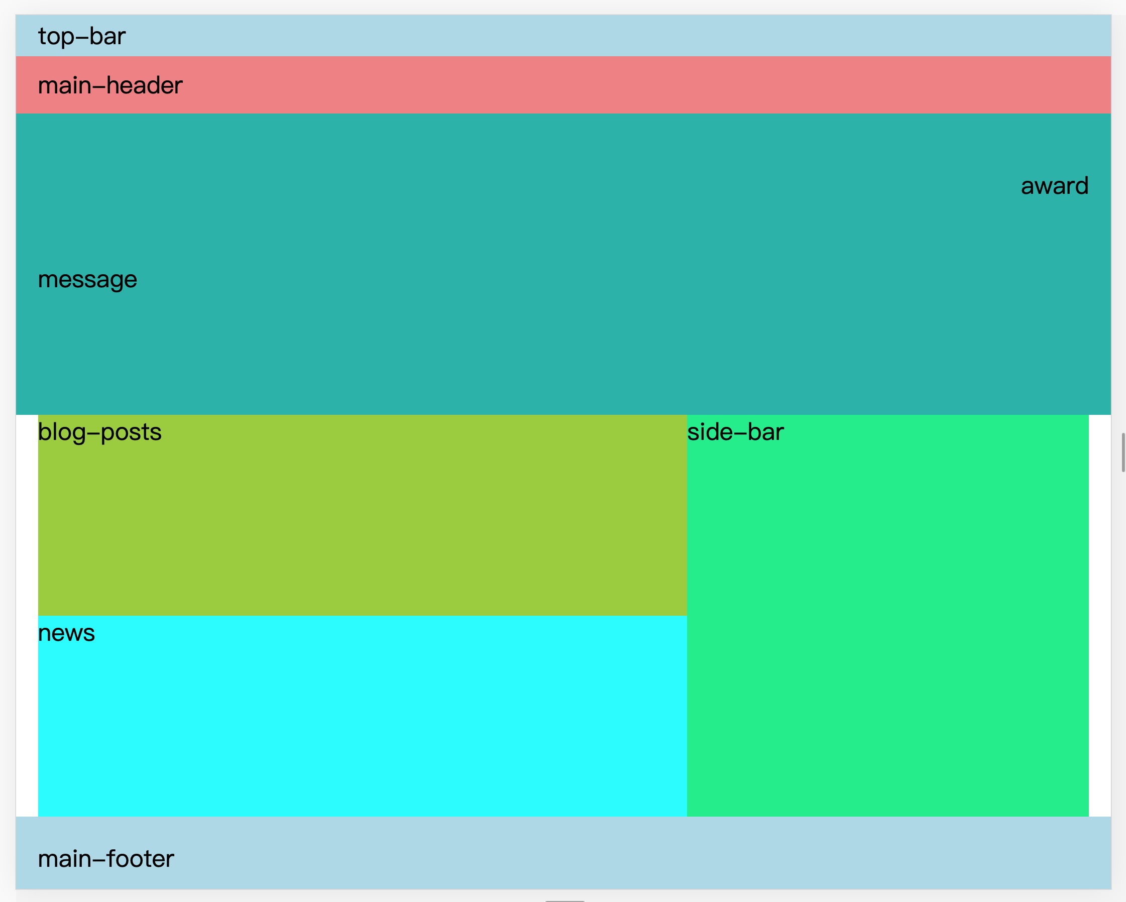
## 效果图
### 原图

### 分析:
---
## HTML结构
```html
<!DOCTYPE html>
<html lang="en">
<head>
<meta name="description" content="grid 主页" />
<link rel="stylesheet" href="style.css">
<meta charset="utf-8">
<title>首页</title>
</head>
<body>
<header class="top-bar">
top-bar
</header>
<header class="main-header">
main-header
</header>
<section class="hero">
<div class="message">
message
</div>
<div class="award">
award
</div>
</section>
<section class="blog-posts">
blog-posts
</section>
<section class="news">
news
</section>
<aside class="side-bar">
side-bar
</aside>
<footer class="main-footer">
main-footer
</footer>
</body>
</html>
```
---
## CSS代码
```css
/* style.css */
body {
display: grid;
grid-template-columns: 12% auto 400px 12%;
grid-template-rows: auto auto 300px auto auto auto;
grid-template-areas:
"top-bar top-bar top-bar top-bar"
"main-header main-header main-header main-header"
"hero hero hero hero"
". blog-posts side-bar ."
". news side-bar ."
"main-footer main-footer main-footer main-footer";
margin: 0;
font-size: 1.5rem;
}
.top-bar{
/*区域命名*/
grid-area: top-bar;
background-color: lightblue;
padding: 4px 12%;
}
.main-header{
grid-area: main-header;
background-color: lightcoral;
padding: 12px 12%;
}
.hero{
grid-area: hero;
background: lightseagreen;
padding: 55px 12% 0 12%;
display: grid;
grid-template-columns: auto 1fr auto;
grid-template-rows: auto auto auto;
grid-template-areas:
". . award"
"message . . "
". . . ";
}
.blog-posts{
grid-area: blog-posts;
min-height: 200px;
background-color: yellowgreen;
}
.news{
grid-area: news;
min-height: 200px;
background-color: cyan;
}
.side-bar{
grid-area: side-bar;
background: #0e8;
}
.main-footer{
grid-area: main-footer;
background-color: lightblue;
padding: 25px 12%;
}
.message{
grid-area: message;
}
.award{
grid-area: award;
}
/*媒体查询*/
@media (max-width: 1600px) {
body{
grid-template-columns: 2% auto 400px 2%;
}
.top-bar{
padding: 4px 2%;
}
.main-header{
padding: 12px 2%;
}
.hero{
padding: 55px 2% 0 2%;
}
.main-footer{
padding: 25px 2%;
}
}
/*媒体查询*/
@media (max-width: 1050px) {
body{
grid-template-columns: 3% auto 3%;
grid-template-rows: auto auto auto auto auto auto auto;
grid-template-areas: "top-bar top-bar top-bar"
"main-header main-header main-header"
"hero hero hero"
". blog-posts ."
". news ."
". side-bar ."
"main-footer main-footer main-footer";
}
}
```
- 教学大纲
- HTML5基础
- 1-html基础知识
- 2-语义化结构元素
- 3-语义化文本元素
- 4-链接/列表/图像元素
- 5-表格元素
- 6-表单与控件元素[重点]
- CSS3基础
- 1-css与html文档
- 2-css选择器
- 3-细说盒模型
- Flex布局[精简版]
- 1-Flex概论
- 2-Flex布局是什么
- 3-Flex基本概念
- 4-Flex容器属性
- 5-Flex项目属性
- Flex布局[细说版]
- 1-flex 布局概述
- 2-flex 容器与项目
- 3-flex 容器主轴方向
- 4-flex 容器主轴项目换行
- 5-flex 容器主轴与项目换行简写
- 6-flex 容器主轴项目对齐
- 7-flex 容器交叉轴项目对齐
- 8-flex 多行容器交叉轴项目对齐
- 9-flex 项目主轴排列顺序
- 10-flex 项目交叉轴单独对齐
- 11-flex 项目放大因子
- 12-flex 项目收缩因子
- 13-flex 项目计算尺寸
- 14-flex 项目缩放的简写
- Flex布局[案例版]
- 1-调整项目顺序
- Grid布局[精简版]
- 1. 常用术语
- 2. 容器属性
- 3. 项目属性
- 4. 布局实例
- 1. 经典三列布局
- 2. 媒体查询
- Grid布局[细说版]
- 1-必知术语
- 2-容器创建与行列划分
- 3-单元格常用单位
- 4-项目填充到单元格
- 5-项目填充到网格区域
- 6-对齐容器中的所有项目
- 7-对齐单元格中所有项目
- 8-对齐单元格中某个项目
- 9-容器中行与列之间的间距