
# 1. 前言
我们平时写布局,当遇到按钮需要**圆角**、或者**描边**等,通常的方法是新建一个`xml`文件,在`shape`标签下写,然后通过`android:background`或`setBackground(drawable)`设置。但是当随着项目的不断增大,项目就会引入很多文件,对项目的管理带来不便。而`Google`在`SDK28`的时候也推出了`MaterialButton`,它能在`xml`直接配置圆角、描边属性。
# 2. 使用
## 2.1 环境
在新建一个`Android`项目的时候,事实上也引入了这个空间,可以看见下面的依赖:
~~~
implementation 'com.google.android.material:material:1.1.0'
~~~
当然再检查一下项目的主题是否是`MaterialComponents`主题:
~~~
<style name="Theme.MyApplication" parent="Theme.MaterialComponents.DayNight.DarkActionBar">
~~~
同样的这里默认就是`MaterialComponents`主题,所以这里符合条件。当然,由于这里我不需要顶部的`ActionBar`,所以具体来说我这里使用的主题为:
~~~
Theme.MaterialComponents.Light.NoActionBar
~~~
## 2.2 属性
简要摘要一些属性:
| 属性 | 描述 | 参数 |
| --- | --- | --- |
| `app:backgroundTint` | 背景着色 | 默认为`?attr/colorPrimary` |
| `app:backgroundTintMode` | 着色模式 | `add`/`multiply`/`screen`/`src_atop`/`src_in`/`src_over` |
| `app:strokeColor` | 描边颜色 | |
| `app:strokeWidth` | 描边宽度 | |
| `app:cornerRadius` | 圆角大小 | |
| `app:rippleColor` | 按压水波纹的颜色 | |
| `app:icon` | 图标 | |
| `app:iconSize` | 图标大小 | |
| `app:iconGravity` | 图标重心 | |
| `app:iconTint` | 图标着色| |
| `app:iconTintMode` | 图标着色模式 |`add`/`multiply`/`screen`/`src_atop`/`src_in`/`src_over` |
| `app:iconPadding` | 图标和文本之间的间距 | |
## 2.3 使用案例
~~~
<?xml version="1.0" encoding="utf-8"?>
<LinearLayout xmlns:android="http://schemas.android.com/apk/res/android"
xmlns:app="http://schemas.android.com/apk/res-auto"
xmlns:tools="http://schemas.android.com/tools"
android:layout_width="match_parent"
android:layout_height="match_parent"
android:orientation="vertical"
tools:context=".MainActivity">
<com.google.android.material.button.MaterialButton
android:layout_width="wrap_content"
android:layout_height="wrap_content"
android:text="Hello World!"
android:textSize="18sp"
app:backgroundTint="#BBBBBB"
app:cornerRadius="10dp"
app:rippleColor="@color/black"
app:icon="@drawable/ic_launcher_foreground"
app:iconSize="50dp"
app:iconGravity="textStart"
app:iconPadding="10dp"
app:strokeColor="@color/black"
app:strokeWidth="2dp"
/>
</LinearLayout>
~~~
效果:
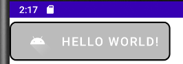
从上面我们可以知道可以很容易的来实现图标和文本的排版。这里有两点需要注意:
- 默认按钮的上下是有留白的,为`6dp`;
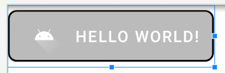
我们切换到设计草图,可以很直观的看见上下留白:
展开其属性,可以看见默认配置:
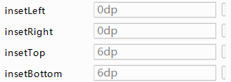
也就是我们可以通过:
~~~
android:insetTop="0dp"
android:insetBottom="0dp"
~~~
来实现没有留白。
- 运行在手机或者模拟器上,默认按钮是有阴影存在的。
可以为这个按钮添加一个样式:
~~~
style="@style/Widget.MaterialComponents.Button.UnelevatedButton"
~~~
就可以做到除去阴影效果。
- 介绍
- UI
- MaterialButton
- MaterialButtonToggleGroup
- 字体相关设置
- Material Design
- Toolbar
- 下拉刷新
- 可折叠式标题栏
- 悬浮按钮
- 滑动菜单DrawerLayout
- NavigationView
- 可交互提示
- CoordinatorLayout
- 卡片式布局
- 搜索框SearchView
- 自定义View
- 简单封装单选
- RecyclerView
- xml设置点击样式
- adb
- 连接真机
- 小技巧
- 通过字符串ID获取资源
- 自定义View组件
- 使用系统控件重新组合
- 旋转菜单
- 轮播图
- 下拉输入框
- 自定义VIew
- 图片组合的开关按钮
- 自定义ViewPager
- 联系人快速索引案例
- 使用ListView定义侧滑菜单
- 下拉粘黏效果
- 滑动冲突
- 滑动冲突之非同向冲突
- onMeasure
- 绘制字体
- 设置画笔Paint
- 贝赛尔曲线
- Invalidate和PostInvalidate
- super.onTouchEvent(event)?
- setShadowLayer与阴影效果
- Shader
- ImageView的scaleType属性
- 渐变
- LinearGradient
- 图像混合模式
- PorterDuffXfermode
- 橡皮擦效果
- Matrix
- 离屏绘制
- Canvas和图层
- Canvas简介
- Canvas中常用操作总结
- Shape
- 圆角属性
- Android常见动画
- Android动画简介
- View动画
- 自定义View动画
- View动画的特殊使用场景
- LayoutAnimation
- Activity的切换转场效果
- 属性动画
- 帧动画
- 属性动画监听
- 插值器和估值器
- 工具
- dp和px的转换
- 获取屏幕宽高
- JNI
- javah命令
- C和Java相互调用
- WebView
- Android Studio快捷键
- Bitmap和Drawable图像
- Bitmap简要介绍
- 图片缩放和裁剪效果
- 创建指定颜色的Bitmap图像
- Gradle本地仓库
- Gradle小技巧
- RxJava+Okhttp+Retrofit构建网络模块
- 服务器相关配置
- node环境配置
- 3D特效