
  2016年之前的前端开发主要还是以PC端为主,移动端做的比较少。
  这里想总结些编写网页的经验,以PC端的为主,前面总结过后台的,今天写些前台的,参考了[bootstrap3.3.5](http://www.bootcss.com/)、[bootstrip2.3.2](http://v2.bootcss.com/index.html)和模版[matrix](http://matrix.pwstrick.com/)。
  前段时间还写过一篇[《前端基础学习分享》](http://www.cnblogs.com/strick/p/4377213.html),比较基础的文章。
  每次写CSS,总感觉不用写那么多CSS,但是精简的时候, 又难以下手。越写越觉得代码越来越多,越来越乱,所以这次我打算整理出一套比较灵活的结构,供以后使用。
  CSS应该也可以像其他那些语言写的有层次,有结构。
## 一、规划
1. 在拿到psd效果图后,我会将所有的效果图看一遍,然后开始打草稿,在纸上画,在PS中标注都可以。一般都是做个大概的统计,太详细不太现实,既费时间也费精力。
2. 网站的浏览器兼容性要顾及到哪些,IE6,IE7还是IE8以上等,[点击查看浏览器分布情况](http://gs.statcounter.com/)。写CSS的时候还得照顾下低版本的浏览器。
3. 页面中的字体大小有几种;颜色有几种;超链接的:visit,:hover,:visit样式有几种
4. 网站中有多少个小图标,是否可以用现有的字体库替代小图片
5. 网站中是否用到了表格table,有哪几种表格款式,能否做出抽象
6. 有几种按钮款式,扁平的、3D的还是啥样的
7. 写些通用点的宽度与位移类,要能与其他地方配合,例如表单,文本等
8. 表单中是横排的还是竖排的;输入框是怎么样的;下拉框单选框多选框又是啥样的,有些高逼格的网站无法忍受下拉框等的默认样式,那就得美化;颜色有几种
9. 需要哪些辅助类,比如情境背景色等
10. 网站可以抽象出许多可复用的组建,例如分页、错误页面等
11. CSS也可以有面向对象的思维,将通用的结构抽象出来,做成一个基类。
12. 开发的时候将CSS手册打开,一些周边的在线网站准备好,例如[CSS参考手册](http://css.doyoe.com/),[webkit css library - 属性速查](http://ued.ctrip.com/blog/wp-content/webkitcss/quicksearch.html),[CSS3样式生成器](http://www.css88.com/tool/css3Preview/)等。
## 二、低版本浏览器支持
  以IE6、IE7为代表的一些低版本的浏览器很多CSS3、HTML5都不支持,有些伪类也不支持,例如:before等。这个时候就要做些兼容的操作。
**1)modernizr.js**
  “[Modernizr](http://modernizr.com/)”是一个用来检测浏览器功能支持情况的 JavaScript 库。 目前,通过检验浏览器对一系列测试的处理情况,Modernizr 可以检测18项 CSS3 功能以及40多项关于HTML5 的功能。可自定义脚本下载。使用了这个插件后,在html标签中会显示class,如下图所示,如果不支持某个CSS3,就会以“no-”开头。这样做的 话,就能优雅降级,在不支持这种样式的时候,换成另外一种样式。
:-: 
**2)respond.js**
  “[Respond.js](https://github.com/scottjehl/Respond)”是一个快速、轻量的 polyfill,用于为 IE6-8 以及其它不支持 CSS3 Media Queries 的浏览器提供媒体查询的 min-width 和 max-width 特性,实现响应式网页设计。
## 三、基本的CSS设置
**1)CSS的reset**
  重新默认样式,这个肯定有必要。参考了[HTML5 Boilerplate](http://www.bootcss.com/p/html5boilerplate/)。模版里的CSS注释是洋文的,自己翻译了一些。
~~~css
/**
* HTML5标签 在IE 8 / 9没有定义。
* 在IE 10/11 Firefox 中没有定义`details` or `summary`
* 在IE 11中没有定义main
*/
article,aside,details,figcaption,figure,footer,header,hgroup,main,menu,nav,section,summary {
display: block;
}
figure,menu{
margin:0;
padding:0;
}
ul,ol{
padding:0;
list-style-type:none;
}
h1,h2,h3,h4,h5,h6,p,ul,ol,form,dl,dt,dd,li{
margin:0;
}
.......
~~~
**2)CSS的通用样式**
1. 左浮动,有浮动,清浮动;左对齐,右对齐,居中;字体粗细,加粗,斜体,普通等;宋体、雅黑字体等
2. position定位,相对定位,绝对定位等;display属性,block、inline、inline-block等
3. overflow属性,有hidden、scrolldeng;zoom属性;cursor属性;text-decoration属性
4. margin的四个方向;padding的四个方向
~~~css
.l{float:left;}.r{float:right;}.cb{clear:both;}
.n{font-weight:normal; font-style:normal;}.b{font-weight:bold;}.i{font-style:italic;}
.fa{font-family:Arial;}.fg{font-family:Georgia;}.ft{font-family:Tahoma;}.fl{font-family:Lucida Console;}.fs{font-family:'宋体';}.fw{font-family:'微软雅黑';}.fe{font-family:'serif';}
.tc{text-align:center;}.tr{text-align:right;}.tl{text-align:left;}
.rel{position:relative;}.abs{position:absolute;}.fixed{position:fixed;}
.db{display:block;}.dib{-moz-inline-stack:inline-block; display:inline-block;}.di{display:inline;}.dn{display:none;}
.ovh{overflow:hidden;}.ovs{overflow:scroll;}.vh{visibility:hidden;}.vv{visibility:visible;}
.z{_zoom:1;}.zoom1{*zoom:1;}
.mt5{margin-top: 5px;}.mt10{margin-top: 10px;}.mt15{margin-top: 15px;}.mt20{margin-top: 20px;}
.mr5{margin-right: 5px;}.mr10{margin-right: 10px;}.mr15{margin-right: 15px;}.mr20{margin-right: 20px;}
.mb5{margin-bottom: 5px;}.mb10{margin-bottom: 10px;}.mb15{margin-bottom: 15px;}.mb20{margin-bottom: 20px;}
.ml5{margin-left: 5px;}.ml10{margin-left: 10px;}.ml15{margin-left: 15px;}.ml20{margin-left: 20px;}
.pt5{padding-top: 5px;}.pt10{padding-top: 10px;}.pt15{padding-top: 15px;}.pt20{padding-top: 20px;}
.pr5{padding-right: 5px;}.pr10{padding-right: 10px;}.pr15{padding-right: 15px;}.pr20{padding-right: 20px;}
.pb5{padding-bottom: 5px;}.pb10{padding-bottom: 10px;}.pb15{padding-bottom: 15px;}.pb20{padding-bottom: 20px;}
.pl5{padding-left: 5px;}.pl10{padding-left: 10px;}.pl15{padding-left: 15px;}.pl20{padding-left: 20px;}
.cursor-pointer{cursor:pointer;}
.line-del{text-decoration:line-through;}
~~~
**3)工具样式**
1. 清除浮动
2. 强制换行
3. 两边对齐等样式
4. 单选框复选框文字对齐
5. 截断文本,多出的文字显示...
6. 小三角显示
~~~css
.input_align{vertical-align:-3px;}/*单选框复选框文字对齐*/
.interception{white-space:nowrap; text-overflow:ellipsis; -o-text-overflow:ellipsis; overflow:hidden;}/*多出的显示...*/
.br{word-wrap:break-word;word-break:break-all}/*强制换行*/
.same_height{margin-bottom:-3000px; padding-bottom:3000px}/*两边齐平*/
.fix{*zoom:1;}
.fix:after,.fix:before{display:block; content:"clear"; height:0; clear:both; overflow:hidden; visibility:hidden;}/*清浮动*/
.min_fix{overflow:hidden;_zoom:1}
/**
* 小三角
* 纯色的就用一个,如果不是纯色的就用两个重叠再绝对定位
*/
span[class^="triangle-"]{
content: '';
height: 0;
width: 0;
position: absolute;
pointer-events: none;
}
.triangle-top{
border: solid transparent;
border-width: 10px;/*宽度自定义*/
border-top-color: #821134;/*四个方向 需要显示那个位置的就设置*/
}
~~~
**4)视网膜屏幕(Retina)**
  现在的手机,或苹果电脑等,屏幕都是Retina屏的,高清分辨率,就要做单独处理了。下面的属性参考了[bootstrap](http://v3.bootcss.com/css/)。
~~~css
@media
only screen and (-webkit-min-device-pixel-ratio: 2),
only screen and ( min--moz-device-pixel-ratio: 2),
only screen and ( -o-min-device-pixel-ratio: 2/1),
only screen and ( min-device-pixel-ratio: 2),
only screen and ( min-resolution: 192dpi),
only screen and ( min-resolution: 2dppx) {
.css{
/*background-image: url(img_2x.png);*/
}
}
~~~
**5)移动端CSS**
  这里简单的介绍下移动端的开发。在这篇[《移动web资源整理》](http://www.cnblogs.com/PeunZhang/archive/2015/03/03/3407453.html)的文章中有更多详细的说明,我里面的代码也是参照这篇文章修改的。
~~~html
<!-- 页面自动调整到设备宽度,并禁止用户缩放页面-->
<meta name="viewport" content="width=device-width,initial-scale=1.0,minimum-scale=1.0,maximum-scale=1.0,user-scalable=no">
<!-- 忽略将页面中的数字识别为电话号码 -->
<meta name="format-detection" content="telephone=no">
<!-- 忽略Android平台中对邮箱地址的识别 -->
<meta name="format-detection" content="email=no">
<!-- 当网站添加到主屏幕快速启动方式,可隐藏地址栏,仅针对ios的safari
ios7.0版本以后,safari上已看不到效果
-->
<meta name="apple-mobile-web-app-capable" content="yes">
<!-- 将网站添加到主屏幕快速启动方式,仅针对ios的safari顶端状态条的样式 -->
<!-- 可选default、black、black-translucent -->
<meta name="apple-mobile-web-app-status-bar-style" content="black">
<!-- 去除winphone系统中a、input标签被点击时产生的半透明灰色背景 -->
<meta name="msapplication-tap-highlight" content="no">
<!-- iOS 设备的桌面图标 -->
<link rel="apple-touch-icon" href="apple-touch-icon.png">
~~~
## 四、字体ICON
**1)自定义字体**
1. 以前的icon基本都是用图片sprite技术,现在有了自定义字体,在高版本的浏览器中可以替代图片了。这里我选用了[Font-Awesome](https://fortawesome.github.io/Font-Awesome/icons/),有400多个图标可以选择。
2. 下载后,稍微修改下那个CSS。第二个样式使用了属性选择符,这样的话只要是“fa-”开头的就是会显示字体。
3. 可以直接引用字体库的CSS,也可以按需引用,写到自己的CSS文档中。
4. 这里顺便介绍下[Simple Icons](http://www.bootcss.com/p/simple-icons/),收集众多网站的Logo,并提供高质量、不同尺寸的png格式图片给广大网友。里面是图片,不是字体。
~~~css
@font-face {
font-family: 'FontAwesome';
src: url('../fonts/fontawesome-webfont.eot?v=4.3.0');
src: url('../fonts/fontawesome-webfont.eot?#iefix&v=4.3.0') format('embedded-opentype'), url('../fonts/fontawesome-webfont.woff2?v=4.3.0') format('woff2'), url('../fonts/fontawesome-webfont.woff?v=4.3.0') format('woff'), url('../fonts/fontawesome-webfont.ttf?v=4.3.0') format('truetype'), url('../fonts/fontawesome-webfont.svg?v=4.3.0#fontawesomeregular') format('svg');
font-weight: normal;
font-style: normal;
}
.fa, i[class^="fa-"]{
display: inline-block;
font: normal normal normal 14px/1 FontAwesome;
text-rendering: auto;
-webkit-font-smoothing: antialiased;
-moz-osx-font-smoothing: grayscale;
transform: translate(0, 0);
}
~~~
**2)h1--h6标签**
  这里参考了[bootstrap](http://v3.bootcss.com/css/)中对这几个标签的重置,设置标题、副标题等可以用到,不然老是用p标签加字体大小,页面中的标签就太不丰富啦。
~~~css
h1,h2,h3,h4,h5,h6,.h1,.h2,.h3,.h4,.h5,.h6 {
font-family: inherit;
font-weight: 500;
line-height: 1.1;
color: inherit;
}
h1 small,h2 small,h3 small,h4 small,h5 small,h6 small,
.h1 small,.h2 small,.h3 small,.h4 small,.h5 small,.h6 small,
h1 .small,h2 .small,h3 .small,h4 .small,h5 .small,h6 .small,
.h1 .small,.h2 .small,.h3 .small,.h4 .small,.h5 .small,.h6 .small {
font-weight: normal;
line-height: 1;
color: #777;
}
h1,.h1,h2,.h2,h3,.h3 {
margin-top: 20px;
margin-bottom: 10px;
}
h1 small,.h1 small,h2 small,.h2 small,h3 small,.h3 small,
h1 .small,.h1 .small,h2 .small,.h2 .small,h3 .small,.h3 .small {
font-size: 65%;
}
h4,.h4,h5,.h5,h6,.h6 {
margin-top: 10px;
margin-bottom: 10px;
}
h4 small,.h4 small,h5 small,.h5 small,h6 small,.h6 small,
h4 .small,.h4 .small,h5 .small,.h5 .small,h6 .small,.h6 .small {
font-size: 75%;
}
h1,.h1 {font-size: 36px;}
h2,.h2 {font-size: 30px;}
h3,.h3 {font-size: 24px;}
h4,.h4 {font-size: 18px;}
h5,.h5 {font-size: 14px;}
h6,.h6 {font-size: 12px;}
~~~
## 五、表格
  网站中或多或少会用到些表格结构,关于表格的一些属性,我在文章[《关于table的一些记录》](http://www.cnblogs.com/strick/p/3789114.html)中做过记录。
  实际应用中的表格是多种多样的,绝不是[bootstrip](http://v3.bootcss.com/css/)模版中的几个样式所能摆平的,但模版中的思路可以借鉴,将样式抽象出来做到复用。
  在CSS中单独开辟一段专门给表格的样式区域。
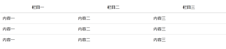
**1)加.table样式**
1. 表格内的单元格是居中,居左还是居右可根据实际情况来定。
2. 准备了三个对齐类.tr、.tc和.tl
:-: 
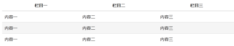
**2)条纹状网格.table-striped**
1. 这里是依赖:nth-child CSS 选择器实现的,这样就会有兼容性的问题,IE8浏览器及以下的都不支持
2. 但可以写的普通点,就是在偶数或单数的tr上面单独加样式
:-: 
**3)带边框的表格.table-bordered**
1. 就是给td、th加上border属性。
2. 注意标题下面的border是2像素,这些都可以找到相应的代码自定义。
:-: 
**4)鼠标悬停.table-hover**
1. 就是给tr加个:hover
:-: 
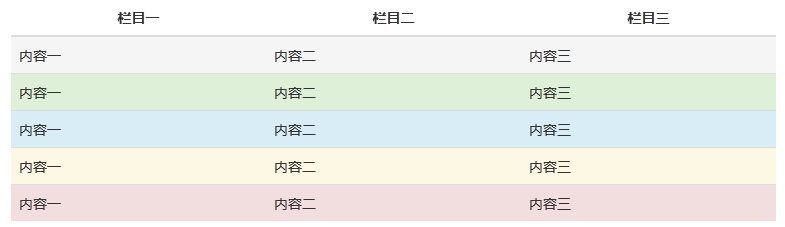
**5)颜色状态**
1. 有时候要给标题栏或内容栏给定不同的颜色,这里做了几个示例颜色
2. 实际情况可能就是几种完全不同的颜色
:-: 
  根据实际情况可以组合运用
  也可以自定义自己实际项目中的样式,组合也行,单独使用也行
## 六、按钮
1. 这里还是参照[bootstrip](http://v3.bootcss.com/css/)的按钮做demo。
2. 如果模版中没有合适的,可以点击[Buttons](http://www.bootcss.com/p/buttons/)网站,一个开源的按钮CSS样式库,款式众多,也可自定义,总有一款适合你吧。
3. 有三种标签可以做成按钮,\<a>、\<button>和\<input>
**1)普通样式按钮**
:-: 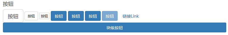
1. 如上图所示,我们常见到的
2. 抽象出一个通用类.btn,然后根据颜色不同再编写不用的类.btn-default、.btn-success等,还有一个disabled,不可点击时候的样式。
3. 将大小类也独立出来,.btn-lg、.btn-sm等
4. 根据实际情况也可以做这三次的抽象,实际的按钮肯定与这里的不一样
5. CSS代码仅仅是部分的,将抽象基类展示了出来
~~~html
<div>
<a href="#" class="btn btn-default btn-lg">按钮</a>
<button class="btn btn-default btn-sm">按钮</button>
<input type="button" class="btn btn-default btn-xs" value="按钮"/>
<a href="#" class="btn btn-primary">按钮</a>
<button class="btn btn-primary">按钮</button>
<input type="button" class="btn btn-primary" value="按钮"/>
<button class="btn btn-primary" disabled="disabled">按钮</button>
</div>
~~~
**2)超链接式按钮**
1. 像个超链接一样,如上图的最后一个按钮,只要加个.btn-link样式即可。
2. 这里也可以将超链接样式给抽象出来,将大小、颜色分出来
3. 独特的超链接可以单独写样式
~~~html
<button class="btn btn-link">按钮</button>
~~~
**3)块级按钮**
  将按钮宽度变为100%,有时候会有所需要,如下图所示的就要比刚刚的按钮宽很多。
~~~html
<button class="btn btn-primary btn-block">块级按钮</button>
~~~
## 七、栅格
  这里把[bootstrip2.3.2](http://v2.bootcss.com/scaffolding.html)中的流布局.row-fluid等搬了过来。
**1)流式栅格布局**
1. span1--span12,有12种选项,默认会margin-left:2%左右
2. offset1--offset12,也有12种选项,代表向左便宜的量
3. margin-left与width,都用到了小数点后14位。
4. show-grid这个类仅仅是展示用的,我就写在了页面上面,没有写在style.css文件中
~~~html
<div>
<div class="row-fluid show-grid">
<div class="span1">1</div>
<div class="span1">1</div>
<div class="span1">1</div>
<div class="span1">1</div>
<div class="span1">1</div>
<div class="span1">1</div>
<div class="span1">1</div>
<div class="span1">1</div>
<div class="span1">1</div>
<div class="span1">1</div>
<div class="span1">1</div>
<div class="span1">1</div>
</div>
<div class="row-fluid show-grid">
<div class="span4">4</div>
<div class="span4">4</div>
<div class="span4">4</div>
</div>
<div class="row-fluid show-grid">
<div class="span4">4</div>
<div class="span8">8</div>
</div>
<div class="row-fluid show-grid">
<div class="span6">6</div>
<div class="span6">6</div>
</div>
<div class="row-fluid show-grid">
<div class="span12">12</div>
</div>
</div>
~~~
:-: 
**2)默认栅格布局**
1. 流是用百分比计算,这里的话是直接用像素计算
2. span也有12种,详细信息可查看CSS。范围在100px---940px。
3. offset也有12种。范围在100px---980px。
## 八、表单
  这里参考了[bootstrip2.3.2](http://v2.bootcss.com/base-css.html#forms)和[bootstrip3.3.5](http://v3.bootcss.com/css/#forms)中的表单布局。
**1)输入框样式**
1. 默认高度是20px,line-height也是20px,加了CSS3的圆角
2. 当:focus的时候,边框颜色会改变,并加了CSS3的阴影效果
3. disabled,readonly的效果稍有不同
4. 有些输入框旁边需要小图标,左边或右边,这里我就不列出来了,bootstrip中有说明
5. 可将输入框的height,line-height,padding等抽象出来,运用到不同场景
~~~html
<fieldset class="form-group">
<input type="text" placeholder="第一个输入框" class="form-control mb5"/>
<input type="text" placeholder="第一个输入框" class="form-control input-sm mb5"/>
<input type="text" placeholder="第一个输入框" class="form-control mb5" disabled="disabled"/>
<input type="text" placeholder="第一个输入框" class="form-control mb5" readonly="readonly"/>
</fieldset>
~~~
:-: 
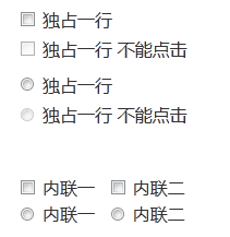
**2)多选框与单选框**
1. 同样也有disabled样式
2. 第一种是堆叠在一起的情况
3. 第二种是内联的样式
~~~html
<fieldset class="form-group">
<div class="checkbox"><label><input type="checkbox">独占一行</label></div>
<div class="checkbox"><label><input type="checkbox" disabled="disabled">独占一行 不能点击</label></div>
<div class="radio"><label><input type="radio">独占一行</label></div>
<div class="radio"><label><input type="radio" disabled="disabled">独占一行 不能点击</label></div>
</fieldset>
<fieldset class="form-group">
<div>
<label class="checkbox-inline"><input type="checkbox">内联一</label>
<label class="checkbox-inline"><input type="checkbox">内联二</label>
</div>
<div>
<label class="radio-inline"><input type="radio">内联一</label>
<label class="radio-inline"><input type="radio">内联二</label>
</div>
</fieldset>
~~~
:-: 
**3)下拉框**
1. 默认高度是34px
2. IE7、IE6低版本浏览器是不受CSS影响的
3. 如果还想好看点的话,可以用插件[select2](http://select2.github.io/),他还提供了额外的功能。
~~~html
<select class="form-control">
<option value="1">1</option>
<option value="2">2</option>
<option value="3">3</option>
<option value="4">4</option>
<option value="5">5</option>
</select>
~~~
**4)静态控件**
1. 经常是在查看页面,直接将文字输出
2. 使用了form-control-static类
3. 注意这里用到了上面的流布局,我是在fieldset的父级加上了row-fluid的类。
~~~html
<fieldset class="form-group">
<label class="control-label">Email</label>
<div class="controls">
<p class="form-control-static span6">email@example.com</p>
</div>
</fieldset>
~~~
**5)堆叠布局**
  control-label-block,label标签上面加上这个类即可。
~~~html
<fieldset class="form-group">
<label class="control-label-block">Name</label>
<div class="controls">
<input type="text" class="form-control span6" />
</div>
</fieldset>
~~~
:-: 
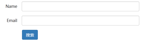
**6)内联布局**
1. 注意下面的span3,这里没有用流布局row-fluid,而是直接引用,这个时候不是百分比,而是写死的px值。
2. fieldset外面套的是form-inline。
~~~html
<div class="form-inline">
<fieldset class="form-group">
<label class="control-label">Name</label>
<div class="controls">
<input type="text" class="form-control span3" />
</div>
</fieldset>
<fieldset class="form-group">
<label class="control-label">Email</label>
<div class="controls">
<input type="text" class="form-control" />
</div>
</fieldset>
<fieldset class="form-group">
<button class="btn btn-primary">搜索</button>
</fieldset>
</div>
~~~
:-: 
**7)水平布局**
1. 标题label,默认是没有设置宽度的,可以添加span1或者其他设置宽度
2. 按钮可以设置offset1或者其他,来设置偏移
3. 加入form-horizontal类和row-fluid类
~~~html
<div class="form-horizontal row-fluid">
<fieldset class="form-group">
<label class="control-label span2">Name</label>
<div class="controls">
<input type="text" class="form-control span6" />
</div>
</fieldset>
<fieldset class="form-group">
<label class="control-label span2">Email</label>
<div class="controls">
<input type="text" class="form-control span6" />
</div>
</fieldset>
<fieldset class="form-group">
<button class="btn btn-primary offset2">搜索</button>
</fieldset>
</div>
~~~
:-: 
**8)校验状态**
1. 表单免不了要做验证,而验证的时候就需要醒目的颜色提示
2. 默认给了三种颜色类.has-error、.has-warning和.has-success
:-: 
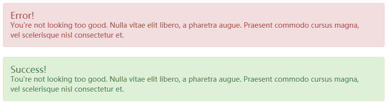
## 九、辅助类
**1)情境背景颜色**
  通过颜色来展示意图,当你表单验证的时候,可以用下面的样式展示提示信息。
:-: 
## 十、组件
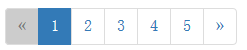
**1)分页**
1. 分页有四种情况,默认的、当前页、不可点击的和移过去变色
2. 分页可以通过URL来分,也可以通过ajax来分,用ajax的话代码会复杂一些
3. 下面是个简单的分页结构,有上一页,下一页,中间页面,还可以有总记录数,总页数,最后一页,第一页,跳转到第几页等
4. 分页也可以在样式不变的基础上,做不同尺寸
~~~html
<nav>
<ul class="pagination">
<li class="disabled"><span>«</span></li>
<li class="active"><a href="#">1</a></li>
<li><a href="#">2</a></li>
<li><a href="#">3</a></li>
<li><a href="#">4</a></li>
<li><a href="#">5</a></li>
<li><a href="#">»</a></li>
</ul>
</nav>
~~~
:-: 
**2)错误页面**
1. 例如404错误呀,查询信息但返回的是空页面。这些根据实际不同,都会特别的设计。
2. 这里做个简单的demo。demo比较朴素,没有图标,只有句简单的话
~~~html
<div class="no-list">
<h4>暂无数据</h4>
</div>
~~~
:-: 
*****
[点击查看在线demo](https://pwstrick.github.io/melon-skin/)
demo下载:[http://download.csdn.net/detail/loneleaf1/8961803](http://download.csdn.net/detail/loneleaf1/8961803)
*****
> 已建立一个微信前端交流群,如要进群,请先加微信号freedom20180706或扫描下面的二维码,请求中需注明“看云加群”,在通过请求后就会把你拉进来。还搜集整理了一套[面试资料](https://github.com/pwstrick/daily),欢迎阅读。

- ES6
- 1、let和const
- 2、扩展运算符和剩余参数
- 3、解构
- 4、模板字面量
- 5、对象字面量的扩展
- 6、Symbol
- 7、代码模块化
- 8、数字
- 9、字符串
- 10、正则表达式
- 11、对象
- 12、数组
- 13、类型化数组
- 14、函数
- 15、箭头函数和尾调用优化
- 16、Set
- 17、Map
- 18、迭代器
- 19、生成器
- 20、类
- 21、类的继承
- 22、Promise
- 23、Promise的静态方法和应用
- 24、代理和反射
- HTML
- 1、SVG
- 2、WebRTC基础实践
- 3、WebRTC视频通话
- 4、Web音视频基础
- CSS进阶
- 1、CSS基础拾遗
- 2、伪类和伪元素
- 3、CSS属性拾遗
- 4、浮动形状
- 5、渐变
- 6、滤镜
- 7、合成
- 8、裁剪和遮罩
- 9、网格布局
- 10、CSS方法论
- 11、管理后台响应式改造
- React
- 1、函数式编程
- 2、JSX
- 3、组件
- 4、生命周期
- 5、React和DOM
- 6、事件
- 7、表单
- 8、样式
- 9、组件通信
- 10、高阶组件
- 11、Redux基础
- 12、Redux中间件
- 13、React Router
- 14、测试框架
- 15、React Hooks
- 16、React源码分析
- 利器
- 1、npm
- 2、Babel
- 3、webpack基础
- 4、webpack进阶
- 5、Git
- 6、Fiddler
- 7、自制脚手架
- 8、VSCode插件研发
- 9、WebView中的页面调试方法
- Vue.js
- 1、数据绑定
- 2、指令
- 3、样式和表单
- 4、组件
- 5、组件通信
- 6、内容分发
- 7、渲染函数和JSX
- 8、Vue Router
- 9、Vuex
- TypeScript
- 1、数据类型
- 2、接口
- 3、类
- 4、泛型
- 5、类型兼容性
- 6、高级类型
- 7、命名空间
- 8、装饰器
- Node.js
- 1、Buffer、流和EventEmitter
- 2、文件系统和网络
- 3、命令行工具
- 4、自建前端监控系统
- 5、定时任务的调试
- 6、自制短链系统
- 7、定时任务的进化史
- 8、通用接口
- 9、微前端实践
- 10、接口日志查询
- 11、E2E测试
- 12、BFF
- 13、MySQL归档
- 14、压力测试
- 15、活动规则引擎
- 16、活动配置化
- 17、UmiJS版本升级
- 18、半吊子的可视化搭建系统
- 19、KOA源码分析(上)
- 20、KOA源码分析(下)
- 21、花10分钟入门Node.js
- 22、Node环境升级日志
- 23、Worker threads
- 24、低代码
- 25、Web自动化测试
- 26、接口拦截和页面回放实验
- 27、接口管理
- 28、Cypress自动化测试实践
- 29、基于Electron的开播助手
- Node.js精进
- 1、模块化
- 2、异步编程
- 3、流
- 4、事件触发器
- 5、HTTP
- 6、文件
- 7、日志
- 8、错误处理
- 9、性能监控(上)
- 10、性能监控(下)
- 11、Socket.IO
- 12、ElasticSearch
- 监控系统
- 1、SDK
- 2、存储和分析
- 3、性能监控
- 4、内存泄漏
- 5、小程序
- 6、较长的白屏时间
- 7、页面奔溃
- 8、shin-monitor源码分析
- 前端性能精进
- 1、优化方法论之测量
- 2、优化方法论之分析
- 3、浏览器之图像
- 4、浏览器之呈现
- 5、浏览器之JavaScript
- 6、网络
- 7、构建
- 前端体验优化
- 1、概述
- 2、基建
- 3、后端
- 4、数据
- 5、后台
- Web优化
- 1、CSS优化
- 2、JavaScript优化
- 3、图像和网络
- 4、用户体验和工具
- 5、网站优化
- 6、优化闭环实践
- 数据结构与算法
- 1、链表
- 2、栈、队列、散列表和位运算
- 3、二叉树
- 4、二分查找
- 5、回溯算法
- 6、贪心算法
- 7、分治算法
- 8、动态规划
- 程序员之路
- 大学
- 2011年
- 2012年
- 2013年
- 2014年
- 项目反思
- 前端基础学习分享
- 2015年
- 再一次项目反思
- 然并卵
- PC网站CSS分享
- 2016年
- 制造自己的榫卯
- PrimusUI
- 2017年
- 工匠精神
- 2018年
- 2019年
- 前端学习之路分享
- 2020年
- 2021年
- 2022年
- 2023年
- 日志
- 2020