
# Matplotlib 教程
> 原文: [http://zetcode.com/python/matplotlib/](http://zetcode.com/python/matplotlib/)
Matplotlib 教程展示了如何使用 Matplotlib 在 Python 中创建图表。 我们创建散点图,折线图,条形图和饼图。
## Matplotlib
Matplotlib 是用于创建图表的 Python 库。 Matplotlib 可用于 Python 脚本,Python 和 IPython shell,jupyter 笔记本,Web 应用服务器以及四个图形用户界面工具包。
## Matplotlib 安装
Matplotlib 是需要安装的外部 Python 库。
```py
$ sudo pip install matplotlib
```
我们可以使用`pip`工具安装该库。
## Matplotlib 散点图
散点图是一种图形或数学图,使用笛卡尔坐标显示一组数据的两个变量的值。
`scatter.py`
```py
#!/usr/bin/python3
import matplotlib.pyplot as plt
x_axis = [1, 2, 3, 4, 5, 6, 7, 8, 9, 10]
y_axis = [5, 16, 34, 56, 32, 56, 32, 12, 76, 89]
plt.title("Prices over 10 years")
plt.scatter(x_axis, y_axis, color='darkblue', marker='x', label="item 1")
plt.xlabel("Time (years)")
plt.ylabel("Price (dollars)")
plt.grid(True)
plt.legend()
plt.show()
```
该示例绘制了一个散点图。 该图表显示了十年内某些商品的价格。
```py
import matplotlib.pyplot as plt
```
我们从`matplotlib`模块导入`pyplot`。 它是创建图表的命令样式函数的集合。 它的操作与 MATLAB 类似。
```py
x_axis = [1, 2, 3, 4, 5, 6, 7, 8, 9, 10]
y_axis = [5, 16, 34, 56, 32, 56, 32, 12, 76, 89]
```
我们有 x 和 y 轴的数据。
```py
plt.title("Prices over 10 years")
```
通过`title()`函数,我们可以为图表设置标题。
```py
plt.scatter(x_axis, y_axis, color='darkblue', marker='x', label="item 1")
```
`scatter()`函数绘制散点图。 它接受 x 和 y 轴,标记的颜色,标记的形状和标签的数据。
```py
plt.xlabel("Time (years)")
plt.ylabel("Price (dollars)")
```
我们为轴设置标签。
```py
plt.grid(True)
```
我们用`grid()`函数显示网格。 网格由许多垂直和水平线组成。
```py
plt.legend()
```
`legend()`函数在轴上放置图例。
```py
plt.show()
```
`show()`函数显示图表。

图:散点图
## 两个数据集
在下一个示例中,我们将另一个数据集添加到图表。
`scatter2.py`
```py
#!/usr/bin/python3
import matplotlib.pyplot as plt
x_axis1 = [1, 2, 3, 4, 5, 6, 7, 8, 9, 10]
y_axis1 = [5, 16, 34, 56, 32, 56, 32, 12, 76, 89]
x_axis2 = [1, 2, 3, 4, 5, 6, 7, 8, 9, 10]
y_axis2 = [53, 6, 46, 36, 15, 64, 73, 25, 82, 9]
plt.title("Prices over 10 years")
plt.scatter(x_axis1, y_axis1, color='darkblue', marker='x', label="item 1")
plt.scatter(x_axis2, y_axis2, color='darkred', marker='x', label="item 2")
plt.xlabel("Time (years)")
plt.ylabel("Price (dollars)")
plt.grid(True)
plt.legend()
plt.show()
```
该图表显示两个数据集。 我们通过标记的颜色来区分它们。
```py
x_axis1 = [1, 2, 3, 4, 5, 6, 7, 8, 9, 10]
y_axis1 = [5, 16, 34, 56, 32, 56, 32, 12, 76, 89]
x_axis2 = [1, 2, 3, 4, 5, 6, 7, 8, 9, 10]
y_axis2 = [53, 6, 46, 36, 15, 64, 73, 25, 82, 9]
```
我们有两个数据集。
```py
plt.scatter(x_axis1, y_axis1, color='darkblue', marker='x', label="item 1")
plt.scatter(x_axis2, y_axis2, color='darkred', marker='x', label="item 2")
```
我们为每个集合调用`scatter()`函数。
## Matplotlib 折线图
折线图是一种显示图表的图表,该信息显示为一系列数据点,这些数据点通过直线段相连,称为标记。
`linechart.py`
```py
#!/usr/bin/python3
import numpy as np
import matplotlib.pyplot as plt
t = np.arange(0.0, 3.0, 0.01)
s = np.sin(2.5 * np.pi * t)
plt.plot(t, s)
plt.xlabel('time (s)')
plt.ylabel('voltage (mV)')
plt.title('Sine Wave')
plt.grid(True)
plt.show()
```
该示例显示正弦波折线图。
```py
import numpy as np
```
在示例中,我们还需要`numpy`模块。
```py
t = np.arange(0.0, 3.0, 0.01)
```
`arange()`函数返回给定间隔内的均匀间隔的值列表。
```py
s = np.sin(2.5 * np.pi * t)
```
我们获得数据的`sin()`值。
```py
plt.plot(t, s)
```
我们使用`plot()`函数绘制折线图。
## Matplotlib 条形图
条形图显示带有矩形条的分组数据,其长度与它们代表的值成比例。 条形图可以垂直或水平绘制。
`barchart.py`
```py
#!/usr/bin/python3
from matplotlib import pyplot as plt
from matplotlib import style
style.use('ggplot')
x = [0, 1, 2, 3, 4, 5]
y = [46, 38, 29, 22, 13, 11]
fig, ax = plt.subplots()
ax.bar(x, y, align='center')
ax.set_title('Olympic Gold medals in London')
ax.set_ylabel('Gold medals')
ax.set_xlabel('Countries')
ax.set_xticks(x)
ax.set_xticklabels(("USA", "China", "UK", "Russia",
"South Korea", "Germany"))
plt.show()
```
该示例绘制了条形图。 它显示了 2012 年伦敦每个国家/地区的奥运金牌数量。
```py
style.use('ggplot')
```
可以使用预定义的样式。
```py
fig, ax = plt.subplots()
```
`subplots()`函数返回图形和轴对象。
```py
ax.bar(x, y, align='center')
```
使用`bar()`函数生成条形图。
```py
ax.set_xticks(x)
ax.set_xticklabels(("USA", "China", "UK", "Russia",
"South Korea", "Germany"))
```
我们为 x 轴设置国家/地区名称。
## Matplotlib 饼图
饼图是圆形图,将其分成多个切片以说明数值比例。
`piechart.py`
```py
#!/usr/bin/python3
import matplotlib.pyplot as plt
labels = ['Oranges', 'Pears', 'Plums', 'Blueberries']
quantity = [38, 45, 24, 10]
colors = ['yellowgreen', 'gold', 'lightskyblue', 'lightcoral']
plt.pie(quantity, labels=labels, colors=colors, autopct='%1.1f%%',
shadow=True, startangle=90)
plt.axis('equal')
plt.show()
```
该示例创建一个饼图。
```py
labels = ['Oranges', 'Pears', 'Plums', 'Blueberries']
quantity = [38, 45, 24, 10]
```
我们有标签和相应的数量。
```py
colors = ['yellowgreen', 'gold', 'lightskyblue', 'lightcoral']
```
我们为饼图的切片定义颜色。
```py
plt.pie(quantity, labels=labels, colors=colors, autopct='%1.1f%%',
shadow=True, startangle=90)
```
饼图是通过`pie()`函数生成的。 `autopct`负责在图表的楔形图中显示百分比。
```py
plt.axis('equal')
```
我们设置了相等的长宽比,以便将饼图绘制为圆形。
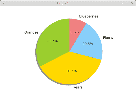
图:饼图
在本教程中,我们使用 Matplotlib 库创建了散点图,折线图,条形图和饼图。
您可能也对以下相关教程感兴趣: [PrettyTable 教程](/python/prettytable/), [Tkinter 教程](/tkinter/), [SymPy 教程](/python/sympy/), [Python Pillow 教程](/python/pillow/), [PyQt5 教程](/gui/pyqt5/)和 [Python 教程](/lang/python/)。
- ZetCode 数据库教程
- MySQL 教程
- MySQL 简介
- MySQL 安装
- MySQL 的第一步
- MySQL 快速教程
- MySQL 存储引擎
- MySQL 数据类型
- 在 MySQL 中创建,更改和删除表
- MySQL 表达式
- 在 MySQL 中插入,更新和删除数据
- MySQL 中的SELECT语句
- MySQL 子查询
- MySQL 约束
- 在 MySQL 中导出和导入数据
- 在 MySQL 中连接表
- MySQL 函数
- MySQL 中的视图
- MySQL 中的事务
- MySQL 存储过程
- MySQL Python 教程
- MySQL Perl 教程
- MySQL & Perl DBI
- 使用 Perl 连接到 MySQL 数据库
- MySQL 中的 Perl 错误处理
- 使用 Perl 进行 MySQL 查询
- 在 MySQL 中使用 Perl 绑定参数&列
- 在 MySQL 中使用 Perl 处理图像
- 使用 Perl 获取 MySQL 元数据
- Perl 的 MySQL 事务
- MySQL C API 编程教程
- MySQL Visual Basic 教程
- MySQL PHP 教程
- MySQL Java 教程
- MySQL Ruby 教程
- MySQL C# 教程
- SQLite 教程
- SQLite 简介
- sqlite3 命令行工具
- 在 SQLite 中创建,删除和更改表
- SQLite 表达式
- SQLite 插入,更新,删除数据
- SQLite SELECT语句
- SQLite 约束
- SQLite 连接表
- SQLite 函数
- SQLite 视图,触发器,事务
- SQLite C 教程
- SQLite Python 教程
- SQLite Perl 教程
- Perl DBI
- 使用 Perl 连接到 SQLite 数据库
- SQLite Perl 错误处理
- 使用 Perl 的 SQLite 查询
- 使用 Perl 绑定 SQLite 参数&列
- 使用 Perl 在 SQLite 中处理图像
- 使用 Perl 获取 SQLite 元数据
- 使用 Perl 进行 SQLite 事务
- SQLite Ruby 教程
- 连接到 SQLite 数据库
- 在 SQLite 中使用 Ruby 进行 SQL 查询
- 绑定参数
- 处理图像
- 使用 Ruby 获取 SQLite 元数据
- Ruby 的 SQLite 事务
- SQLite C# 教程
- SQLite C# 简介
- 使用SqliteDataReader检索数据
- ADO.NET 数据集
- 使用 C# 在 SQLite 中处理图像
- 使用 C# 获取 SQLite 元数据
- 使用 C# 的 SQLite 事务
- SQLite Visual Basic 教程
- SQLite Visual Basic 简介
- 使用SqliteDataReader检索数据
- ADO.NET 的数据集
- 使用 Visual Basic 在 SQLite 中处理图像
- 使用 Visual Basic 获取 SQLite 元数据
- 使用 Visual Basic 的 SQLite 事务
- PostgreSQL C 教程
- PostgreSQL Ruby 教程
- PostgreSQL PHP 教程
- PostgreSQL PHP 编程简介
- 在 PostgreSQL 中使用 PHP 检索数据
- 在 PostgreSQL 中使用 PHP 处理图像
- 用 PHP 获取 PostgreSQL 元数据
- 在 PostgreSQL 中使用 PHP 进行事务
- PostgreSQL Java 教程
- Apache Derby 教程
- Derby 简介
- Derby 的安装&配置
- Derby 工具
- ij 工具
- Derby 中的 SQL 查询
- 在 Derby 中使用 JDBC 进行编程
- Derby 安全
- 使用 Derby & Apache Tomcat
- NetBeans 和 Derby
- SQLAlchemy 教程
- SQLAlchemy 简介
- 原始 SQL
- 模式定义语言
- SQL 表达式语言
- SQLAlchemy 中的对象关系映射器
- MongoDB PHP 教程
- MongoDB JavaScript 教程
- MongoDB Ruby 教程
- Spring JdbcTemplate 教程
- JDBI 教程
- MyBatis 教程
- Hibernate Derby 教程
- ZetCode .NET 教程
- Visual Basic 教程
- Visual Basic
- Visual Basic 语法结构
- 基本概念
- Visual Basic 数据类型
- Visual Basic 中的字符串
- 运算符
- 控制流
- Visual Basic 数组
- Visual Basic 中的过程&函数
- 在 Visual Basic 中组织代码
- 面向对象编程
- Visual Basic 中的面向对象编程 II
- Visual Basic 中的集合
- 输入和输出
- C# 教程
- C# 语言
- C# 语法结构
- C# 基础
- C# 数据类型
- C# 中的字符串
- C# 运算符
- C# 中的流控制
- C# 数组
- C# 面向对象编程
- C# 中的方法
- C# 面向对象编程 II
- C# 属性
- C# 结构
- C# 委托
- 命名空间
- C# 集合
- C# 输入和输出
- C# 目录教程
- C# 字典教程
- 在 C# 中读取文本文件
- C# 中的日期和时间
- 在 C# 中读取网页
- C# HttpClient教程
- ASP.NET Core 教程
- ZetCode 图形教程
- Java 2D 游戏教程
- Java 游戏基础
- 动画
- 移动精灵
- 碰撞检测
- Java 益智游戏
- Java Snake
- Breakout 游戏
- Java 俄罗斯方块
- Java 吃豆人
- Java 太空侵略者
- Java 扫雷
- Java 推箱子
- Java 2D 教程
- 介绍
- 基本绘图
- 形状和填充
- 透明度
- 合成
- 剪裁
- 变换
- 特效
- 图像
- 文字和字体
- 命中测试,移动物体
- 俄罗斯方块
- Cario 图形教程
- Cario 图形库
- Cario 定义
- Cairo 后端
- Cairo 基本图形
- 形状和填充
- 渐变
- 透明度
- 合成
- 剪裁和遮罩
- 变换
- Cairo 文字
- Cairo 中的图像
- 根窗口
- PyCairo 教程
- PyCairo 简介
- PyCairo 后端
- PyCairo 中的基本绘图
- PyCairo 形状和填充
- PyCairo 渐变
- PyCairo 剪裁&遮罩
- PyCairo 的透明度
- PyCairo 中的变换
- PyCairo 中的文字
- PyCairo 中的图像
- 根窗口
- HTML5 画布教程
- 介绍
- HTML5 画布中的直线
- HTML5 画布形状
- HTML5 画布填充
- HTML5 画布中的透明度
- HTML5 画布合成
- HTML5 canvas 中的变换
- HTML5 画布中的文字
- HTML5 画布中的动画
- HTML5 画布中的 Snake
- ZetCode GUI 教程
- Windows API 教程
- Windows API 简介
- Windows API main函数
- Windows API 中的系统函数
- Windows API 中的字符串
- Windows API 中的日期和时间
- Windows API 中的一个窗口
- UI 的第一步
- Windows API 菜单
- Windows API 对话框
- Windows API 控件 I
- Windows API 控件 II
- Windows API 控件 III
- Windows API 中的高级控件
- Windows API 中的自定义控件
- Windows API 中的 GDI
- PyQt4 教程
- PyQt4 简介
- PyQt4 中的第一个程序
- PyQt4 中的菜单和工具栏
- PyQt4 中的布局管理
- PyQt4 中的事件和信号
- PyQt4 中的对话框
- PyQt4 小部件
- PyQt4 小部件 II
- PyQt4 中的拖放
- PyQt4 中的绘图
- PyQt4 中的自定义小部件
- PyQt4 中的俄罗斯方块游戏
- PyQt5 教程
- PyQt5 简介
- PyQt5 日期和时间
- PyQt5 中的第一个程序
- PyQt5 中的菜单和工具栏
- PyQt5 中的布局管理
- PyQt5 中的事件和信号
- PyQt5 中的对话框
- PyQt5 小部件
- PyQt5 小部件 II
- PyQt5 拖放
- PyQt5 中的绘图
- PyQt5 中的自定义小部件
- PyQt5 中的俄罗斯方块
- Qt4 教程
- Qt4 工具包简介
- Qt4 工具类
- Qt4 中的字符串
- Qt4 中的日期和时间
- 在 Qt4 中使用文件和目录
- Qt4 中的第一个程序
- Qt4 中的菜单和工具栏
- Qt4 中的布局管理
- Qt4 中的事件和信号
- Qt4 小部件
- Qt4 小部件 II
- Qt4 中的绘图
- Qt4 中的自定义小部件
- Qt4 中的打砖块游戏
- Qt5 教程
- Qt5 工具包简介
- Qt5 中的字符串
- Qt5 中的日期和时间
- Qt5 中的容器
- 在 Qt5 中处理文件和目录
- Qt5 中的第一个程序
- Qt5 中的菜单和工具栏
- Qt5 中的布局管理
- Qt5 中的事件和信号
- Qt5 小部件
- Qt5 小部件 II
- Qt5 中的绘图
- Qt5 中的自定义小部件
- Qt5 中的贪食蛇
- Qt5 中的打砖块游戏
- PySide 教程
- PySide 工具包简介
- PySide 中的第一个程序
- PySide 中的菜单和工具栏
- PySide 中的布局管理
- PySide 中的事件和信号
- PySide 中的对话框
- PySide 小部件
- PySide 小部件 II
- 在 PySide 中拖放
- 在 PySide 中绘图
- PySide 中的自定义小部件
- PySide 中的俄罗斯方块游戏
- Tkinter 教程
- Tkinter 简介
- Tkinter 中的布局管理
- Tkinter 标准小部件属性
- Tkinter 小部件
- Tkinter 中的菜单和工具栏
- Tkinter 中的对话框
- Tkinter 中的绘图
- Tkinter 中的贪食蛇
- Tcl/Tk 教程
- Tcl/Tk 简介
- Tcl/Tk 中的布局管理
- Tcl/Tk 小部件
- Tcl/Tk 中的菜单和工具栏
- Tcl/Tk 中的对话框
- Tcl/Tk 绘图
- 贪食蛇
- Qt 快速教程
- Java Swing 教程
- Java Swing 简介
- Java Swing 首个程序
- Java Swing 中的菜单和工具栏
- Swing 布局管理
- GroupLayout管理器
- Java Swing 事件
- 基本的 Swing 组件
- 基本的 Swing 组件 II
- Java Swing 对话框
- Java Swing 模型架构
- Swing 中的拖放
- Swing 中的绘图
- Java Swing 中的可调整大小的组件
- Java Swing 中的益智游戏
- 俄罗斯方块
- JavaFX 教程
- JavaFX 简介
- JavaFX 首个程序
- JavaFX 布局窗格
- 基本的 JavaFX 控件
- 基本 JavaFX 控件 II
- JavaFX 事件
- JavaFX 效果
- JavaFX 动画
- JavaFX 画布
- JavaFX 图表
- Java SWT 教程
- Java SWT 简介
- Java SWT 中的布局管理
- Java SWT 中的菜单和工具栏
- Java SWT 中的小部件
- Table小部件
- Java SWT 中的对话框
- Java SWT 绘图
- Java SWT 中的贪食蛇
- wxWidgets 教程
- wxWidgets 简介
- wxWidgets 助手类
- wxWidgets 中的第一个程序
- wxWidgets 中的菜单和工具栏
- wxWidgets 中的布局管理
- wxWidgets 中的事件
- wxWidgets 中的对话框
- wxWidgets 小部件
- wxWidgets 小部件 II
- wxWidgets 中的拖放
- wxWidgets 中的设备上下文
- wxWidgets 中的自定义小部件
- wxWidgets 中的俄罗斯方块游戏
- wxPython 教程
- wxPython 简介
- 第一步
- 菜单和工具栏
- wxPython 中的布局管理
- wxPython 中的事件
- wxPython 对话框
- 小部件
- wxPython 中的高级小部件
- wxPython 中的拖放
- wxPython 图形
- 创建自定义小部件
- wxPython 中的应用框架
- wxPython 中的俄罗斯方块游戏
- C# Winforms Mono 教程
- Mono Winforms 简介
- Mono Winforms 中的第一步
- Mono Winforms 中的布局管理
- Mono Winforms 中的菜单和工具栏
- Mono Winforms 中的基本控件
- Mono Winforms 中的高级控件
- 对话框
- Mono Winforms 中的拖放
- Mono Winforms 中的绘图
- Mono Winforms 中的贪食蛇
- Java Gnome 教程
- Java Gnome 简介
- Java Gnome 的第一步
- Java Gnome 中的布局管理
- Java Gnome 中的布局管理 II
- Java Gnome 中的菜单
- Java Gnome 中的工具栏
- Java Gnome 中的事件
- Java Gnome 中的小部件
- Java Gnome 中的小部件 II
- Java Gnome 中的高级小部件
- Java Gnome 中的对话框
- Java Gnome 中的 Pango
- 在 Java Gnome 中用 Cairo 绘图
- Cario 绘图 II
- Java Gnome 中的贪食蛇
- QtJambi 教程
- QtJambi 简介
- QtJambi 中的布局管理
- QtJambi 中的小部件
- QtJambi 中的菜单和工具栏
- QtJambi 对话框
- QtJambi 中的绘图
- QtJambi 中的自定义小部件
- 贪食蛇
- GTK+ 教程
- GTK+ 简介
- GTK+ 中的第一个程序
- GTK+ 中的菜单和工具栏
- GTK+ 布局管理
- GTK+ 事件和信号
- GTK+ 对话框
- GTK+ 小部件
- GTK+ 小部件 II
- GtkTreeView小部件
- GtkTextView小部件
- 自定义 GTK+ 小部件
- Ruby GTK 教程
- Ruby GTK 简介
- Ruby GTK 中的布局管理
- Ruby GTK 中的小部件
- Ruby GTK 中的菜单和工具栏
- Ruby GTK 中的对话框
- Ruby GTK Cario 绘图
- Ruby GTK 中的自定义小部件
- Ruby GTK 中的贪食蛇
- GTK# 教程
- GTK# 简介
- GTK 的第一步
- GTK# 中的布局管理
- GTK 中的菜单
- GTK# 中的工具栏
- GTK# 中的事件
- GTK# 中的小部件
- GTK 中的小部件 II
- GTK# 中的高级小部件
- GTK# 中的对话框
- Pango
- GTK# 中的 Cario 绘图
- GTK# 中的 Cario 绘图 II
- GTK# 中的自定义小部件
- Visual Basic GTK# 教程
- Visual Basic GTK# 简介
- 布局管理
- 小部件
- 菜单和工具栏
- 对话框
- Cario 绘图
- 自定义小部件
- 贪食蛇
- PyGTK 教程
- PyGTK 简介
- PyGTK 的第一步
- PyGTK 中的布局管理
- PyGTK 中的菜单
- PyGTK 中的工具栏
- PyGTK 中的事件和信号
- PyGTK 中的小部件
- PyGTK 中的小部件 II
- PyGTK 中的高级小部件
- PyGTK 中的对话框
- Pango
- Pango II
- PyGTK 中的 Cario 绘图
- Cario 绘图 II
- PyGTK 中的贪食蛇游戏
- PyGTK 中的自定义小部件
- PHP GTK 教程
- PHP GTK 简介
- PHP GTK 中的布局管理
- PHP GTK 中的小部件
- PHP GTK 中的菜单和工具栏
- 对话框
- Cario 绘图
- 自定义小部件
- 贪食蛇
- C# Qyoto 教程
- Qyoto 介绍
- 布局管理
- Qyoto 中的小部件
- Qyoto 中的菜单和工具栏
- Qyoto 对话框
- Qyoto 中的绘图
- Qyoto 中的绘图 II
- Qyoto 中的自定义小部件
- 贪食蛇
- Ruby Qt 教程
- Ruby Qt 简介
- Ruby Qt 中的布局管理
- Ruby Qt 中的小部件
- 菜单和工具栏
- Ruby Qt 中的对话框
- 用 Ruby Qt 绘图
- Ruby Qt 中的自定义小部件
- Ruby Qt 中的贪食蛇
- Visual Basic Qyoto 教程
- Qyoto 介绍
- 布局管理
- Qyoto 中的小部件
- Qyoto 中的菜单和工具栏
- Qyoto 对话框
- Qyoto 中的绘图
- Qyoto 中的自定义小部件
- 贪食蛇
- Mono IronPython Winforms 教程
- 介绍
- IronPython Mono Winforms 中的第一步
- 布局管理
- 菜单和工具栏
- Mono Winforms 中的基本控件
- Mono Winforms 中的基本控件 II
- Mono Winforms 中的高级控件
- 对话框
- Mono Winforms 中的拖放
- 绘图
- IronPython Mono Winforms 中的绘图 II
- IronPython Mono Winforms 中的贪食蛇
- IronPython Mono Winforms 中的俄罗斯方块游戏
- FreeBASIC GTK 教程
- Jython Swing 教程
- Jython Swing 简介
- Jython Swing 中的布局管理
- Jython Swing 中的组件
- Jython Swing 中的菜单和工具栏
- Jython Swing 中的对话框
- Jython Swing 中的绘图
- Jython Swing 中的半字节
- JRuby Swing 教程
- JRuby Swing 简介
- JRuby Swing 中的布局管理
- JRuby Swing 中的组件
- 菜单和工具栏
- JRuby Swing 中的对话框
- 在 JRuby Swing 中绘图
- JRuby Swing 中的贪食蛇
- Visual Basic Winforms 教程
- Visual Basic Winforms 简介
- 布局管理
- 基本控制
- 进阶控件
- 菜单和工具栏
- 对话框
- 绘图
- 拖放
- 贪食蛇
- JavaScript GTK 教程
- JavaScript GTK 简介
- 布局管理
- JavaScript GTK 中的小部件
- JavaScript GTK 中的菜单和工具栏
- JavaScript GTK 中的对话框
- JavaScript GTK 中的 Cario 绘图
- ZetCode Java 教程
- Java 教程
- Java 语言
- Java 语法结构
- Java 基础
- Java 数据类型
- Java 数据类型 II
- Java 字符串
- Java 数组
- Java 表达式
- Java 控制流程
- Java 面向对象的编程
- Java 方法
- Java 面向对象编程 II
- Java 包
- Java 中的异常
- Java 集合
- Java 流
- Java Future 教程
- Java Comparable和Comparator
- Java DOM 教程
- Java MVC 教程
- Java SAX 教程
- Java JAXB 教程
- Java JSON 处理教程
- Java H2 教程
- MongoDB Java 教程
- Java 正则表达式教程
- Java PDFBox 教程
- Java 文件教程
- Java Files.list教程
- Java Files.walk教程
- Java DirectoryStream教程
- Java 外部与内部迭代器
- Java 文件大小
- 用 Java 创建目录
- 用 Java 创建文件
- Java Log4j 教程
- Gson 教程
- Java RequestDispatcher
- Java HTTP GET/POST 请求
- Java InputStream教程
- Java FileOutputStream教程
- Java FileInputStream教程
- Java ZipInputStream教程
- Java FileWriter教程
- EJB 简介
- Java forEach教程
- Jetty 教程
- Tomcat Derby 教程
- Stripes 介绍
- 使用 Stripes 的 Java webapp,MyBatis,& Derby
- EclipseLink 简介
- Java 中的数据源
- JSTL 中的 SQL 查询标记
- Java 验证过滤器
- Hibernate 验证器
- 用 Java 显示图像
- Play 框架简介
- Spark Java 简介
- Java ResourceBundle教程
- Jtwig 教程
- Java Servlet 教程
- Java 套接字教程
- FreeMarker 教程
- Android 教程
- Java EE 5 教程
- JSoup 教程
- JFreeChart 教程
- ImageIcon教程
- 用 Java 复制文件
- Java 文件时间教程
- 如何使用 Java 获取当前日期时间
- Java 列出目录内容
- Java 附加到文件
- Java ArrayList教程
- 用 Java 读写 ICO 图像
- Java int到String的转换
- Java HashSet教程
- Java HashMap教程
- Java static关键字
- Java 中的HashMap迭代
- 用 Java 过滤列表
- 在 Java 中读取网页
- Java 控制台应用
- Java 集合的便利工厂方法
- Google Guava 简介
- OpenCSV 教程
- 用 Java8 的StringJoiner连接字符串
- Java 中元素迭代的历史
- Java 谓词
- Java StringBuilder
- Java 分割字串教学
- Java NumberFormat
- Java TemporalAdjusters教程
- Apache FileUtils教程
- Java Stream 过滤器
- Java 流归约
- Java 流映射
- Java InputStreamReader教程
- 在 Java 中读取文本文件
- Java Unix 时间
- Java LocalTime
- Java 斐波那契
- Java ProcessBuilder教程
- Java 11 的新功能
- ZetCode JavaScript 教程
- Ramda 教程
- Lodash 教程
- Collect.js 教程
- Node.js 简介
- Node HTTP 教程
- Node-config 教程
- Dotenv 教程
- Joi 教程
- Liquid.js 教程
- faker.js 教程
- Handsontable 教程
- PouchDB 教程
- Cheerio 教程
- Axios 教程
- Jest 教程
- JavaScript 正则表达式
- 用 JavaScript 创建对象
- Big.js 教程
- Moment.js 教程
- Day.js 教程
- JavaScript Mustache 教程
- Knex.js 教程
- MongoDB JavaScript 教程
- Sequelize 教程
- Bookshelf.js 教程
- Node Postgres 教程
- Node Sass 教程
- Document.querySelector教程
- Document.all教程
- JSON 服务器教程
- JavaScript 贪食蛇教程
- JavaScript 构建器模式教程
- JavaScript 数组
- XMLHttpRequest教程
- 从 JavaScript 中的 URL 读取 JSON
- 在 JavaScript 中循环遍历 JSON 数组
- jQuery 教程
- Google 图表教程
- ZetCode Kotlin 教程
- Kotlin Hello World 教程
- Kotlin 变量
- Kotlin 的运算符
- Kotlin when表达式
- Kotlin 数组
- Kotlin 范围
- Kotlin Snake
- Kotlin Swing 教程
- Kotlin 字符串
- Kotlin 列表
- Kotlin 映射
- Kotlin 集合
- Kotlin 控制流程
- Kotlin 写入文件
- Kotlin 读取文件教程
- Kotlin 正则表达式
- ZetCode 其它教程
- TCL 教程
- Tcl
- Tcl 语法结构
- Tcl 中的基本命令
- Tcl 中的表达式
- Tcl 中的控制流
- Tcl 中的字符串
- Tcl 列表
- Tcl 中的数组
- Tcl 中的过程
- 输入&输出
- AWK 教程
- Vaadin 教程
- Vaadin 框架介绍
- Vaadin Grid教程
- Vaadin TextArea教程
- Vaadin ComboBox教程
- Vaadin Slider教程
- Vaadin CheckBox教程
- Vaadin Button教程
- Vaadin DateField教程
- Vaadin Link教程
- ZetCode PHP 教程
- PHP 教程
- PHP
- PHP 语法结构
- PHP 基础
- PHP 数据类型
- PHP 字符串
- PHP 运算符
- PHP 中的控制流
- PHP 数组
- PHP 数组函数
- PHP 中的函数
- PHP 正则表达式
- PHP 中的面向对象编程
- PHP 中的面向对象编程 II
- PHP Carbon 教程
- PHP Monolog 教程
- PHP 配置教程
- PHP Faker 教程
- Twig 教程
- Valitron 教程
- Doctrine DBAL QueryBuilder 教程
- PHP Respect 验证教程
- PHP Rakit 验证教程
- PHP PDO 教程
- CakePHP 数据库教程
- PHP SQLite3 教程
- PHP 文件系统函数
- ZetCode Python 教程
- Python 教程
- Python 语言
- 交互式 Python
- Python 语法结构
- Python 数据类型
- Python 字符串
- Python 列表
- Python 字典
- Python 运算符
- Python 关键字
- Python 函数
- Python 中的文件
- Python 中的面向对象编程
- Python 模块
- Python 中的包
- Python 异常
- Python 迭代器和生成器
- Python 内省
- Python Faker 教程
- Python f 字符串教程
- Python bcrypt 教程
- Python 套接字教程
- Python smtplib教程
- OpenPyXL 教程
- Python pathlib教程
- Python YAML 教程
- Python 哈希教程
- Python ConfigParser教程
- Python 日志教程
- Python argparse 教程
- Python SQLite 教程
- Python Cerberus 教程
- Python PostgreSQL 教程
- PyMongo 教程
- PyMySQL 教程
- Peewee 教程
- pyDAL 教程
- pytest 教程
- Bottle 教程
- Python Jinja 教程
- PrettyTable 教程
- BeautifulSoup 教程
- pyquery 教程
- Python for循环
- Python 反转
- Python Lambda 函数
- Python 集合
- Python 映射
- Python CSV 教程-读写 CSV
- Python 正则表达式
- Python SimpleJson 教程
- SymPy 教程
- Pandas 教程
- Matplotlib 教程
- Pillow 教程
- Python FTP 教程
- Python Requests 教程
- Python Arrow 教程
- Python 列表推导式
- Python 魔术方法
- PyQt 中的QPropertyAnimation
- PyQt 中的QNetworkAccessManager
- ZetCode Ruby 教程
- Ruby 教程
- Ruby
- Ruby 语法结构
- Ruby 基础
- Ruby 变量
- Ruby 中的对象
- Ruby 数据类型
- Ruby 字符串
- Ruby 表达式
- Ruby 控制流
- Ruby 数组
- Ruby 哈希
- Ruby 中的面向对象编程
- Ruby 中的面向对象编程 II
- Ruby 正则表达式
- Ruby 输入&输出
- Ruby HTTPClient教程
- Ruby Faraday 教程
- Ruby Net::HTTP教程
- ZetCode Servlet 教程
- 从 Java Servlet 提供纯文本
- Java Servlet JSON 教程
- Java Servlet HTTP 标头
- Java Servlet 复选框教程
- Java servlet 发送图像教程
- Java Servlet JQuery 列表教程
- Servlet FreeMarker JdbcTemplate 教程-CRUD 操作
- jQuery 自动补全教程
- Java servlet PDF 教程
- servlet 从 WAR 内读取 CSV 文件
- Java HttpServletMapping
- EasyUI datagrid
- Java Servlet RESTFul 客户端
- Java Servlet Log4j 教程
- Java Servlet 图表教程
- Java ServletConfig教程
- Java Servlet 读取网页
- 嵌入式 Tomcat
- Java Servlet 分页
- Java Servlet Weld 教程
- Java Servlet 上传文件
- Java Servlet 提供 XML
- Java Servlet 教程
- JSTL forEach标签
- 使用 jsGrid 组件
- ZetCode Spring 教程
- Spring @Bean注解教程
- Spring @Autowired教程
- Spring @GetMapping教程
- Spring @PostMapping教程
- Spring @DeleteMapping教程
- Spring @RequestMapping教程
- Spring @PathVariable教程
- Spring @RequestBody教程
- Spring @RequestHeader教程
- Spring Cookies 教程
- Spring 资源教程
- Spring 重定向教程
- Spring 转发教程
- Spring ModelAndView教程
- Spring MessageSource教程
- Spring AnnotationConfigApplicationContext
- Spring BeanFactoryPostProcessor教程
- Spring BeanFactory教程
- Spring context:property-placeholder教程
- Spring @PropertySource注解教程
- Spring @ComponentScan教程
- Spring @Configuration教程
- Spring C 命名空间教程
- Spring P 命名空间教程
- Spring bean 引用教程
- Spring @Qualifier注解教程
- Spring ClassPathResource教程
- Spring 原型作用域 bean
- Spring Inject List XML 教程
- Spring 概要文件 XML 教程
- Spring BeanDefinitionBuilder教程
- Spring 单例作用域 bean
- 独立的 Spring 应用
- 经典 Spring 应用中的JdbcTemplate
- Spring EmbeddedDatabaseBuilder教程
- Spring HikariCP 教程
- Spring Web 应用简介
- Spring BeanPropertyRowMapper教程
- Spring DefaultServlet教程
- Spring WebSocket 教程
- Spring WebJars 教程
- Spring @MatrixVariable教程
- Spring Jetty 教程
- Spring 自定义 404 错误页面教程
- Spring WebApplicationInitializer教程
- Spring BindingResult教程
- Spring FreeMarker 教程
- Spring Thymeleaf 教程
- Spring ResourceHandlerRegistry教程
- SpringRunner 教程
- Spring MockMvc 教程
- ZetCode Spring Boot 教程
- Spring Boot 发送电子邮件教程
- Spring Boot WebFlux 教程
- Spring Boot ViewControllerRegistry教程
- Spring Boot CommandLineRunner教程
- Spring Boot ApplicationReadyEvent 教程
- Spring Boot CORS 教程
- Spring Boot @Order教程
- Spring Boot @Lazy教程
- Spring Boot Flash 属性
- Spring Boot CrudRepository 教程
- Spring Boot JpaRepository 教程
- Spring Boot findById 教程
- Spring Boot Data JPA @NamedQuery教程
- Spring Boot Data JPA @Query教程
- Spring Boot Querydsl 教程
- Spring Boot Data JPA 排序教程
- Spring Boot @DataJpaTest教程
- Spring Boot TestEntityManager 教程
- Spring Boot Data JPA 派生的查询
- Spring Boot Data JPA 查询示例
- Spring Boot Jersey 教程
- Spring Boot CSV 教程
- SpringBootServletInitializer教程
- 在 Spring Boot 中加载资源
- Spring Boot H2 REST 教程
- Spring Boot RestTemplate
- Spring Boot REST XML 教程
- Spring Boot Moustache 教程
- Spring Boot Thymeleaf 配置
- Spring Boot 自动控制器
- Spring Boot FreeMarker 教程
- Spring Boot Environment
- Spring Boot Swing 集成教程
- 在 Spring Boot 中提供图像文件
- 在 Spring Boot 中创建 PDF 报告
- Spring Boot 基本注解
- Spring Boot @ResponseBody教程
- Spring Boot @PathVariable教程
- Spring Boot REST Data JPA 教程
- Spring Boot @RequestParam教程
- Spring Boot 列出 bean
- Spring Boot @Bean
- Spring Boot @Qualifier教程
- 在 Spring Boot 中提供静态内容
- Spring Boot Whitelabel 错误
- Spring Boot DataSourceBuilder 教程
- Spring Boot H2 教程
- Spring Boot Web JasperReports 集成
- Spring Boot iText 教程
- Spring Boot cmd JasperReports 集成
- Spring Boot RESTFul 应用
- Spring Boot 第一个 Web 应用
- Spring Boot Groovy CLI
- Spring Boot 上传文件
- Spring Boot @ExceptionHandler
- Spring Boot @ResponseStatus
- Spring Boot ResponseEntity
- Spring Boot @Controller
- Spring Boot @RestController
- Spring Boot @PostConstruct
- Spring Boot @Component
- Spring Boot @ConfigurationProperties教程
- Spring Boot @Repository
- Spring Boot MongoDB 教程
- Spring Boot MongoDB Reactor 教程
- Spring Boot PostgreSQL 教程
- Spring Boot @ModelAttribute
- Spring Boot 提交表单教程
- Spring Boot Model
- Spring Boot MySQL 教程
- Spring Boot GenericApplicationContext
- SpringApplicationBuilder教程
- Spring Boot Undertow 教程
- Spring Boot 登录页面教程
- Spring Boot RouterFunction 教程
- ZetCode Symfony 教程
- Symfony DBAL 教程
- Symfony 表单教程
- Symfony CSRF 教程
- Symfony Vue 教程
- Symfony 简介
- Symfony 请求教程
- Symfony HttpClient教程
- Symfony Flash 消息
- 在 Symfony 中发送邮件
- Symfony 保留表单值
- Symfony @Route注解教程
- Symfony 创建路由
- Symfony 控制台命令教程
- Symfony 上传文件
- Symfony 服务教程
- Symfony 验证教程
- Symfony 翻译教程